An introduction to statistics in R
A series of tutorials by Mark Peterson for working in R
Chapter Navigation
- Basics of Data in R
- Plotting and evaluating one categorical variable
- Plotting and evaluating two categorical variables
- Analyzing shape and center of one quantitative variable
- Analyzing the spread of one quantitative variable
- Relationships between quantitative and categorical data
- Relationships between two quantitative variables
- Final Thoughts on linear regression
- A bit off topic - functions, grep, and colors
- Sampling and Loops
- Confidence Intervals
- Bootstrapping
- More on Bootstrapping
- Hypothesis testing and p-values
- Differences in proportions and statistical thresholds
- Hypothesis testing for means
- Final thoughts on hypothesis testing
- Approximating with a distribution model
- Using the normal model in practice
- Approximating for a single proportion
- Null distribution for a single proportion and limitations
- Approximating for a single mean
- CI and hypothesis tests for a single mean
- Approximating a difference in proportions
- Hypothesis test for a difference in proportions
- Difference in means
- Difference in means - Hypothesis testing and paired differences
- Shortcuts
- Testing categorical variables with Chi-sqare
- Testing proportions in groups
- Comparing the means of many groups
- Linear Regression
- Multiple Regression
- Basic Probability
- Random variables
- Conditional Probability
- Bayesian Analysis
Comparing the means of many groups
31.1 Load today’s data
Start by loading today’s data. If you need to download the data, you can do so from these links, Save each to your data directory, and you should be set.
- crash.csv
- Data downloaded from The Data and Story Library
- Originally from National Transportation Safety Board
- Gives information on the crash tests of 352 vehicles
- Injury information is given in unitless measures of an injury criterion index
- hotdogs.csv
- Data on nutritional information for various types of hotdogs
We also want to make sure that we load any packages we know we will want near the top here. Today, will be wanting to use things from gplots so make sure it is loaded
# Set working directory
# Note: copy the path from your old script to match your directories
setwd("~/path/to/class/scripts")

# Load needed libraries
library(gplots)

# Load data
crash   <- read.csv("../data/crash.csv")
hotdogs <- read.csv("../data/hotdogs.csv")
31.2 Background
We have now looked, through the chi-square test, at how to compare proportions between multiple groups. That is great, but much of the data we are likely to be interested in is going to numeric, and we are likely to want to determine if the means of various groups are different.
The way we approach this is with a test officially called analysis of variance, but almost always referred to simply as ANOVA. The calculations here are the most complex that we have yet encountered, and they are the first time that I am not even going to bother showing them to you. There are a lot of places that show the calculations more completely, including most stats text books and Wikipedia. However, here, we will walk through only the very last parts of the calculation so that you understand what anova tells us, and how to interpret the output.
Like with chi-square, the test statistic just tells us about the big picture, and we have to look at the data directly to get a hint about what is causing the major difference. We will just begin to touch on this, as the application is very specific to each analysis need.
31.3 What is ANOVA?
ANOVA is a method for analyzing where the variance of data lies. The essential question that ANOVA asks is:
Is the difference between groups bigger than the difference within groups?
Look at these plots for an example
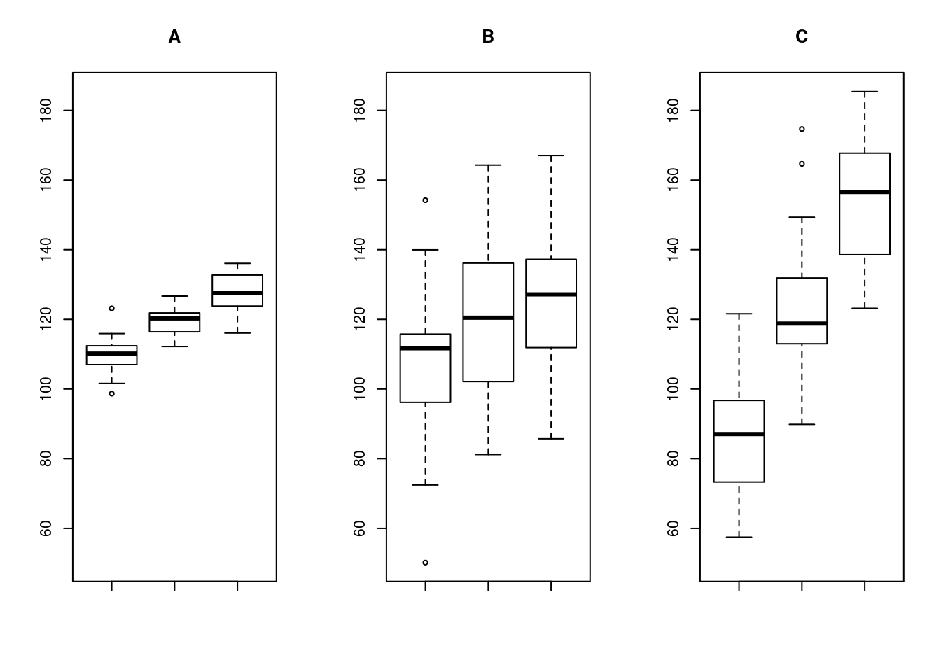
In A and B, the difference between the groups means is roughly the same, but the increased variability means that we are less sure that the groups are actually different. In B and C, the variability within each group is roughly the same, but the increased differences between them would give us more confidence that the groups are truly different. ANOVA takes this intuitive idea, adds a heap of math, and formalizes it to give us a method of testing hypotheses.
31.3.1 Splitting variability
ANOVA does this by splitting up the total variability (how much the data differ on the whole, called SSTotal) into two components:
- The variability between groups (how much the group means differ, called SSG)
- The variability within groups (how much the values within each group differ, called SSE)
Here, the SS stands for sum of squares, and gives us a hint about how it is calculated. Those calculations are long, confusing, and tedious, so (in a moment) we will let R handle them. The G rather clearly stands for groups, but the E stands, perhaps confusingly at first, for “error” instead of something else. This is for historical reasons, and is related to ANOVA’s emergence from linear modelling, which we will cover in the next tutorial.
31.3.2 Scaling variability
However, as we learned with the t-statistic, when we estimate variability from a smaller group, we are likely to underestimate it. In the plots above, there are 30 data points in each group and only 3 groups. We need to find some way to standardize those scores before we compare them.
ANOVA does this by calulating something called the “Mean Square”, which is a measure of the “mean” variability. To scale these though, the sums of squares (SS) are divided by the degrees of freedom, rather than the total samples. This accounts for the risk of underestimation, and builds in some protections against over-interpretting poorly designed tests.
So, we now need to calculate degrees of freedom both for the groups and for the errors. The groups should be simple: they follow the same rule as chi-square, the number of groups minus one (often denoted as k - 1). We might think that we can now do the same for the errors (using n in place of k), but here we run into a problem.
The total degrees of freedom for the test should only be n - 1, so, we need to account for the fact that we are already using some of those for the groups. In ANOVA, this is accomplished by setting the degrees of freedom for the errors (within groups) to n - k, yielding the correct total degress of freedom. Don’t worry if that was a bit confusing, R will calculate these for you, you just need to know where they come from.
So, we can now scale each of our SS terms to calculate the mean sum of squares for groups (MSG) and the mean sum of squares for errors (MSE) using these formulas:
\[ MSG = \frac{SSG}{k-1} \]
\[ MSE = \frac{SSE}{n-k} \]
31.3.3 Our new test statistic
Now, as we calculated a z-statistic for proportions, a t-statistic for comparing one or two means, and a chi-square-statistic for comparing distributions, we now need a new (complicated) statistic to test differences in means between multiple groups. I mentioned that ANOVA is comparing the source of variability, so it should be clear that we are some how going to compare our (now appropriately scaled) MSE and MSG values. But … how?
Well, like the chi-square, the distribution we will use (the f-distribution) treats big numbers as less likely under the null (that the groups are all equal). So, we need to make sure that if MSG is bigger than MSE we get a bigger value. However, as we saw in panels A and C above, we need this test to work similarly no matter how big the values are. So, what we need is a ratio of the two sources of variability. This ratio is called the F-statistic, and is calculated as:
\[ F = \frac{MSG}{MSE} \]
So, the bigger the group differences are compared to the variability within groups, the bigger the F-statistic.
31.3.4 A distribution to compare to
Finally, we need to know whether or not our F-statistic is unusual or not. As always, we could simulate, but here (because the calculations are beyond the scope of this tutorial) we will jump straight to the approximation. The F-distribution has the same set of functions as all of the others we have encountered. The only main difference is that it requires two specificied degrees of freedom (one for the groups and one for the errors).
Just to see what it looks like (here, using 3, as if we had 4 groups (4 - 1 = 3); and 20, as if we had 24 samples (24 - 4 = 20) ).
# Example f- distribution
# If there were 4 groups and 24 samples
curve(df(x,
         df1 = 4 - 1 ,
         df2 = 24 - 4),
      from = 0, to = 5,
      add = FALSE, xpd = TRUE,
      col = "green3", lwd = 4,
      ylab = "Density")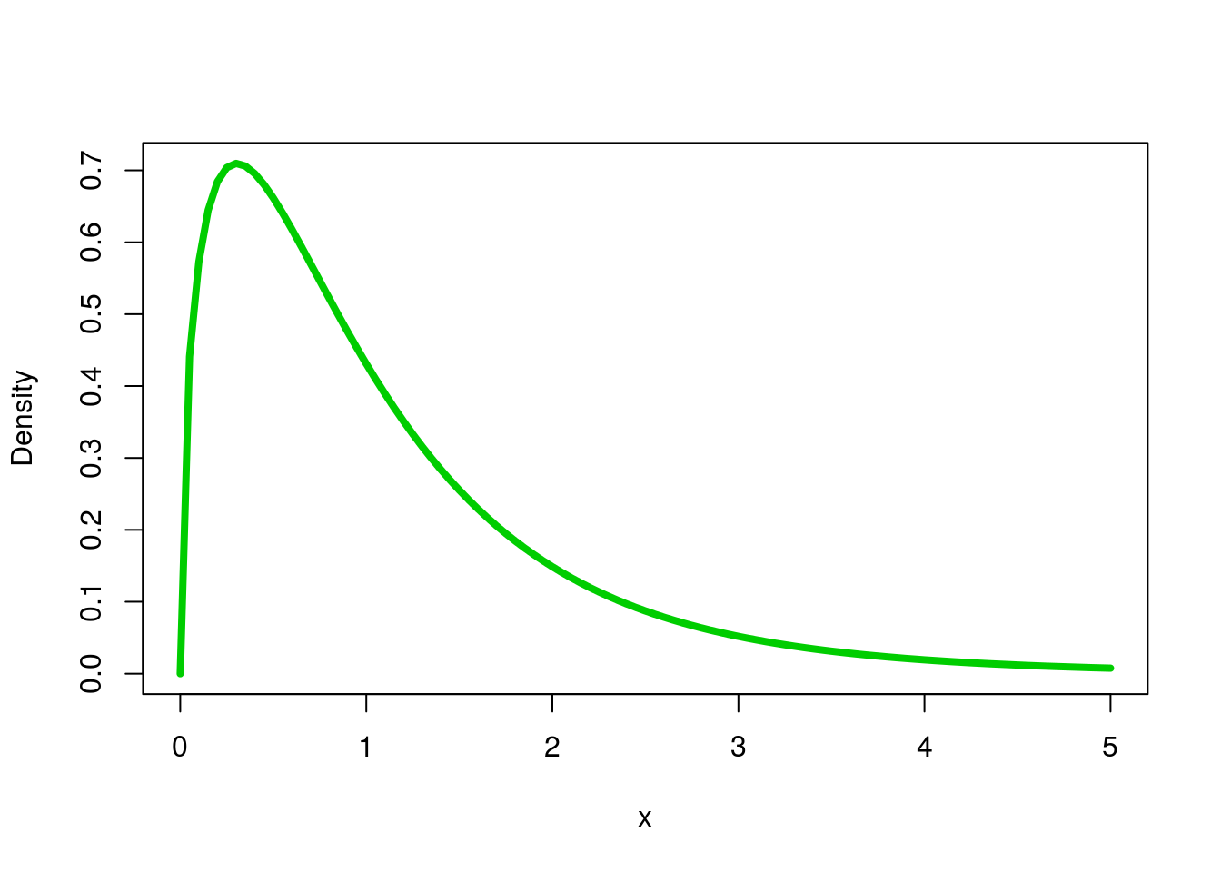
You won’t need to worry much about using these functions directly, as we will leave the rest up to R.
31.3.5 Assumptions of ANOVA
As before, when we use these shortcuts, they come at the cost of making (and meeting) some assumptions. For ANOVA, the first (normality) is the same one we have encountered before. As always, these tests rely on the Central Limit Theorem, and so require that either the underlying data is roughly normal or that the sample size is large. So, we always need to plot our data before running ANOVA. Second, ANOVA assumes that the variances are equal in each group.
The assumption of equal variances comes from the history of the ANOVA as it was designed to test outcomes of experiments, where if the null (no effect of treatment) is true, then all of the groups will have the same variability. In practice, as long as the standard deviation of one group isn’t double that of another, we are generally ok. Plotting the data is usually enough to test this too.
31.4 Run an ANOVA
Now, finally, with all of that background behind us we can actually run and ANOVA! Back when we were comparing the means of groups with the t-test, we discovered that the t-test only let us compare two groups at a time. Now, instead, we can compare all of them at once. Let’s start by asking whether or not all sizes of cars have the same mean right leg injury (column rLegInjury). As always, first state our hypotheses.
H0: mean rLegInjury is equal for all car sizes
Ha: at least one mean rLegInjury is not equal to the others
We could, in principle, do this with a bunch of pair-wise t-tests (i.e. small vs. medium, small vs. large, and medium vs. large), but that loses some information (and therefore power to detect differences) and runs the risk of making type I errors (by running multiple tests). Imagine if you had to run 20 pairwise tests – how many would you expect to come out significant by chance if the null is true for all of them?
Let’s start by plotting our data:
# Plot data to check assumptions
plot(rLegInjury ~ size,
     data = crash)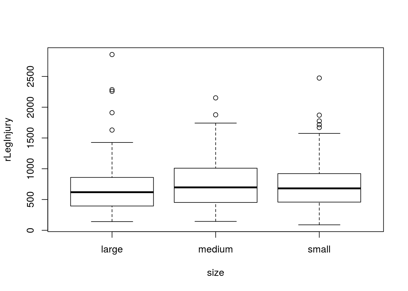
# Check sample size
table(crash$size)
##
## large medium small
## 116 136 100So, there are a few outliers, but we have enough samples that I think we will be ok. The variability in each group looks pretty similar as well, so we are ok to move forward. Let’s run the test.
In R, there are (as always) a few ways to run an ANOVA. The way I am going to show you has one extra step, but that extra step will make our lives substantially easier in the next section, so I want to start getting you in the habit of using it.
We will first use lm() to construct a linear model, just like we did when calculating lines earlier this semester (we are coming back to that soon, hence using it here again). We will save the model it creates (like we did when looking at the detail of the chisq.test() outputs and when we used lm() with abline() in an earlier chapter), then run it through the function anova() to output the ANOVA information we just discussed.
# Build and save a linear model
# We don't need to look at the output directly here
#   as the information we want will be shown soon
# I started by copy-pasting the boxplot line
rLegSizeLM <- lm(rLegInjury ~ size,
                 data = crash)

# View the anova output
anova(rLegSizeLM)
## Analysis of Variance Table
##
## Response: rLegInjury
## Df Sum Sq Mean Sq F value Pr(>F)
## size 2 225567 112783 0.6171 0.5401
## Residuals 338 61770641 182753This shows us all of the information we want. Importanly, the p-value (under Pr(>F))) tells us how likely these data were under the null hypothesis. Here, this tells us that these differences were relatively likely to occur under the null of no differences, and so we cannot reject that null. From the graph, we might have suspected this, as there is a lot of overlap between the groups.
Importantly: because we did not reject the null we cannot go forward and analyze for any pair-wise differences between the samples. To do so is to invite a huge risk of Type I error.
31.4.1 Plot the result
Finally, we always want to be able to visualize our results. For this, just like when using the t-test, we want a comparison of means with some indication of their variability, such as a confidence interval. So, we also want ot use the plotmeans() function here. Just like when using t.test(), the argument to plotmeans() is the same as the argument to lm(), so we can just copy and paste it in, though (as before), I also like to turn off some of the plot details.
# Plot the differences
plotmeans(rLegInjury ~ size,
          data = crash,
          n.label = FALSE,
          connect = FALSE)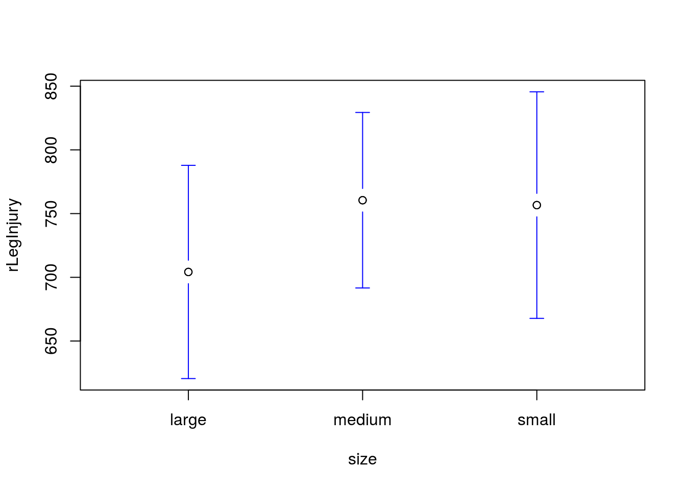
As expected, we see that the confidence intervals are substantially overlapping: just like we expected given our large p-value.
31.4.2 Try it out
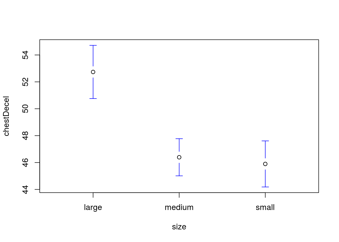
Is the mean chest deceleration (column chestDecel, a measure of how quickly the body slows) the same in all sizes of cars?
State your null and alternative hypotheses, run and interpret a test, then visualize the result.
You should get a p value of 0.0000000074, and a plot like this:
31.5 Following up on a significant result
Let’s look at another example to demonstrate some more features of the ANOVA test. For this, we will use the hotdogs data that you worked with earlier in this tutorial. Let’s start by reminind ourselves what is available:
# Look at hotdogs data
head(hotdogs)
## Type Calories Sodium
## 1 Beef 186 495
## 2 Beef 181 477
## 3 Beef 176 425
## 4 Beef 149 322
## 5 Beef 184 482
## 6 Beef 190 587# And a summary
summary(hotdogs)## Type Calories Sodium
## Beef :20 Min. : 86.0 Min. :144.0
## Meat :17 1st Qu.:132.0 1st Qu.:362.5
## Poultry:17 Median :145.0 Median :405.0
## Mean :145.4 Mean :424.8
## 3rd Qu.:172.8 3rd Qu.:503.5
## Max. :195.0 Max. :645.0So, we have three types of hotdogs, and some numerical information about each. Let’s test to see if the Calories are the same for all of them. Start by stating our hypotheses
H0: Mean calories are equal for all hotdog types
Ha: At least one hotdog type has a different mean calorie content
As always, first plot your data and see how it makes you feel.
# Plot the data
boxplot(Calories ~ Type,
        data = hotdogs)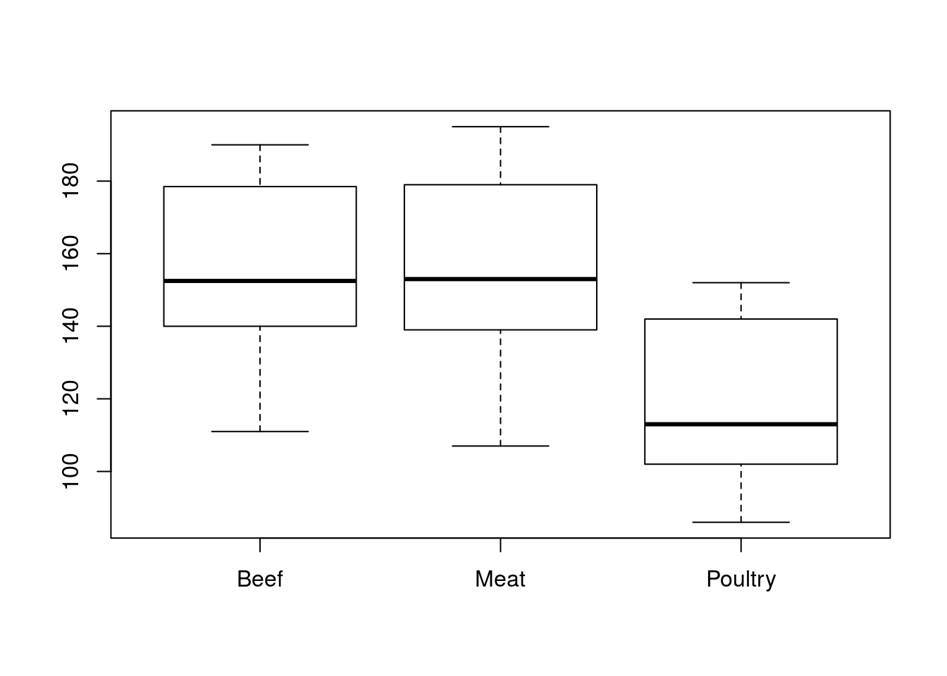
First, there are no outliers (and we have reasonable sample sizes), so it looks like we are ok on normality. Second, all of the groups appear to have about the same variability, so we are ok on that assumption as well. So, let’s run our ANOVA.
# Run and save the linear model
hotdogCalLM <- lm(Calories ~ Type,
                  data = hotdogs)

# View the anova output
anova(hotdogCalLM)
## Analysis of Variance Table
##
## Response: Calories
## Df Sum Sq Mean Sq F value Pr(>F)
## Type 2 17692 8846.1 16.074 3.862e-06 ***
## Residuals 51 28067 550.3
## ---
## Signif. codes: 0 '***' 0.001 '**' 0.01 '*' 0.05 '.' 0.1 ' ' 1Here, we get a very significant p-value, which is what we might expect, given the plot we looked at before. So, we can reject the null hypothesis of no differences between groups, but this doesn’t actually tell us which group is different.
31.5.1 Next steps
There are two general approaches to determining which group(s) actually differ. The first, which many introductory books recommend, is to manually make direct pairwise comparisons and see which ones are significant. Only doing this following a significant ANOVA result reduces the likelihood of Type I error (we already believe there is at least one real difference), but it doesn’t elminate it. Those introductory texts leave dealing with this (very major) concern, beyond the scope of the text, but give you just enough information to be dangerous.
Instead, I am going to give you just a little more information, but ask you to do less interpretation from it. There are a number of systems that handle the issue of multiple comparisions after an ANOVA, but one of the most common is called Tukey’s Honest Significant Differences. In R, this is implemented by passing a (slightly different) ANOVA object to the function TukeyHSD(). For this, we use that aov() function, instead of anova().
The TukeyHSD() function reports a confidence interval (95% by default, but can be changed with the conf.level = argument) and a p-value for each pairwise comparison of groups. These p-values have been adjusted for the multiple comparisons, so we can (more) safely interpret them. If the p adj is below your alpha threshold, you can conclude that the two groups are different. To see it in action:
# Run a Tukey "posthoc" test
TukeyHSD( aov(hotdogCalLM) )
## Tukey multiple comparisons of means
## 95% family-wise confidence level
##
## Fit: aov(formula = hotdogCalLM)
##
## $Type
## diff lwr upr p adj
## Meat-Beef 1.855882 -16.82550 20.53726 0.9688129
## Poultry-Beef -38.085294 -56.76667 -19.40391 0.0000277
## Poultry-Meat -39.941176 -59.36515 -20.51720 0.0000239Here, we see that (as expected) the Poultry group differs from both Beef and Meat, but Beef and Meat do not differ from each other.
Finally, you will almost always want to plot something to show the results of a comparison like this.
# Plot the means and CI's
plotmeans(Calories ~ Type,
          data = hotdogs,
          n.label = FALSE,
          connect = FALSE )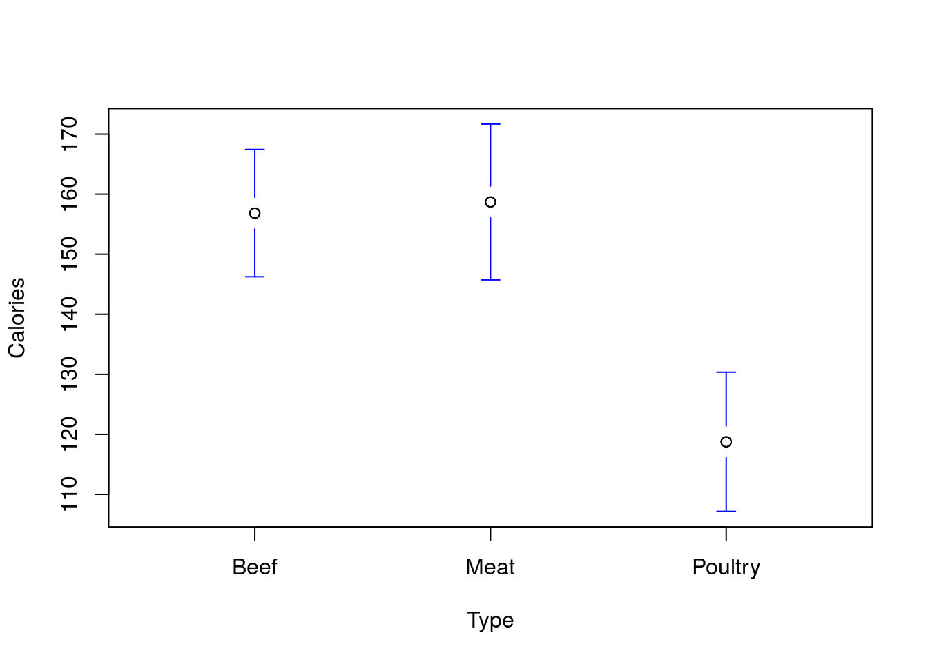
We can also get the means from the anova object if we want to report them directly. Here, rep gives us the sample size in each group, and the values are the mean of each group (Grand mean is the overall mean).
# Get the means
model.tables( aov(hotdogCalLM), type = "means" )
## Tables of means
## Grand mean
##
## 145.4444
##
## Type
## Beef Meat Poultry
## 156.8 158.7 118.8
## rep 20.0 17.0 17.031.5.2 Try it out
Is the mean measure of right leg injury (column rLegInjury) the same in various types of cars? Set up, run, interpret, and plot an appropriate test. Which pair-wise differences are significant?
You should get a p value of 0.0214, and a plot like this:
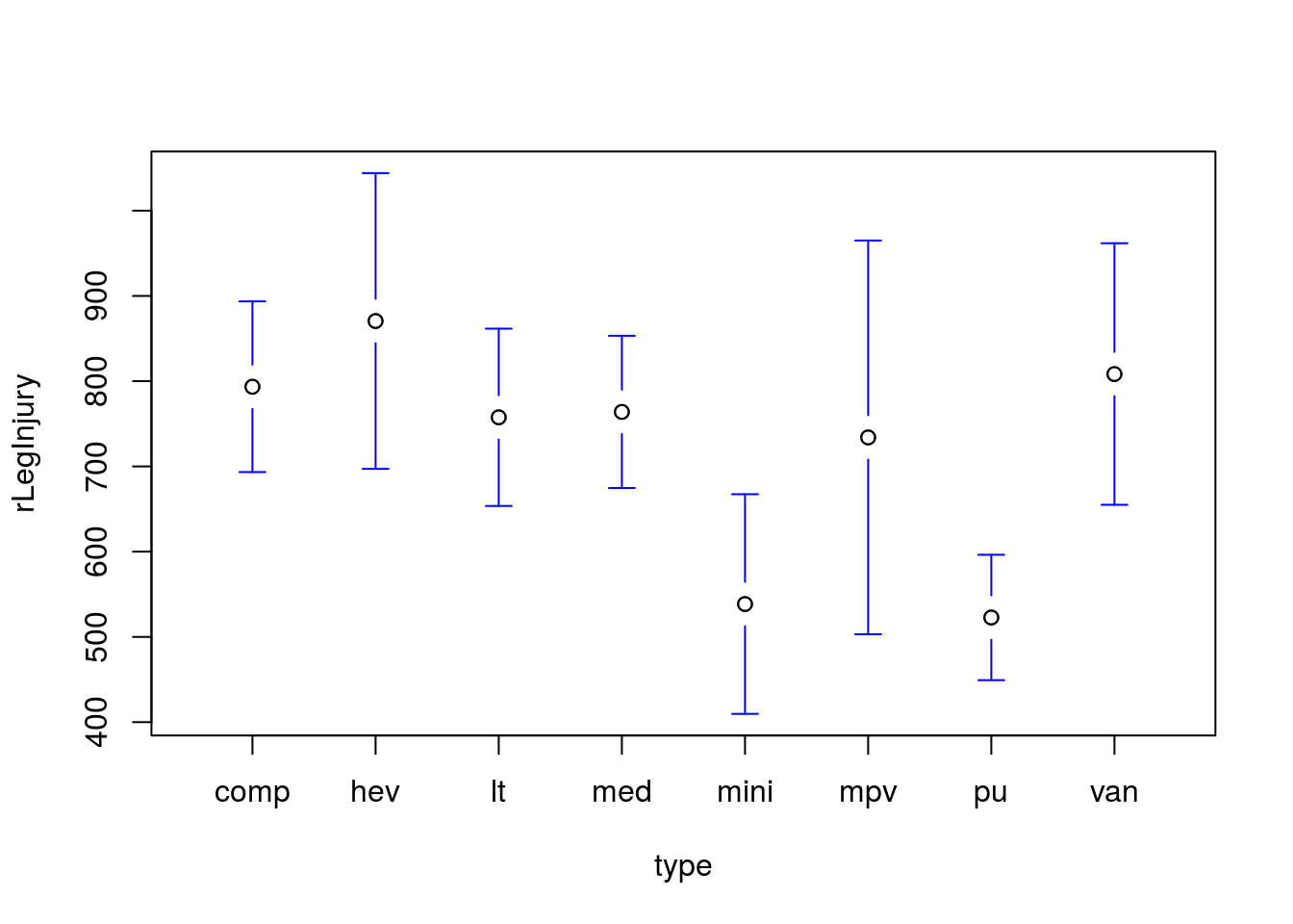
The comparison between pickups and compact cars is the only significant difference identified. This suggests that we may not have sufficient power to accurately identify any of the smaller differences between groups.