An introduction to statistics in R
A series of tutorials by Mark Peterson for working in R
Chapter Navigation
- Basics of Data in R
- Plotting and evaluating one categorical variable
- Plotting and evaluating two categorical variables
- Analyzing shape and center of one quantitative variable
- Analyzing the spread of one quantitative variable
- Relationships between quantitative and categorical data
- Relationships between two quantitative variables
- Final Thoughts on linear regression
- A bit off topic - functions, grep, and colors
- Sampling and Loops
- Confidence Intervals
- Bootstrapping
- More on Bootstrapping
- Hypothesis testing and p-values
- Differences in proportions and statistical thresholds
- Hypothesis testing for means
- Final thoughts on hypothesis testing
- Approximating with a distribution model
- Using the normal model in practice
- Approximating for a single proportion
- Null distribution for a single proportion and limitations
- Approximating for a single mean
- CI and hypothesis tests for a single mean
- Approximating a difference in proportions
- Hypothesis test for a difference in proportions
- Difference in means
- Difference in means - Hypothesis testing and paired differences
- Shortcuts
- Testing categorical variables with Chi-sqare
- Testing proportions in groups
- Comparing the means of many groups
- Linear Regression
- Multiple Regression
- Basic Probability
- Random variables
- Conditional Probability
- Bayesian Analysis
Analyzing shape and center of one quantitative variable
4.1 Load today’s data
Start by loading today’s data. If you need to download the data, you can do so from these links, Save each to your data directory, and you should be set.
# Set working directory
# Note: copy this from your old script to match your directories
setwd("~/path/to/class/scripts")

# Load data
survey <- read.csv("../data/survey.csv")
pizza <- read.csv("../data/Pizza_Prices.csv")
The pizza data gives the price of pizza and number of slices sold for each week in several cities. The survey data has a small selection of student responses to a class survey (combined over multiple terms). Run head on each to see what we have to work with. You should get something like this (not the same format).
# Look at pizza data
head(pizza)| Week | BAL.Sales.vol | BAL.Price | DAL.Sales.vol | DAL.Price | CHI.Sales.vol | CHI.Price | DEN.Sales.vol | DEN.Price |
|---|---|---|---|---|---|---|---|---|
| 1/8/1994 | 27982 | 2.76 | 58224 | 2.55 | 353412 | 2.34 | 58171 | 2.45 |
| 1/15/1994 | 26951 | 2.98 | 47699 | 2.74 | 264862 | 2.61 | 59348 | 2.40 |
| 1/22/1994 | 28782 | 2.78 | 59578 | 2.39 | 204975 | 2.77 | 63137 | 2.41 |
| 1/29/1994 | 32074 | 2.62 | 61595 | 2.49 | 208763 | 2.70 | 61271 | 2.29 |
| 2/5/1994 | 19765 | 2.81 | 64889 | 2.21 | 326558 | 2.45 | 70480 | 2.22 |
| 2/12/1994 | 22393 | 3.02 | 46388 | 2.75 | 176891 | 2.78 | 53496 | 2.48 |
# Look at survey data
head(survey)| class | height | birthMonth | genderID | pickRandomNumber | trueRandomNumber | sugaryDrink |
|---|---|---|---|---|---|---|
| Sophomore | 63 | October | Female | 77 | 66 | Soda |
| Freshman | 62 | June | Female | 96 | 6 | Pop |
| Sophomore | 63 | February | Female | 76 | 97 | Soda |
| Sophomore | 64 | June | Female | 64 | 46 | Pop |
| Sophomore | 70 | March | Male | 80 | 93 | Pop |
| Sophomore | 62 | October | Female | 7 | 83 | Pop |
Now that we have an idea of the data we will be working with, we can take a look at the some ways of plotting and analyizing the numerical variables in these sets.
4.2 Shape of a distribution
You have all probably heard of a “Bell curve” before, and probably have an intuitive sense that it looks something like this.
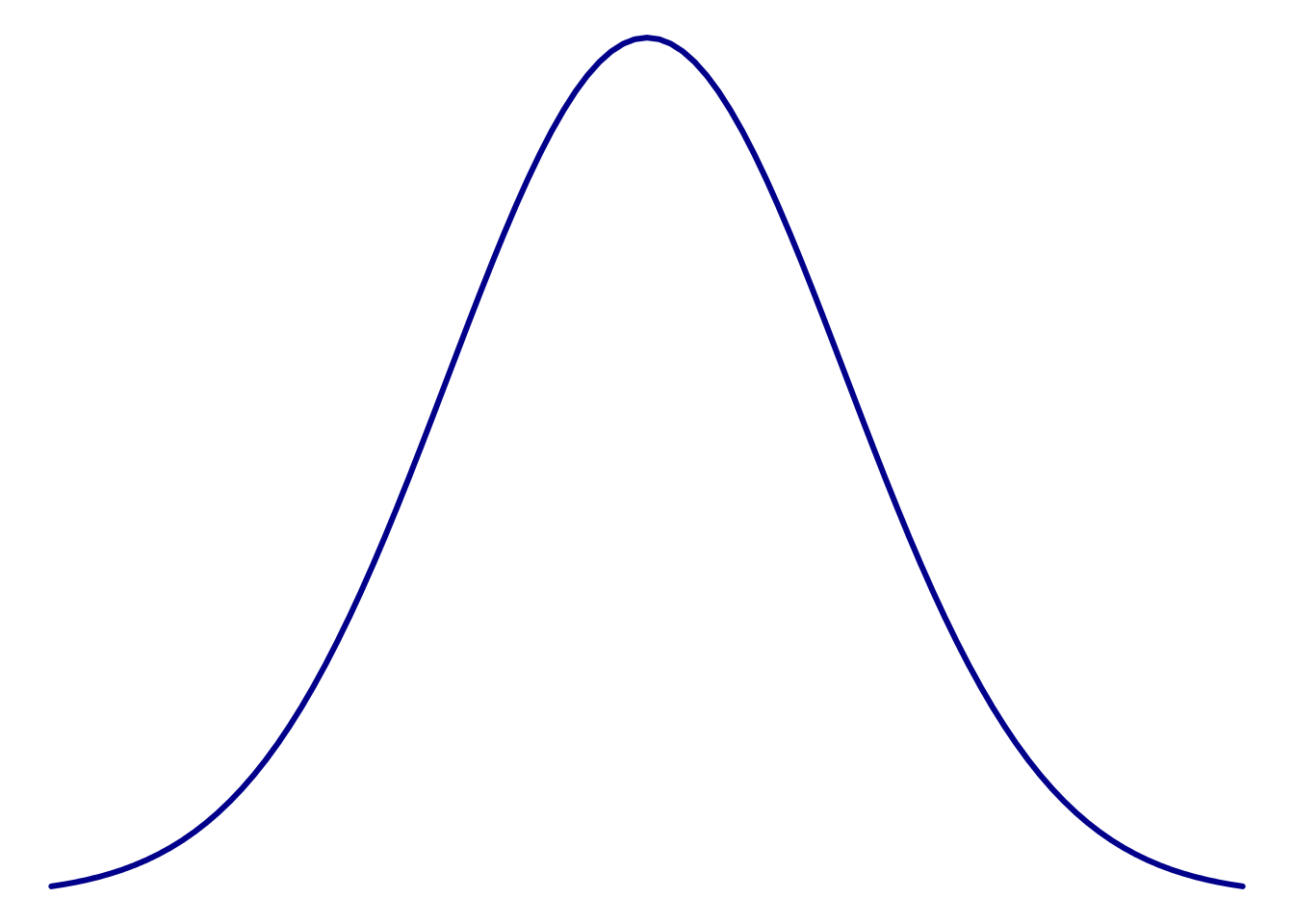
This single peak with a symmetrical (balanced) fall in both directions is a common model used to describe data of many kinds. Statisticians (and anyone that analyzes data) are often concerned about whether their data look at least sort of like that bell curve. There are some tests to determine if your data are match this curve, but nothing works quite as well as your eyes. So, here, we will plot a few distributions to develop a sense for this shape.
4.2.1 Histogram
Perhaps the most common plot to assess shape is the histogram. You have all likely encountered histograms before, though may not have heard them called that. A histogram simply takes a set of numeric data, puts it in bins that capture a range of data, then plots the amount in each bin. This is very similar to the bar plots we made from categorical data, except that the bins are always ordered in a histogram and are selected somewhat arbitrarily.
In this section, we will make histograms to look at a few distributions. However, instead of just telling you what function you should use, I want to demonstrate the process of finding it.
There are two general ways to search for things that you want to accomplish in R: on the internet and within R. Try searching Google for “plot histogram in R” and see what comes up. One of the top few results will almost always have what you want, though it may take a few tries to get exactly the one you want. When I searched, one of the top hits was a long description of how histograms can be made (Link). It goes into a lot more detail than we need, but is an example of what you can find with a just a little digging.
Within R, we can extend the single-questionmark (?) search approach we used before. If we want to search for a term, but don’t know the function it is associated with, we can use two question marks, and R will search for the term in all it’s help files. Try it here by typing ??histogram (comment out after running to make your future easier).
This pulls up a list of functions that are tagged with “histogram” in some way along with a brief description of what the function does. In this list, it looks like the function hist may do what we want. Clicking on it opens the full help page, which describes what it does and the options we can set.
4.2.1.1 Histogram of Pizza price
Now, we can use this new found function to look at the distribution of pizza prices (cost by slice) in Denver. That data is in the column DEN.Price
# Histogram of denver pizza price
hist( pizza$DEN.Price )
After you see the plot, change the axis and main label to describe the plot better. It should look something like this:

This distribution only has one “peak” and the two sides are fairly symmetrical. So, this seems to fit “close enough” with the bell curve above.
4.2.1.2 Denver sales volume
However, what about sales volume? Does the number of slices sold per week look similarly uni-modal (statistician for one-peak)? Let’s look and find out. Modify the above code to make a histogram like this one:

The “e+04” part of the label is short hand for scientific notation and means “multiply the first number by 104” (a 1 followed by 4 zeroes). So, this graph ranges from 20,000 to 100,000 slices sold per week.
More importantly, does this plot look as symmetrical as the previous plot? We call this difference from symmetry “skew”, and name it based on where the longer “tail” is. So, here, the graph goes much further to the right than the left, giving us a “right-skewed” distribution. Skew like this can cause some problems when we start asking where the center of the data is.
Finally, I am guessing that, even after changing labels, your histogram still looked a little different than mine. As mentioned above, the “bins” that catch the numbers are arbitrary. It is often the case that changing the size of those bins may reveal or conceal an interesting pattern. There are lots of ways to change the number of bins, but the easiest is by setting the parameter breaks = to a number close to the number of breaks you want[*] R won’t always let you set the exact number of bins because it wants to make sure that the breaks are sensible (e.g., the breaks are at even 100’s rather than every 12.785 units). R uses the function pretty to pick these breaks, though you can pass in a full list of breaks if you prefer to set an exact number. . Try it with this code, and play with different numbers to see how it affects the look of the histogram. Pick a good value and leave it in your script.
# Play to find a good number of breaks
hist( pizza$DEN.Sales.vol , breaks = 100)
4.2.1.3 Student height
As a final histogram example, let’s look at the distribution of student heights. Using the height column in the survey data, make a plot that looks like this:

Does this plot have a single peak, or more than one? Here, it looks like there are two peaks, so we call this plot bi-modal (two modes). Like with skewness, this can cause problems for talking about center.
4.2.2 Try it out (I)
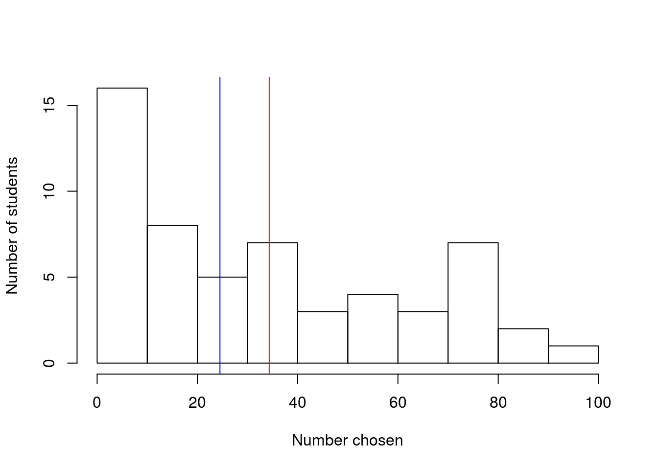
Make a histogram of the pickRandomNumber column, which contains a number that students were asked to select at random, and decide whether or not it is skewed (include your assessment as a comment). Why do you think it might follow this pattern?
4.2.3 Dot plot
Let’s take a look at one more kind of plot for looking at distributions: the dot plot. A dot plot puts a mark (a dot) on the graph for each entry in the data, but it stacks up any that are at the same place. So, it can look a lot like a histogram, but with each value as it’s own bin. As you hopefully saw above, having more bins can be either really helpful or really problematic. In R, the function to make a dot plot is stripchart, though it is not nearly as pretty a plot as many of the others (without substantial additional arguments)[*] In my opinion, the lack of a built in function to make dot plots easily is because dot plots are rarely used any more. They were much more useful when working by hand becuase they could be built as you went along. . The function is set to work on continuously varying data, so we need to set the method = "stack" argument to make it build up the piles we want.
The dot plot is included here for completeness, but we will only rarely encounter it for the rest of the semester
4.2.3.1 Student height
Let’s start by looking at the bi-modal student height data. At first, it seems quite odd that something like height should have such sharp peaks, but I think we may see soon why that is the case.
# Make a dotplot
stripchart(survey$height, method = "stack")
Now, what we can see is that there are two specific heights (63 inches and 70 inches) that have a large number of cases. This suggests that students with heights near those heights may have “rounded” to be those heights (5’3" and 5’10" respectively). This may have been difficult to see from the histogram, but gives us a hint that survey data may be less than completely reliable (more about that later).
We can replicate this, however, by setting the number of bins in the histogram to a very large number, which I think looks a little nicer.
# histogram like dot plot
hist(survey$height, breaks = 10)
However, it is possible with some tweaking to make nice dot plots. The effort is just more than I want to throw at you right now. Throught the semester we will add these skills, but they are not necessary now.

4.3 Measuring the center
Now that we have a sense of the shape of distributions, let’s talk a little about measuring their center. For this, let’s create a simple variable that will let us see exactly what is happening.
# Make sample variable
test <- c(1, 2, 3, 6, 7, 8, 9)
When most people think of the center, think of the “average”: you add up all of the values and divide by the number of values. In notation, this can look like:
\[ \text{mean} = \frac{\text{sum of values}}{\text{number of values}} = \frac{\sum\limits_{i=1}^nx_i}{n} \]
So, for our test variable, which has 7 values, we could calculate mean like this:
# Calculate the mean by "hand"
sum(test) / 7
## [1] 5.142857However, R already has a function to do that automatically for us: mean().
# Calculate the mean more easily
mean(test)
## [1] 5.142857It gives the same result, but will do the work for us. The function mean() takes any numeric variable as it’s argument, making it great to use in a large number of circumstances.
However, there is one other way to think about the “center”. sometimes we might be interested in finding the middle value of a variable. This is called the “median” and is the number in a variable for which there are just as many values greater than it as there are less than it. In R, we find the median with the function median(), which works just like mean()
# Find the median
median(test)
## [1] 6Not here that it is our fourth value from test and that there are three number larger than it and three numbers smaller than it. As you can see, the mean and median are often similar, but their differences can tell us important things as we will see below. Each measure of the center is good for slightly different things.
4.3.1 Pizza price
For our first actual example, let’s look again at the price of pizza Denver. Start by plotting the histogram again so that we have a sense of what we are looking at.

Calculating the mean we see:
# Mean price of pizza
mean(pizza$DEN.Price)
## [1] 2.566026So, it will cost about $2.57 for a slice of pizza on average. What about the median?
# Median price of pizza
median(pizza$DEN.Price)
## [1] 2.56This tells that half of the time we will pay more than $2.56, and half the time less than that. In this case, the mean and median are very similar, which shouldn’t surprise us as the distribution is symmetrical and both are very near the middle. But, what happens when the distribution isn’t symmetrical?
4.3.2 Pizza sales volume
Let’s look again at the sales volume of pizza in Denver

We can calculate the mean and the median the same way as before:
# Mean sales volume
mean(pizza$DEN.Sales.vol)
## [1] 45742.89# Median sales volume
median(pizza$DEN.Sales.vol)## [1] 43158Not that now, they are rather different, off by 2,500 slices. This is becuase the very large numbers at the far right of the distribution pull the mean up by a lot, but only count as one more value over the median. This becomes more clear if we think about where the values fall on the plot.
So, let’s add the lines. The function abline() can be used to add lines to plots in a lot of ways (many of which we explore in coming chapters). Here, we just want to add a vertical line at the site of the mean and median, so we use the argument v = and pass in the mean or median. We will also use the argument col = to set the color[*] There are a lot of colors built into R. We will explore them more soon using the function colors() and apply them to a lot of plots .
# Add lines to the histogram
abline(v = mean(pizza$DEN.Sales.vol), col = "red")
abline(v = median(pizza$DEN.Sales.vol), col = "blue")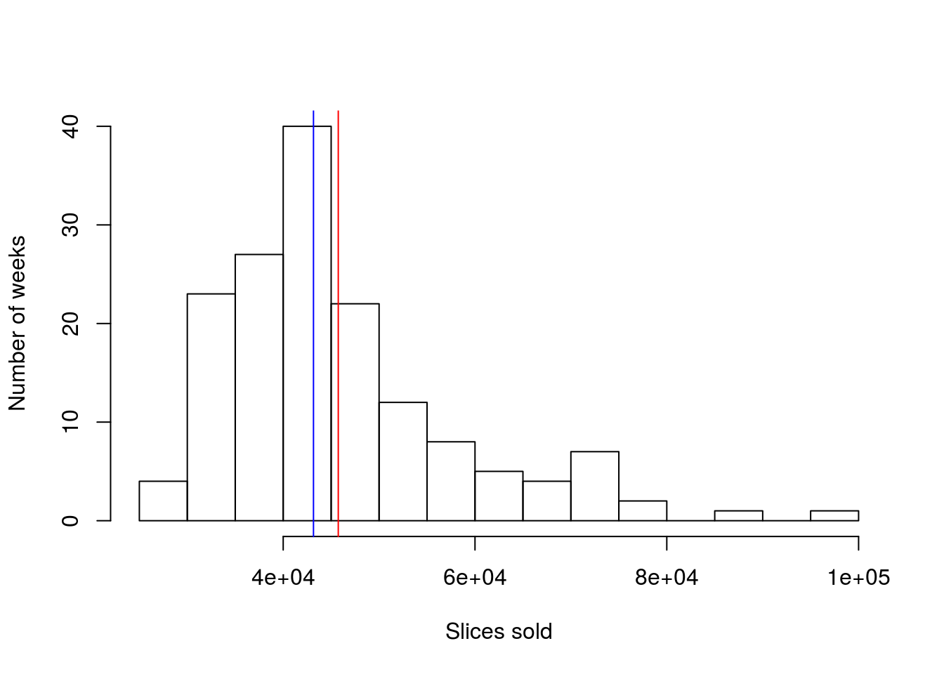
So, we can now see that the median is still right in the biggest peak, while the mean has been pulled away from it, towards the tail. Identifying when the mean and median differ is one big clue towards identifying skew (and the mean is always different in the direction of the skew).
4.4 Try it out (II)
Calculate the mean and median of the random numbers chosen by students (the pickRandomNumber column). Report the results and interpret what they mean. Plot the lines over the histogram as well – you should get something like this:
4.5 Output
As with other chapters, click the notebook icon at the top of the screen to compile and HTML output. This will help keep everything together and help you identify any errors in your script.