An introduction to statistics in R
A series of tutorials by Mark Peterson for working in R
Chapter Navigation
- Basics of Data in R
- Plotting and evaluating one categorical variable
- Plotting and evaluating two categorical variables
- Analyzing shape and center of one quantitative variable
- Analyzing the spread of one quantitative variable
- Relationships between quantitative and categorical data
- Relationships between two quantitative variables
- Final Thoughts on linear regression
- A bit off topic - functions, grep, and colors
- Sampling and Loops
- Confidence Intervals
- Bootstrapping
- More on Bootstrapping
- Hypothesis testing and p-values
- Differences in proportions and statistical thresholds
- Hypothesis testing for means
- Final thoughts on hypothesis testing
- Approximating with a distribution model
- Using the normal model in practice
- Approximating for a single proportion
- Null distribution for a single proportion and limitations
- Approximating for a single mean
- CI and hypothesis tests for a single mean
- Approximating a difference in proportions
- Hypothesis test for a difference in proportions
- Difference in means
- Difference in means - Hypothesis testing and paired differences
- Shortcuts
- Testing categorical variables with Chi-sqare
- Testing proportions in groups
- Comparing the means of many groups
- Linear Regression
- Multiple Regression
- Basic Probability
- Random variables
- Conditional Probability
- Bayesian Analysis
Analyzing the spread of one quantitative variable
5.1 Load data
This chapter will work with two datasets which can be downloaded from the links:
- Pizza_Prices.csv
- Gives information on weekly pizza sales (number of slices sold and average price) for various cities.
- militiaChestSize.csv
- Gives the chest size for members of the Irish militia in the 1800’s
Load the data as such (so that your variable names match the tutorial):
# Set working directory
# Note: copy this from your old script to match your directories
setwd("~/path/to/class/scripts")

# Load data
pizza   <- read.csv("../data/Pizza_Prices.csv")
militia <- read.csv("../data/militiaChestSize.csv")
5.2 Thinking about spread
In the last chapter, we found that the average price of a slice of pizza in Denver (during the study period) was $2.57. Does this tell us that we could go to Denver with exactly $2.57 in our pockets and get one slice of pizza? Intuitively, we know that is not true. However, if the price of pizza had been exactly $2.57 every week, that is exactly what it would mean. This seems unlikely, but without more information, we can’t know how widely the cost of pizza varies. Free pizza one week could be balanced by pizza that cost $5.14 the next week to still give us an average of $2.57 still.
5.2.1 Extremes
There are a lot of numbers that might help us understand how much the price of pizza varies (how big the “spread” is). The first, and perhaps simplest, is just to ask what the extremes are. How much did pizza cost on the most expensive week and the least expensive week? These values are referred to as the maximum and minimum values and can give us a clue about the spread. In R, we calculate these with the functions min() and max(), which each take a single vector as their arguements. Try them here.
# Calculate the minimum price of pizza in Denver
min(pizza$DEN.Price)

# Calculate the maximum price of pizza in Denver
max(pizza$DEN.Price)
From this, we see that pizza price ranged from a low of $2.11 to a high of $2.99. But, such minima and maxima are senstive to a single large value. For example, imagine that just one week in the test set, there had been a giant pizza dough shortage that led to the price of pizza to shoot all the way to $6.00/slice. Would that me representative of the price you’d expect to pay? Probably not.
Such values, often called outliers, are important in data analysis (we will talk more about them when we compare values against each other). However, they can lead to un-realistic depictions of the spread if a statistician is not careful. One way to avoid this is by asking, rather than what the extremes are, where the middle chunk of the data lies.
5.2.2 Percentiles
For this, we turn to the concept of percentiles. You have likely encountered percentiles before, such as when evaluating your scores on a standardized test. There, it is often phrased as something like the “90th percentile” which means the value that separates the lower 90% of the data from the top 10%. In contrast, the “10th percentile” tells us where the lowest 10% of values are. Between these two points lies the middle 80% (we cut off the top and bottom 10%).
In R, we use the function quantile() to give these values. Like mean() and median(), quantile() takes a vector as its main argument. However, for quantile() we must also express the cutoff(s) we want it to return. The cutoff must be between 0 and 1, so you’ll need to convert from percent to proportion (by dividing by 100).
# Calculate the 10th percentile
quantile(pizza$DEN.Price, .10)

# Calculate the 90th percentile
quantile(pizza$DEN.Price, .90)
So, the middle 80% of the data lies between 2.33 and 2.81. However, for historical reasons, statisticians are often most concerned with where the middle half lies. For this, we need the 25th and 75th percentile, which have 50% of the data between them. Because these each capture one quarter of the data outside of them, they are often called the 1st and 3rd quartile. To get this, we can run quantile() without specifying a percentile of interest:
# Try quantile() without a percentile
quantile(pizza$DEN.Price)
## 0% 25% 50% 75% 100%
## 2.1100 2.4575 2.5600 2.7000 2.9900This gives us the:
- Minimum (0%)
- 1st quartile (25%)
- Median (50%)
- 3rd Quartile (75%), and
- Maximum (100%)
and is traditionally called a “Five number summary”. This is a great quick picture of the data. We can also use the function summary() to get these pieces of information. Using summary() also returns the mean and will give a good summary of data other than numeric data, so may be safer to try. However, summary will only ever give these percentiles, there is no way to get other cutoffs – and we are going to need a way to get other cutoffs soon. So, each function has it’s advantages. Let’s see summary() in action:
# Use summary
summary(pizza$DEN.Price)
## Min. 1st Qu. Median Mean 3rd Qu. Max.
## 2.110 2.458 2.560 2.566 2.700 2.990Note that the values are the same (plus the mean is returned) but that the names are slightly different.
5.2.3 Plotting this spread
This five number summary is a great quick glance at data, but comparing one set of numbers to another may still be tricky. For this, we may want a graphical represntation called a box plot.
A box plot plots the quartiles as a box with the median marked by a line. In addition, it uses “whiskers” to show the minimum and maximum of the data (most of the time[*] However, if the whiskers would be too long, they are cutoff at the most extreme point that is less than 1.5 times the interquartile range (IQR, distance between the 1st and 3rd quartile). This is for purely aesthetic reasons and is largely arbitrary. When asked why 1.5, John Tukey (the one who first popularized this plot) said it was because 1 was not far enough and 2 was too far. ). We will discuss exceptions when we see them.
In R, we use the sensibly named function boxplot() to make boxplots. The simplest use takes a single vector and makes a box plot. We will encounter more complex usages soon. See it in action here:
# Make a boxplot
boxplot(pizza$DEN.Price)
Note that if we compare the boxplot to our five number summary:
| Min. | 1st Qu. | Median | 3rd Qu. | Max. |
|---|---|---|---|---|
| 2.11 | 2.458 | 2.56 | 2.7 | 2.99 |
We see that the thick central line is right at the median, the top and bottom of the box match the 3rd and 1st quartile respectively, and the whiskers extend out to the maximum and minimum values. This visual representation will often come in handy.
5.2.4 Put it all together
That last section had a lot of text and explanation. Let’s cut through that quickly to show all those functions near each other. We’ll use the militia data as it gives some nice interpretations.
First, let’s plot a histogram to get a general sense of the data. Make sure that you add reasonable labels to your histogram too.
# Make a histogram -- don't forget to add labels
hist(militia$chestSize)
So, the plot looks generally uni-modal and symmetrical. Let’s calculate the spread, first the fast way:
# Quick idea of spread
summary(militia$chestSize)
## Min. 1st Qu. Median Mean 3rd Qu. Max.
## 33.00 38.00 40.00 39.83 41.00 47.00This gives all of the information we asked about above in one function! We will need some of those separate functions again for other tasks, but this gives us a great start. Importantly, we know know that the middle half of the militiamen had chest sizes between 38 and 41 inches. Now, let’s make a plot of this information:
# Make a boxplot
boxplot(militia$chestSize,
        ylab = "Chest size (inches)")
Right away, we encounter something new: there are now points outside the whiskers. These are generally called outliers, and are a way to quickly identify the most extreme data. Here, they are fairly close to the whiskers, but that won’t always be the case. By default, the whiskers only reach out to a certain distance (1.5 times the difference between the 1st and 3rd quartile) to keep the plot looking nice and to identify very extreme points. This cutoff is arbitrary, but appears to work well for most data sets.
5.2.5 Try it out (I)
Now, use the sales volume from Denver (column DEN.Sales.vol) and calculate the summary stats and make a boxplot. It should look something like this:

Think about what may be creating those very high sales weeks. We’ll be discussing those more soon.
5.3 The Standard Deviation: A more formal calculation
All of the above methods are great for getting an intuitive sense of how broadly a set of data spreads. However, they are not quite complete, and there are many applications for which a simple description of the five number summary is not sufficient. There are a lot of mathematical formulas that work on distributions of data, and they almost universally require a specific calculation of the spread called the “Standard Deviation”.
5.3.1 The math
The standard deviation measures how much, on average, the values of a distribution differ from it’s mean. If all of the values are identical, the standard deviation is 0. Thus, as the amount of spread increases, the value of the standard deviation increases. Here, we will work through why the calculation is what it is before showing the full equation and an R shortcut.
Let’s start by creating a small vector that we can use to illustrate what is happening. In R, if we want a sequnce of numbers, we can use the colon (:) between two numbers to get all of the digits between them. Let’s do that here (note that test and temp tend to be common names for throwaway variables like this):
# Create a small test variable
test <- 8:12
test
## [1] 8 9 10 11 12Now, we can probably guess it’s mean by hand (since it is the same as the median), but let’s use R to make sure.
# Calculate the mean
mean(test)
## [1] 10Good, we were right. Now, we want to know how much each value of test differs from that mean. So, we can use the way vector math works in R to calculate that:
# How much does each differ from mean?
test - mean(test)
## [1] -2 -1 0 1 2But, what the standard deviation wants is the total amount that the values differ by, so let’s wrap that in sum() to get a total amount of difference.
# How much is the total difference from mean?
sum(test - mean(test) )
## [1] 0Uh oh. That can’t be right. We know that the values differ (we just saw that they did). How, then, can the total by zero? This is because the negatives cancel out the positives, and will always be true for any set of values. So, we need to do something. Any ideas?
.
.
.
.
.
There are two simple approaches. You could just take the absolute value, but for historical reasons (it matches more closely with other methods) statisticians take a different approach. Instead, all of the differences are squared, because any number times itself must be positive (take a moment to think through the logic if it is not clear). In R, like many other systems, the carat (^) is used to show taking a number to the power of another number. So, 5^2 can be interpretted as 52. Let’s try it with our test variable, first showing the result than calculating the sum.
# Square the differences
(test - mean(test) )^2
## [1] 4 1 0 1 4# Calculate the sum now
sum( (test - mean(test) )^2 )## [1] 10That looks much better – our value is now always going to be positive, and will take divergence that is both above and below into account. However, we are not quite done yet. You probably notice that, if we were to have 10 numbers instead of 5, our sum of the deviations would (almost by definition) increase. So, we need a way to scale for the number of observations we have. For the mean, we divided by n – the number of observations. For the standard deviation, we instead divide by n - 1 because of how the standard deviation is related to more complicated statistical concepts[*] It is linked to the concept of degrees of freedom. Using n-1 also reduces the degree of some errors that result from analyzing small sample sizes. We will address both of these more completely in later chapters. .
We can implement this in R like this. Note that we are introducing the function length() which returns the number of enteries in a variable.
# See length in action to get our n value
length(test)
## [1] 5# Scale our measurement of deviation
sum( (test - mean(test) )^2 ) / (length(test) - 1)## [1] 2.5We are now almost there. What we have just calculated is something called the variance. This is a good measure of spread, but it has one fatal flaw: its units are wrong. Look again at the line we just calculated and notice that we are squaring the difference between the variable and the mean. So, if test is in inches, the value of the variance would be in inches-squared (in2), which is rather different than inches.
To return to our correct units, we take the square root of the variance. This has the added bonus of bringing the value back to a range that seems more intuitive to use, and has some very nice (lucky) properties. In R, we use the function sqrt(), which (unsurprisingly) calculates the square root.
# Put it all together
sqrt( sum( (test - mean(test) )^2 ) / (length(test) - 1) )
## [1] 1.581139So, the full formula for the standard deviation looks like this:
\[ \sqrt{ \frac{\sum\left(x - \bar{x}\right)^2}{n-1} } \]
Now, that is a lot of calculations. Only a few years ago, and in many stats classes still, you would be expected to do that calculation by hand all semester long, or at least several times before getting a shortcut. However, as long as you have a reasonable understanding of where the number comes from, I think that focusing on application is much more fruitful[*] Don’t be fooled though: I will still hide some shortcuts from you later in these lessons. There are many applications that have a strong pedagological value in working ‘the long way’. I just don’t think this is one of them. . The shortcut to the standard deviation comes from a function named with its abbreviation: sd(), which takes a vector argument and returns the standard deviation.
# Calculate sd the quick way
sd(test)
## [1] 1.5811395.3.2 Pizza price
Now, after all of that math aside, let’s apply what we just learned. First, re-plot your histogram of the price of pizza. (Probably fastest to go back to your script from last chapter and copy the code).

Now, calculate the standard deviation (sd) of the price of pizza:
# Calculate sd of pizza price in Denver
sd(pizza$DEN.Price)
## [1] 0.1788915So, the sd of the price of pizza in Denver is about $0.18. But, what does that mean? Well, the standard deviation really only makes sense in light of the mean. So, let’s calculate it and add it to the plot (as before, if the code weren’t here, you could copy it from an old script). Note that I have added the argument lwd = 3 to the abline() call. This sets the line width (hence the abbreviation) to a bit thicker, which makes it is look a little nicer (in this case and my opinion).
# Calculate the mean (again)
mean(pizza$DEN.Price)

# Add a line to the plot
abline( v = mean(pizza$DEN.Price),
        col = "green3", lwd = 3,
        )
Now that the mean is on the plot, you might notice that a good chunk of the data values fall within one standard deviation ($0.18) of the mean. Hopefully even more clear is that if we look within two standard deviations ($0.36) of the mean, we see that nearly all of the data are captured.
Let’s add lines at those spots, just to see how much data we are catching. To do this, we will add two sds to the mean for one line and subtract two sds for the other. Instead of writing out separate functions for each line, we can combine them. First, I will show how that combining works:
# Add and subtract 2 sds from the mean
mean(pizza$DEN.Price) + (c(-2,2) * sd(pizza$DEN.Price) )
## [1] 2.208243 2.923809Using the c(-2,2) creates to values in the resulting vector, one that is two sd less than the mean, and one that is 2 sd greater than the mean. Now, we add that to the abline() function, pick a new color[*] Feel free to try a different color. Very soon we will start exploring good ways to pick colors in R. For now, you can run colors() to see all 657 named colors in R. You can also use rgb or hex specification to make any color you want. , and add the lines to the plot in one shot. For now, you can copy what I have below, but if you were working on your own, you could start with the abline code you had above.
# Add lines to the plot for +/- 2 sds
abline( v = mean(pizza$DEN.Price) + (c(-2,2) * sd(pizza$DEN.Price) ),
        col = "red3", lwd = 3,
        )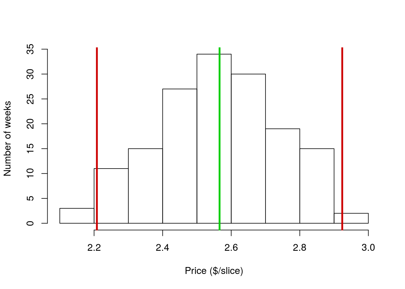
Each red line marks the location that is 2 sds away from the mean. As you can see, nearly all of the data points fall in that space. This is not just a coincidence or a quirk of this data set. For all unimodal and symmetrical distributions, approximately 95% of data values fall within 2 sds of the mean. This is such an important point that it has a (very creative) name: The 95% Rule (ok, maybe not so creative, but what do you expect from statisticians?). Similar information tells us how much data falls within other numbers of sds, but we will worry about that later this semester.
5.3.3 Limitations
It is important to note here that the standard deviation is not a perfect tool, and in many cases is an entirely inappropriate one. The sd is only particularly meaningful for unimodal symmetric distributions. The numeric value of the sd can still be informative for other distributions, but its interpretation becomes very difficult.
As an example, let’s apply what we just calculated above to the sales volume of pizza in Denver. As always, it helps to have a picture of the data to look at while doing analysis, so copy in the code from last chapter to make this histogram:

Next, calculate the mean and sd:
# Calculate the mean and sd:
mean(pizza$DEN.Sales.vol)
sd(pizza$DEN.Sales.vol)
As before, these numbers feel reasonable, and seem to describe the spread pretty appropriately. However, let’s add lines for the mean and the location of \(\pm\) 2 sds.
# Add lines for mean and +/- 2 sds
abline(v = mean(pizza$DEN.Sales.vol),
       col = "green3", lwd = 3)
abline(v = mean(pizza$DEN.Sales.vol) +
                  (c(-2,2) * sd(pizza$DEN.Sales.vol)),
       col = "red3", lwd = 3)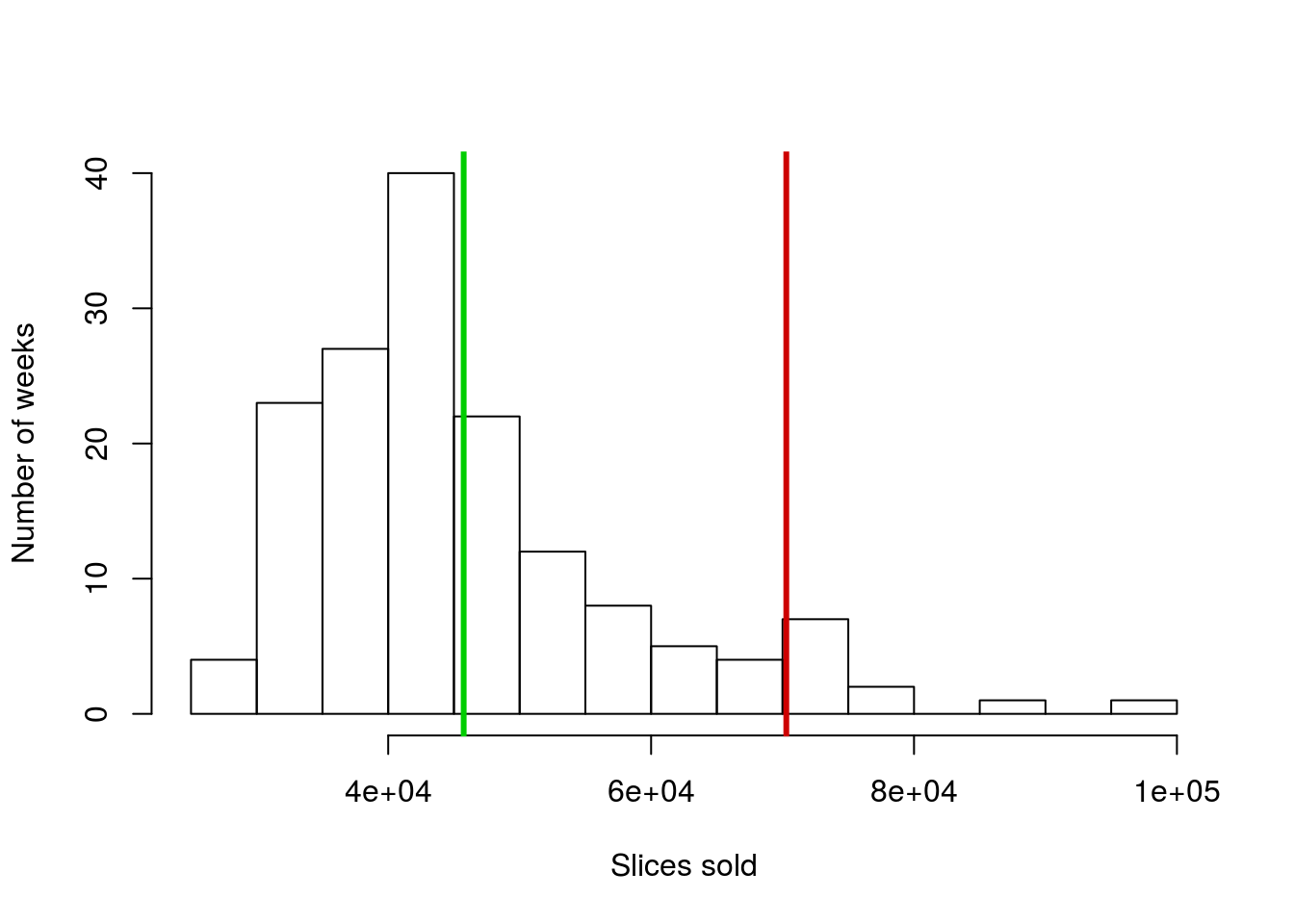
Why is there only one red line this time? Did something go wrong? Here is a good point to remember that sometimes, when R doesn’t do what you expect, the cause isn’t an error in the code, but rather that you are trying to do something that doesn’t make sense. Here, let’s look at the locations where we are trying to make the lines. (Ordinarily, you would do this either by copying out what you tried to set v = to or by just highlighting that section of code and running it without creating a new line.)
# Where should the lines have gone?
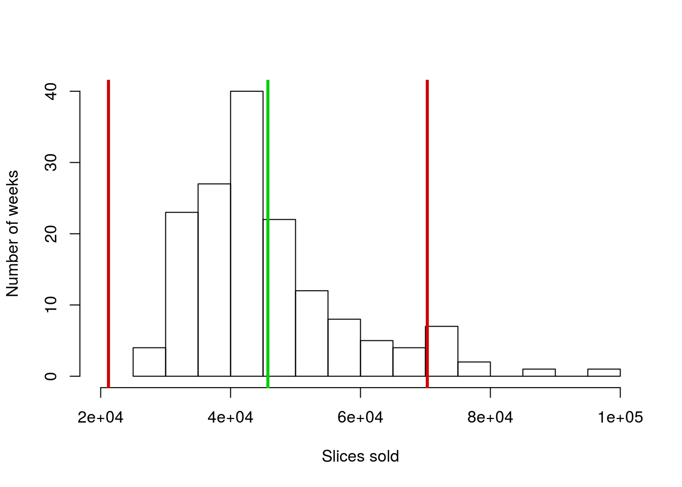
mean(pizza$DEN.Sales.vol) + (c(-2,2) * sd(pizza$DEN.Sales.vol))## [1] 21201.37 70284.41What do you notice about the left hand line? Where would you draw it on the graph if you were doing it by hand? Off of the plot to the left, correct? I can change the plot to make it fit so we can see it (but don’t worry for now about trying to do this[*] I did this using xlim = c(20000,100000) in the call to hist(), if you really want to try it. xlim = (and ylim =) set the axis limits if, for some reason, you want to manually control them. ).
So, in this case, we are capturing a large area where no data is, but missing more than 5% of the data on the other extreme. This is just the first (or what will be many) reminders that some of the shortcuts we use only apply to unimodal symmetrical distributions.
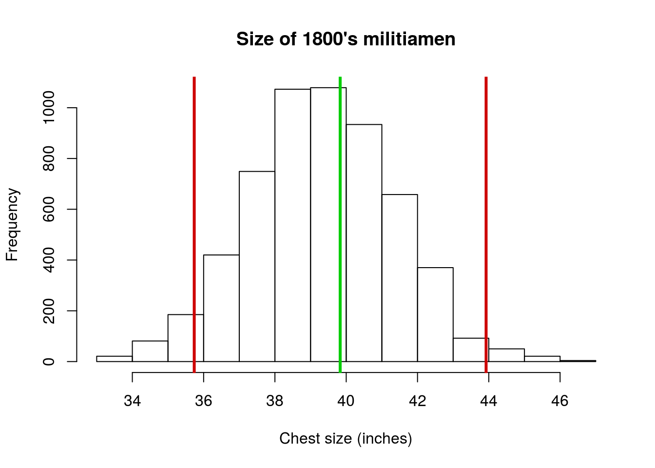
5.3.4 Try it out (II)
Now, try it out for yourself using the militia data (using the only column chestSize). Generate a histogram with the mean and sd marked on it, and include a note (as a comment) interpretting what the sd means for those data. Your plot should look something like this:
5.4 Output
As with other chapters, click the notebook icon at the top of the screen to compile and HTML output. This will help keep everything together and help you identify any errors in your script.