An introduction to statistics in R
A series of tutorials by Mark Peterson for working in R
Chapter Navigation
- Basics of Data in R
- Plotting and evaluating one categorical variable
- Plotting and evaluating two categorical variables
- Analyzing shape and center of one quantitative variable
- Analyzing the spread of one quantitative variable
- Relationships between quantitative and categorical data
- Relationships between two quantitative variables
- Final Thoughts on linear regression
- A bit off topic - functions, grep, and colors
- Sampling and Loops
- Confidence Intervals
- Bootstrapping
- More on Bootstrapping
- Hypothesis testing and p-values
- Differences in proportions and statistical thresholds
- Hypothesis testing for means
- Final thoughts on hypothesis testing
- Approximating with a distribution model
- Using the normal model in practice
- Approximating for a single proportion
- Null distribution for a single proportion and limitations
- Approximating for a single mean
- CI and hypothesis tests for a single mean
- Approximating a difference in proportions
- Hypothesis test for a difference in proportions
- Difference in means
- Difference in means - Hypothesis testing and paired differences
- Shortcuts
- Testing categorical variables with Chi-sqare
- Testing proportions in groups
- Comparing the means of many groups
- Linear Regression
- Multiple Regression
- Basic Probability
- Random variables
- Conditional Probability
- Bayesian Analysis
Relationships between two quantitative variables
7.1 Load today’s data
Start by loading today’s data. If you need to download the data, you can do so from these links, Save each to your data directory, and you should be set.
- hotdogs.csv
- Data on nutritional information for various types of hotdogs
- rollerCoaster
- Data on the tallest drop and highest speed of a set of roller coasters
- smokingCancer
- Data on the smoking and mortality rates of various professions in Great Britain.
Smokingcolumn gives a ratio with 100 meaning the profession smokes exactly the same amount as the general public and higher values meaning they smoke moreMortalitycolumn gives a ratio with 100 meaning the profession has exactly the same lung cancer mortality rate as the general public and higher values meaning they have a higher mortality rate
# Set working directory
# Note: copy the path from your old script to match your directories
setwd("~/path/to/class/scripts")

# Load data
hotdogs       <- read.csv("../data/hotdogs.csv")
rollerCoaster <- read.csv("../data/Roller_coasters.csv")
smokingCancer <- read.csv("../data/smokingCancer.csv")
7.2 Compare Apples and Oranges
We have all heard that you can’t compare apples and oranges[*] Then again, some have: xkcd, and even a scientific journal . But, why not? In this section, we will see how to do exactly that using the standard deviation we just learned about as a yard stick.
Now, we can’t say that apples are better than oranges. But, we can say that this apple is a better apple than that orange is an orange. Said another way, we can identify which is more extreme, given the distribution of things like it.
Let’s be a bit more specific. Because the standard deviation is a measure of the width of the spread, it is directly comparable no matter what it is measuring[*] Recall that this is the formula for sd \[ \sqrt{ \frac{\sum\left(x - \bar{x}\right)^2}{n-1} } \] . Recall that, no matter what the units or thing being meausured is, approximately 95% of the values are within 2 standard deviations of the mean (as long as the distribution is unimodal and symmetrical). This means that we can measure how many standard deviations away from the mean a value is and that will tell us how “extreme” the value is – for that distribution
As an example, imagine that we decide that size (of fruit) matters. Thus, the best apple is the biggest one and the best orange is the biggest one. If we are given an orange that is 3 standard deviations bigger than the mean and an apple that is 2.5 standard deviations bigger than the mean, we can conclude that the orange is a better (or at least bigger) orange than the apple is an apple. This approach to measuring is so common that it has a name: z-scores.
7.2.1 Calcalute a z-score
Let’s turn our attention back to some actual data. The Speed column in the rollerCoaster data gives the top speed of some roller coasters. Let’s use it to see how extreme some of the speeds are. First, make a histogram of the speeds, which may help you to visualize the calculations we are making.

The plot looks generally unimodal and symmetrical. There is a slight gap (between 55 and 60 mph) that appears to be caused by some rounding (e.g., listing at 55 or 65 instead of some value in between); however, for this question, we are ok to move forward. At the end of this subsection, we will calculate a z-score for all of the values – for now, we will use a single example of a roller coaster with a max speed of 85 mph.
To calculate a z-score, the first thing we need to know is how far away from the mean the value is. We want something that matches the mean exactly to have a score of zero, things that are lower than the mean to be negative, and things that are higher than the mean to be positive. So, we need to subtract the mean of the data from the value we are interested in. Let’s do exactly that.
# Calculate the mean
mean(rollerCoaster$Speed)
## [1] 65.11067# How far is 85 from the mean?
85 - mean(rollerCoaster$Speed)## [1] 19.88933So, a 85 mph roller coaster is about 20 mph faster than the average coaster. Next, we need to know how many standard deviations that is. Dividing that difference by the standard deviation will tell us exactly that.
# Calulate the sd
sd(rollerCoaster$Speed)
## [1] 11.88235# Calculate the z- score for an 85 mph coaster
( 85 - mean(rollerCoaster$Speed) ) / sd(rollerCoaster$Speed)## [1] 1.673856Now we can clearly see that the 85 mph roller coaster is about 1.67 standard deviations above the mean; this puts it near the top, but still within the middle 95% of values. Note importantly that this value is now unitless. We divided mph by mph, leaving us with no units at all! This is why the z-score works so well for comparing different distributions.
Finally, let’s looks at a way to calculate a z-score for the entire distribution in one go. As with all arithmetic in R, we can simply replace the single value at the beginning (the 85 above) with a vector of values. Now, it will calculate the z-score for all of the values at once.
# Calculate the z- score for all coasters in the data set
( rollerCoaster$Speed - mean(rollerCoaster$Speed) ) / sd(rollerCoaster$Speed)
That prints 75 z-scores to your console, which is probably not the most useful output. But, before we get to using them, let’s look at a short cut. We will be using z-scores off and on throughout the class, so it is probably going to help us to be able to do this quicker. For this, we can use the function scale(). In it’s simplest use, scale() takes any matrix (or, here, a vector that it converts to a one-column matrix) and returns the z-score[*] scale() can also be used to scale scores to centers and widths (scales) that are set manually. However the line: scale(85, mean(rollerCoaster$Speed), sd(rollerCoaster$Speed)) is just as long as we used above and substantially less clear. .
# Fast way to calculate z-scores
scale(rollerCoaster$Speed)
Note that it returns the values as a matrix (with some attributes that we can ignore, but may prove helpful if we forget what we did), which will affect some of the ways we handle using it for plots. However, the simplest plot we might like to make is just a histogram showing our newly scaled data:
# Make histogram of scaled data
hist(scale(rollerCoaster$Speed),
     main = "How fast are roller coasters?",
     xlab = "Max Speed (sds from mean)",
     ylab = "Number of coasters")
The change in default bins helped to smooth out the plot, but other than that the distribution looks the same. Now, instead of raw speed along the bottom, we have how different (in standard deviations) the speed is from the mean speed. Hopefully unsurprisingly, that will allow us to compare these speeds to something else much more easily.
7.2.2 Compare z-scores
Now that we have z-scores in our tool kit, we can ask a question that I am sure has been burning in your minds:
Which is more extreme: a 100 mph roller coaster or a 250 calorie hotdog?
I know, I know – you are all incredibly excited to discover the answer to this question[*] The answer is not, unfortunately, 42. . All we need to do is calculate a z-score for each. Starting from the lines above for the 85 mph roller coaster, we can copy, paste, and modify to get these lines:
# How extreme is a 100 mph coaster?
(100 - mean(rollerCoaster$Speed) ) / sd(rollerCoaster$Speed)
## [1] 2.936233# How extreme is a 250 Calorie hotdog
(250 - mean(hotdogs$Calories) ) / sd(hotdogs$Calories)## [1] 3.558322As we can clearly see, a 250 calorie hotdog is over half a standard deviation more extreme than a 100 mph roller coaster. While this may seem trivial, several statistical concepts we will introduce throughout this semester rely on the z-score and the fact that it can put all similarly shaped distributions on the same scale. In fact, the reason the z-score is being introduced now is that it is used to calculate some of the first tests we will encounter later in this chapter.
In any case, what we are asking is essentially “which of these values is more unusual for its distribution.” So, whether the z-score is positive or negative, we can still be a long ways from the mean.
7.2.3 Try it out
Which is more extreme:
- A 60 foot tall roller coaster, or
- A hotdog with 300 mg of sodium?
7.3 Scatterplot
With z-scores out of the way, the next thing we might want to see is how two variables relate to each other. That is, can we visually see if high values of one variable are related to high values of another variable? For this, we obviously won’t be comparing completely unrelated data sets to each other. Rather, we need paired sets of data that can be linked together. In this section, we will see how to plot the relationships, in the next two sections, we will see how to put numerical summaries on the outcomes.
First, we will look at the structure of just such a dataset: the smokingCancer data.frame we loaded above.
# Look at the top of the data
head(smokingCancer)| OccupationalGroup | Smoking | Mortality |
|---|---|---|
| Farmers, foresters, and fisherman | 77 | 84 |
| Miners and quarrymen | 137 | 116 |
| Gas, coke, and chemical makers | 117 | 123 |
| Glass and ceramics makers | 94 | 128 |
| Furnace, forge, foundry, and rolling mill workers | 116 | 155 |
| Electrical and electronics workers | 102 | 101 |
As described above, this data gives information on the smoking and lung cancer mortality rates for 25 sets of professions in Britain. Each is scaled as a ratio with a value of 100 equating to the population average. We can plot the data using the default plot() function that will guess (usually correctly) at what kind of a plot we want. Here, that is a scatter plot, but we can get it the same way we got a box plot: using the formula and data = arguments to plot().
# Make a plot of smoking data
plot(Mortality ~ Smoking, data = smokingCancer)
With very little work, we have a servicable scatter plot. If we wanted to present this (in class, in a paper, etc.), we may want to clarify the labels a bit more, but for now, it will serve it’s purposes.
We now run into an interesting point that we must consider: which numeric variable should go on the x (bottom) axis and which should go on the y (left) axis? Because of the way people view plots, it is important to be careful with what may seem a small differnce. We always want to put the variable that we think “explains” the other variable (the one that “responds”) on the x-axis.
In this plot with a quick glance, we can see a trend in the plot (the next two sections will explore that trend). The plot implies that increased Smoking explains increased Mortality. However, it may be the case that jobs with higher Mortality explain why those people have higher Smoking rates. Always think carefully when deciding which order to put variables in. For all formulas we use in R, the order will be:
Response Variable ~ Explanatory variable
7.3.1 Try it out
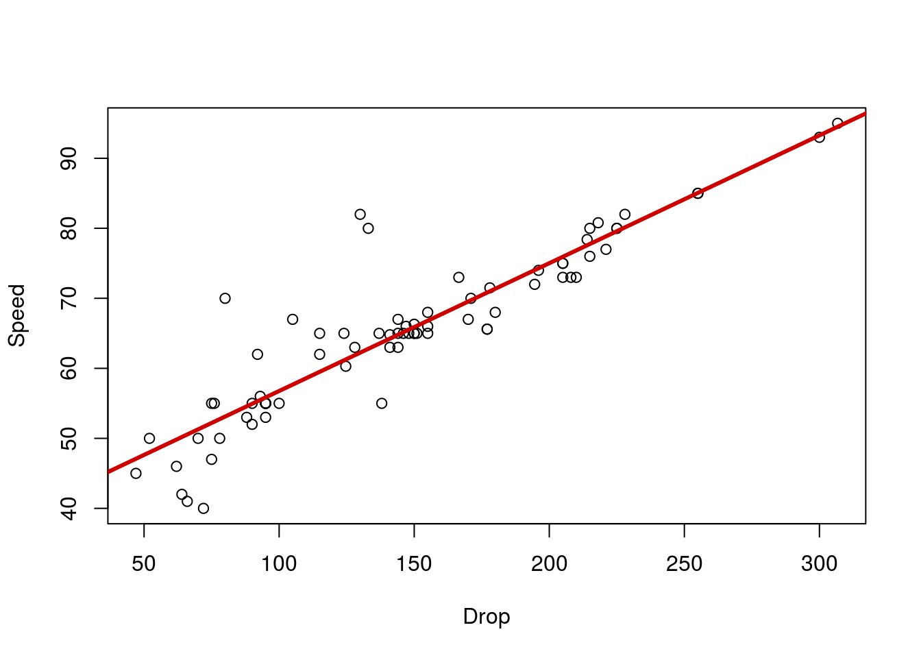
Now use the data in rollerCoaster to make a scatter plot showing the relationship between maximum speed of a roller coaser (column Speed) and the tallest drop (column Drop). Think carefully about the order on the plot. Which variable to you think explains the other?
7.4 Correlation
Now that we have a picture of the relationship between Smoking and Mortality, we may want to ask how strong the relationship is. By this, we mean “how often are the large values of one variable matched with the large values of the other variable (and the small with the small)?” Now, talking about “large” and “small” values of a variable sounds rather familiar – it sounds like z-scores. Let’s convert our smoking data to z-scores and plot the scatter plot again. We can also add lines at the 0’s on each axis to show us where the means are using abline() (recall that the z-score for the mean is by definition 0).
# Plot the z-scores
plot(scale(Mortality) ~ scale(Smoking), data = smokingCancer)
abline(v = 0, h = 0)
It should become immediately obvious that most of the points are either in the top-right or the bottom-left quadrants. this suggests that jobs with above average smoking rates also have above average lung cancer mortality rates (and below average have below average). We can go a step further and ask how tightly that holds true.
The formula to calculate this is messy[*] \[ r = \frac{1}{n-1}\sum{\left(\frac{x - \bar{x}}{s_x}\right)\left(\frac{y - \bar{y}}{s_y}\right)} \] See why I hid this? , but the concept is simple. For each data point, multiply the two z-scores together. When both are above the mean, the product will be a positive value. When both are below the mean, the product will be a positive value (a negative times a negative is positive).
Thus, when we have a pattern like this, the values sum up to be a positive number. If they were in the top-left and bottom-right, the products would add up to a negative number. If they were a mix, the positives and negatives would cancel out and leave a value near 0.
By scaling this sum (again by n - 1), it turns out that it will always be between -1 (for a perfectly straight line from the top-left to bottom-right) and 1 (for a perfectly straight line from the top-right to bottom-left).
Instead of calculating this by hand, we will use the cor() function in R. Here, we will pass in two variables. The variables must be the same length (have the same number of values) because the order needs to match. That is, the first value for our “x” variable needs to be linked to our first “y” value (e.g., be from the same profession). Try it here:
# Test the correlation between Smoking and Mortality
cor(smokingCancer$Smoking,
    smokingCancer$Mortality)
## [1] 0.7162398This value is the correlation coefficient, and is denoted by either an “r” or the Greek letter rho “ρ”.
7.4.1 Try it out
Now, make a plot of the z-scores for the Speed and Drop for the rollerCoaster data and calculate the correlation co-efficient.

## [1] 0.90969547.5 Linear Regression
To close this chapter, we will do formally what many readers probably did in their heads already: draw a line through the relationship.
First, make your plot of the smokingCancer data again (copy your command to generate it here).
# Make a plot of smoking data
plot(Mortality ~ Smoking, data = smokingCancer)
Now, imagine drawing a line through the data. You probably have an intuitive idea of where it goes, and are probably pretty close to accurate. But, how can we draw that line in R, and what does it mean?
For both questions, we will turn to the function lm() which creates a linear model of the data. Note that the arguments are exactly the same as the arguments to our call to plot(). Generally, the easiest way to write this line is to copy the plot() line, and just change plot to lm. Here, we will save the output of lm() because we are going to use it again[*] The output also contains a lot of other information, which we will use later in the semester. .
# Save a line for the plot
smokeLine <- lm(Mortality ~ Smoking,
                data = smokingCancer)
# Display the output
smokeLine
##
## Call:
## lm(formula = Mortality ~ Smoking, data = smokingCancer)
##
## Coefficients:
## (Intercept) Smoking
## -2.885 1.088The output gives us two values of coeffiecients: one for the intercept and one for the effect of Smoking. We can put these into an equation like this:
Mortality = -2.885 + 1.088*Smoking
The coefficient for Smoking gives us the slope of the line. That is, for every 1 unit increase in smoking, this line says that lung cancer mortality will increase by 1.088 units. The intercept just tells us where the line crosses the y axis. Imagine you put a 0 in for Smoking: all you would be left with on the right hand side would be the intercept.
This equation has a more general form of:
Response Variable = Β0 + ExplanatoryVariable*Β1
Where Β0 (that is a captial Greek letter beta; this is pronounced “Beta Nought”) represents the intercept and Β1 (“Beta 1”) is the coefficient for the explanatory variable, which tells us the slope of the line[*] This probably looks familiar to you as the y = mx + b you learned in algebra. Betas with subscripts are used in statistics because we are often going to have more than one explantory variable and using subscripts helps us keep track of things. .
Now, we can add this line to the plot with a function we already know: abline() works to plot the output of lm() as well. Simply give it our saved line with any parameters we want (e.g. color and thickness), and it will do the rest.
# Add a line to the plot
abline(smokeLine,
       col = "purple",
       lwd = 3)
7.5.1 Try it out
For the last try it out of this section, generate a line to explain the relationship between Speed and Drop in the rollerCoaster data. Put it on a plot, show the equation for the line, and explain what it means. Your plot should look something like this
7.6 Warnings and interpretation
There are a lot of caveats and warnings associated with investigating linear relationships between variables. Instead of putting them here in this already long chapter, they will be discussed separately after we have a chance to talk about where data like these come from.
7.7 Output
As with other chapters, click the notebook icon at the top of the screen to compile and HTML output. This will help keep everything together and help you identify any errors in your script.