An introduction to statistics in R
A series of tutorials by Mark Peterson for working in R
Chapter Navigation
- Basics of Data in R
- Plotting and evaluating one categorical variable
- Plotting and evaluating two categorical variables
- Analyzing shape and center of one quantitative variable
- Analyzing the spread of one quantitative variable
- Relationships between quantitative and categorical data
- Relationships between two quantitative variables
- Final Thoughts on linear regression
- A bit off topic - functions, grep, and colors
- Sampling and Loops
- Confidence Intervals
- Bootstrapping
- More on Bootstrapping
- Hypothesis testing and p-values
- Differences in proportions and statistical thresholds
- Hypothesis testing for means
- Final thoughts on hypothesis testing
- Approximating with a distribution model
- Using the normal model in practice
- Approximating for a single proportion
- Null distribution for a single proportion and limitations
- Approximating for a single mean
- CI and hypothesis tests for a single mean
- Approximating a difference in proportions
- Hypothesis test for a difference in proportions
- Difference in means
- Difference in means - Hypothesis testing and paired differences
- Shortcuts
- Testing categorical variables with Chi-sqare
- Testing proportions in groups
- Comparing the means of many groups
- Linear Regression
- Multiple Regression
- Basic Probability
- Random variables
- Conditional Probability
- Bayesian Analysis
Testing proportions in groups
30.1 Load today’s data
Start by loading today’s data. If you need to download the data, you can do so from these links, Save each to your data directory, and you should be set.
- montanaOutlook.csv
- Data downloaded from The Data and Story Library
- Originally from Bureau of Business and Economic Research, University of Montana, May 1992
- Poll of Montana residence on their economic outlook
- Contains some additional information about each respondent
# Set working directory
# Note: copy the path from your old script to match your directories
setwd("~/path/to/class/scripts")

# Load data
outlook <- read.csv("../data/montanaOutlook.csv")
30.2 Background
Last chapter, we covered how to compare counts of a value to an expected distribution using the chi-square statistic. However, as with the other tests we have done, we are often far more interested in comparing two distributions against each other. Today, as promised, we will use M&M’s to illustrate this, combined with some other data.
30.3 Candy!
Let’s start by generating some new count data. Below are the data for counts from both Regular and Mini M&M’s. Instead of providing a file, use one of the below methods to enter the data. This way, if you prefer, you can count M&M’s yourself, and still follow right along with the tutorial. The data below were generated in class from counting a number of “Fun size” packs of Regular M&M’s, and from two separate tubes of Mini M&M’s.
30.3.1 Entering data
Count data like these are usually entered in the form of a matrix, though we could do similar things with data.frames. Here, we use rbind() which binds its arguments into rows (row bind). By naming the two values, we automatically create the row names. In addition, we probably want to set column names so that we can keep track of what colors we are talking about. For that, we use the function colnames(), which (as its name suggests) gives or sets the column names.
# enter data as matrix
mmCounts <- rbind(
  Mini    = c(34, 31, 36, 41, 30, 31),
  Regular = c(35, 19, 39, 37, 20, 26)
  )
# Add descriptive column names
colnames(mmCounts) <-
  c("Blue", "Brown", "Green",
    "Orange", "Red", "Yellow")

# Look at the data
mmCounts| Blue | Brown | Green | Orange | Red | Yellow | |
|---|---|---|---|---|---|---|
| Mini | 34 | 31 | 36 | 41 | 30 | 31 |
| Regular | 35 | 19 | 39 | 37 | 20 | 26 |
If we wanted to enter the data as column names instead, we could use cbind() (for column bind), and set the row names separately with row.names(). You will notice that this looks a lot like the count data we have gotten from the function table() in the past. Because, like from table() all of the values are numbers (with the descriptors in the column and row names), we can do lot’s of things working with the data directly.
30.4 Plotting the data
Let’s start by plotting just one of the types of M&M’s, here the Minis. As we have with other count data, we can use barplot(). Because we only want to use the Minis data, we will (for the moment) limit the data to that row of the mmCounts matrix by using the square-bracket ([ ]) selection.
Note the comma after the row name (it is important). For two-dimensional data, we always select the rows first and the columns second, separated by a comma (we can either use names or numbers for this selection). Not setting one of them selects all (so we are asking for the “Mini” row and all columns).
# Plot the data
barplot(mmCounts["Mini",])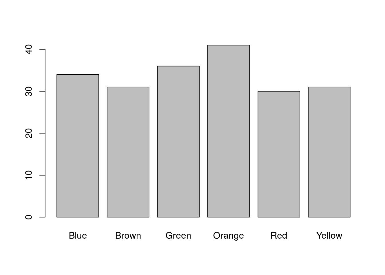
That is a nice plot, but it is a little boring. Note that by naming the columns, R automatically labels the bar plot. We can also use those names to color the bars (only because they match named colors in R). Let’s take a moment to make it a little nicer:
# Plot the data
barplot(mmCounts["Mini",],
        col = colnames(mmCounts))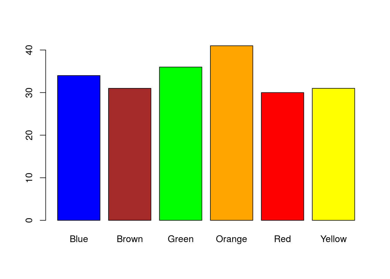
30.4.0.1 Play with colors
Those colors aren’t bad, but are a little garrish. I prefer to pick better colors, and this is a nice place to remind you how to do that. For more information, refer to the chapter on functions, grep, and colors. This is just to play with some colors and would not be necesary. First, we need to add the function we used for exploring colors.
# To look at colors, from previous
showpanel <- function(Colors){
  image(matrix(1:length(Colors), ncol=1),
        col=Colors, xaxt="n", yaxt="n" )
}
I like the blue and orange, and know that I like “green3”" and “red3”“, however, feel free to look for other colors to use there. I will stick to the R builtin colors for now, but will also show you how to use hex colors you find elsewhere below. I am going to focus on picking a better brown and yellow. Staring with brown, I want to look at all of the options.
# Plot all of the browns
showpanel(grep("brown",colors(), value = TRUE))
# Show the names
grep("brown",colors(), value = TRUE)
## [1] "brown" "brown1" "brown2" "brown3" "brown4"
## [6] "rosybrown" "rosybrown1" "rosybrown2" "rosybrown3" "rosybrown4"
## [11] "saddlebrown" "sandybrown"Of those options, I like “saddlebrown” though you may prefer to dig some more. For yellow, we then do the same thing.
# Look for better yellow
showpanel(grep("yellow",colors(), value = TRUE))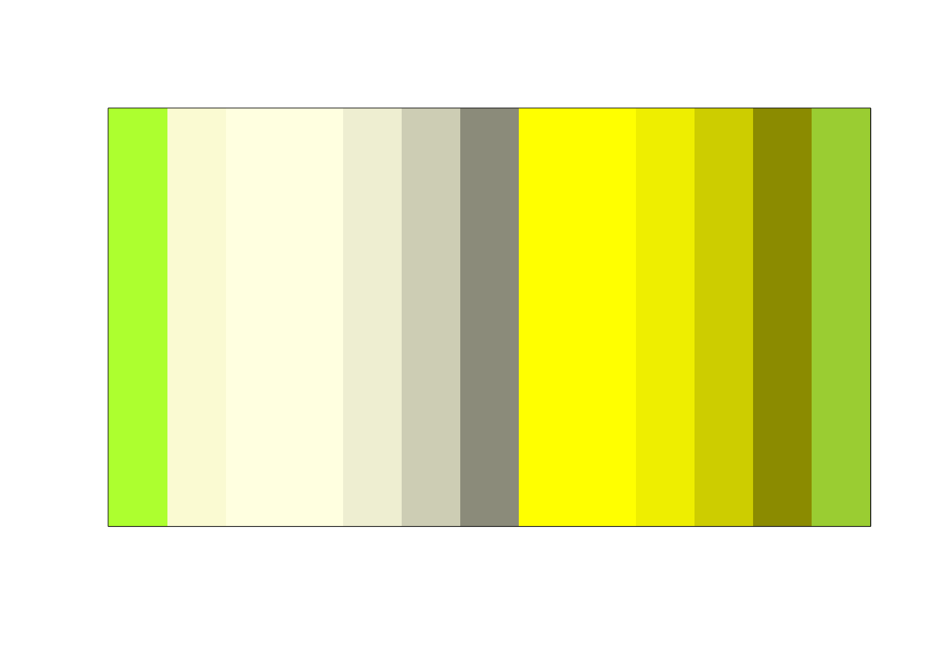
grep("yellow",colors(), value = TRUE)## [1] "greenyellow" "lightgoldenrodyellow" "lightyellow"
## [4] "lightyellow1" "lightyellow2" "lightyellow3"
## [7] "lightyellow4" "yellow" "yellow1"
## [10] "yellow2" "yellow3" "yellow4"
## [13] "yellowgreen"I like “yellow2” best on my screen, though all are a bit ugly. Finally, we set the values of colors to use. Make sure that they match the order of the color names in mmCounts.
# Set some new colors
# based on ones I like and what I found above
myColors <- c("blue", "saddlebrown","green3",
              "orange","red3","yellow2")
Then, we can plot with these colors:
# Plot the data
barplot(mmCounts["Mini",],
        col = myColors,
        main = "Distribution of Mini M&M colors")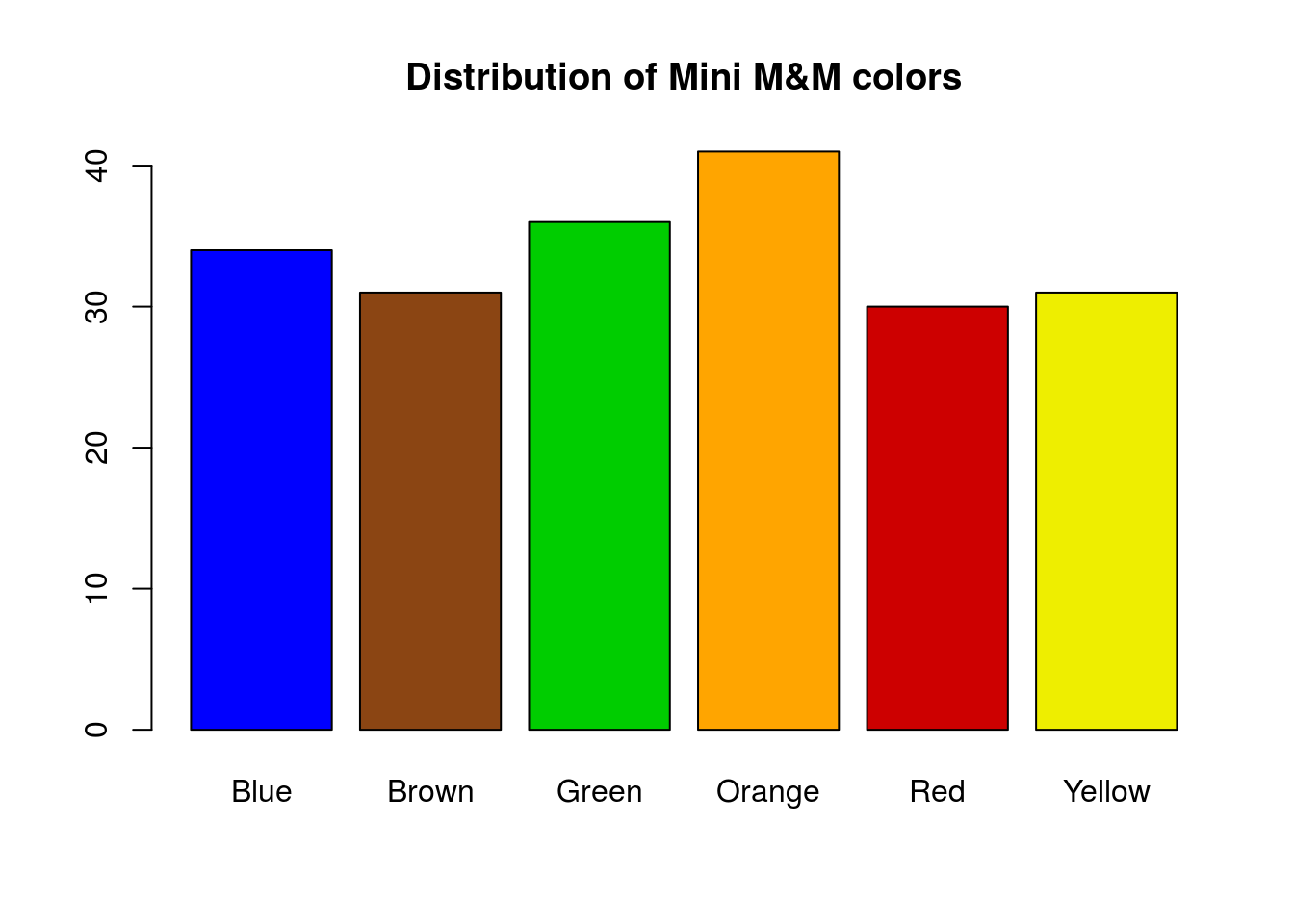
Alternatively, if you found colors that you liked online or elsewhere, you can set them directly from the hex values (or from rgb values). For example, this link pulled up some suitable hex colors. I have them named below for clarity, though what matters is that they are in the same order as our columns.
mmColors <- c(
  Blue   = "#0168A3",
  Brown  = "#492004",
  Green  = "#2FB44A",
  Orange = "#FF6E17",
  Red    = "#C0012E",
  Yellow = "#FFF200"
  )
And they (or colors of your choosing) can then be used in the plot instead:
# Plot the data
barplot(mmCounts["Mini",],
        col = mmColors,
        main = "Distribution of Mini M&M colors")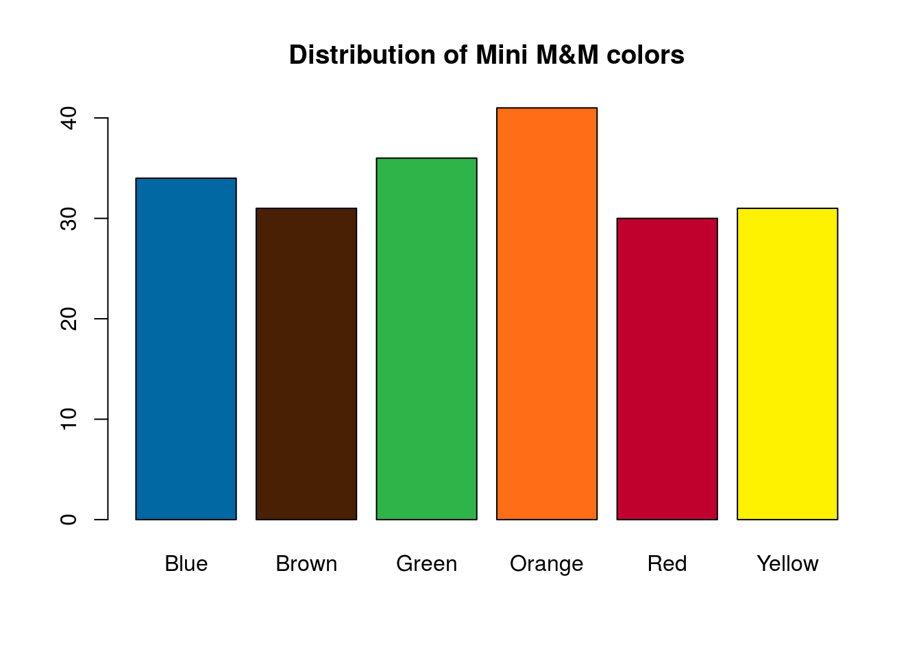
and for the Regular M&M’s:
# Plot the data
barplot(mmCounts["Regular",],
        col = mmColors,
        main = "Distribution of Mini M&M colors")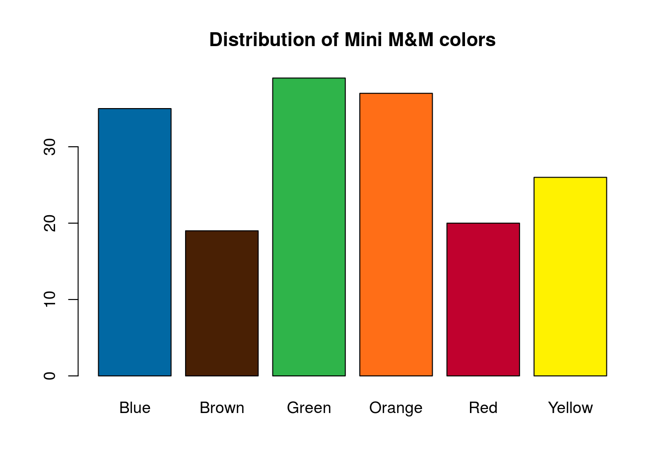
Those two distributions don’t look quite the same. In the next section, we will look at how to compare them directly.
30.5 Compare types of M&M’s
How can we compare the types of M&M’s directly? Can we use the raw counts? What if our sample sizes are different? Let’s make a table with the proportions of each type and color. Here, we again use prop.table(), telling it to use the mmCounts data, use the first margin (the 1) which is rows, and that, for each row, we want to divide each value by the total number of M&M’s in that row (type of M&M).
# Combine the two types
mmProps <- prop.table(mmCounts,1)

# View the table
mmProps| Mini | Regular | |
|---|---|---|
| Blue | 0.167 | 0.199 |
| Brown | 0.153 | 0.108 |
| Green | 0.177 | 0.222 |
| Orange | 0.202 | 0.210 |
| Red | 0.148 | 0.114 |
| Yellow | 0.153 | 0.148 |
Next, let’s plot these. This is very similar to what we did in the chapter on plotting two categorical variables in an earlier. I am skipping straight to a decent (though imperfect) plot, so refer to the tutorial for more information.
# Plot the table
barplot(t(mmProps),
        beside = TRUE,
        col = mmColors)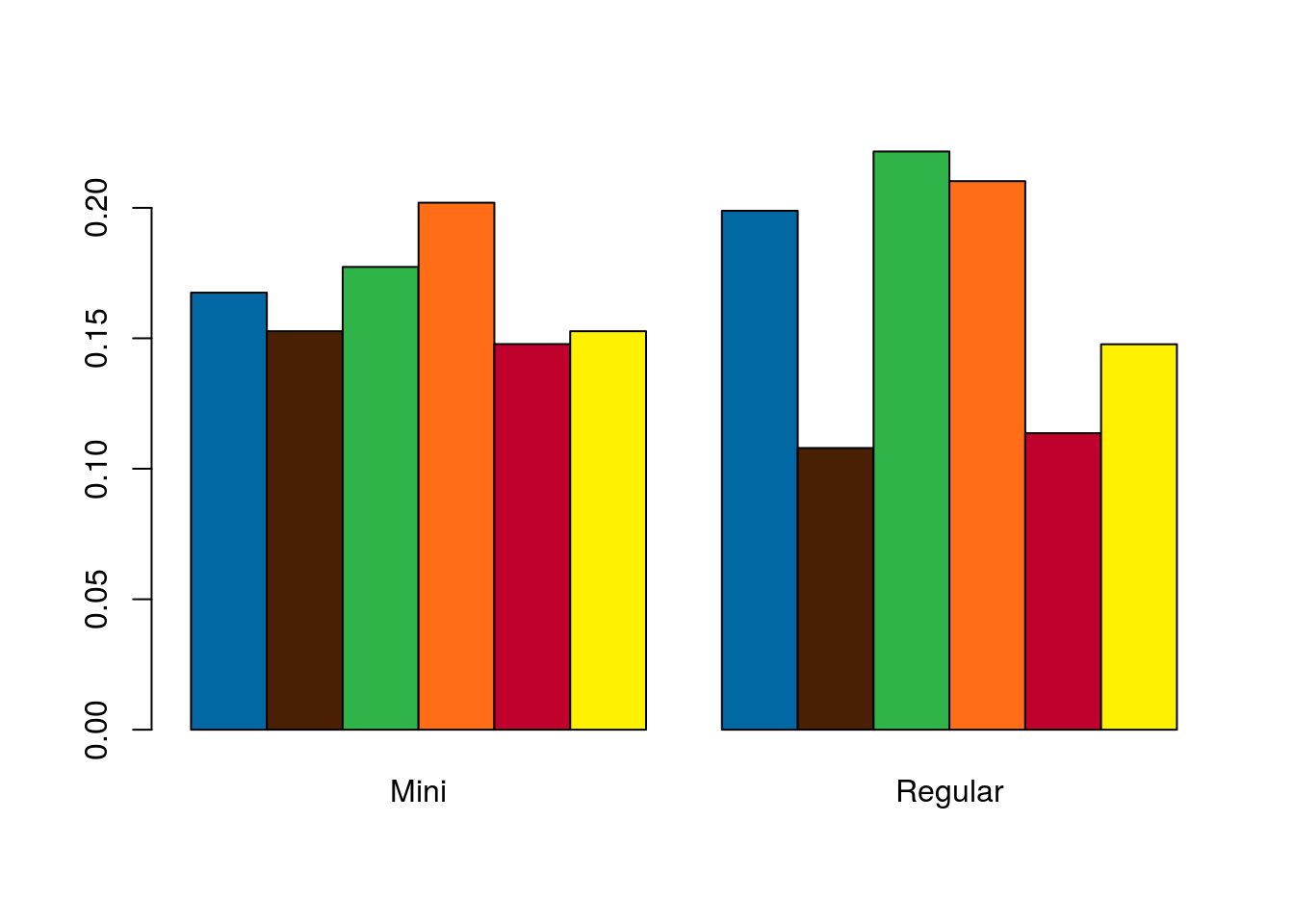
That looks nice and gives us a good general picture of each type of M&M’s distribution. However, except for large differences, it makes it rather difficult to compare the proportion of each color. For two types, this is not completely detrimental, but for more it can become very difficult.
Instead, we would like to flip things around so that we can put the bars for blue M&M’s next to each other.
# Plot the table
barplot(mmProps,
        beside = TRUE,
        col = mmColors)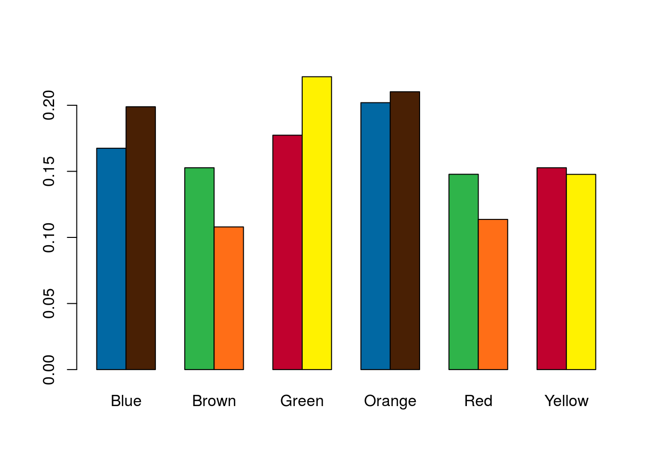
That makes it a lot easier to see which (if any) colors differ between the types. However, the colors no longer make any sense, and it is unclear which bar corresponds to which type. To remedy that, we can take out our colors and add a legend in by setting legend.text = TRUE.
# Plot the table
barplot(mmProps,
        beside = TRUE,
        legend.text = TRUE)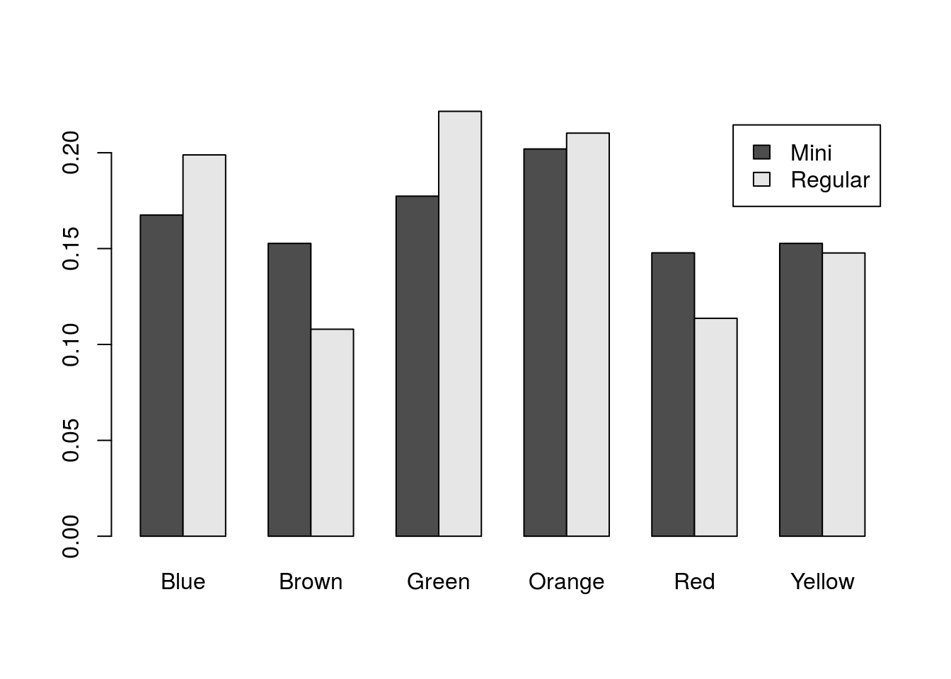
Now we can quickly see which bars belong to which type. However, it does leave us looking a bit bland. We can add some colors, though don’t likely want to color by M&M type. Instead, let’s use two of the mascot’s colors (feel free to pick any colors you would prefer. In addition, since this will be our last plot, we will add axis labels.
# Plot the table
barplot(mmProps,
        beside = TRUE,
        legend.text = TRUE,
        col = c("yellow2", "red3"),
        main = "M&M color distribution by type",
        xlab = "Color",
        ylab = "Proportion")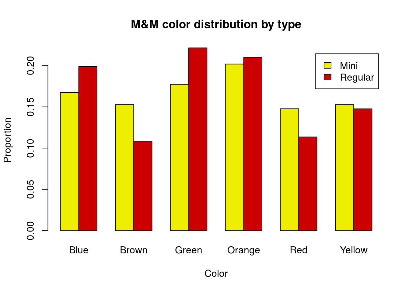
Note, if the legend is in the way, we can suppress it in the barplot and add our own as below.
# Plot the table without legend
barplot(mmProps,
        beside = TRUE,
        legend.text = FALSE,
        col = c("yellow2", "red3"),
        main = "M&M color distribution by type",
        xlab = "Color",
        ylab = "Proportion")
# Add legend in a better spot
legend("topright",
       legend = rownames(mmProps),
       fill = c("yellow2","red3"),
       horiz = TRUE)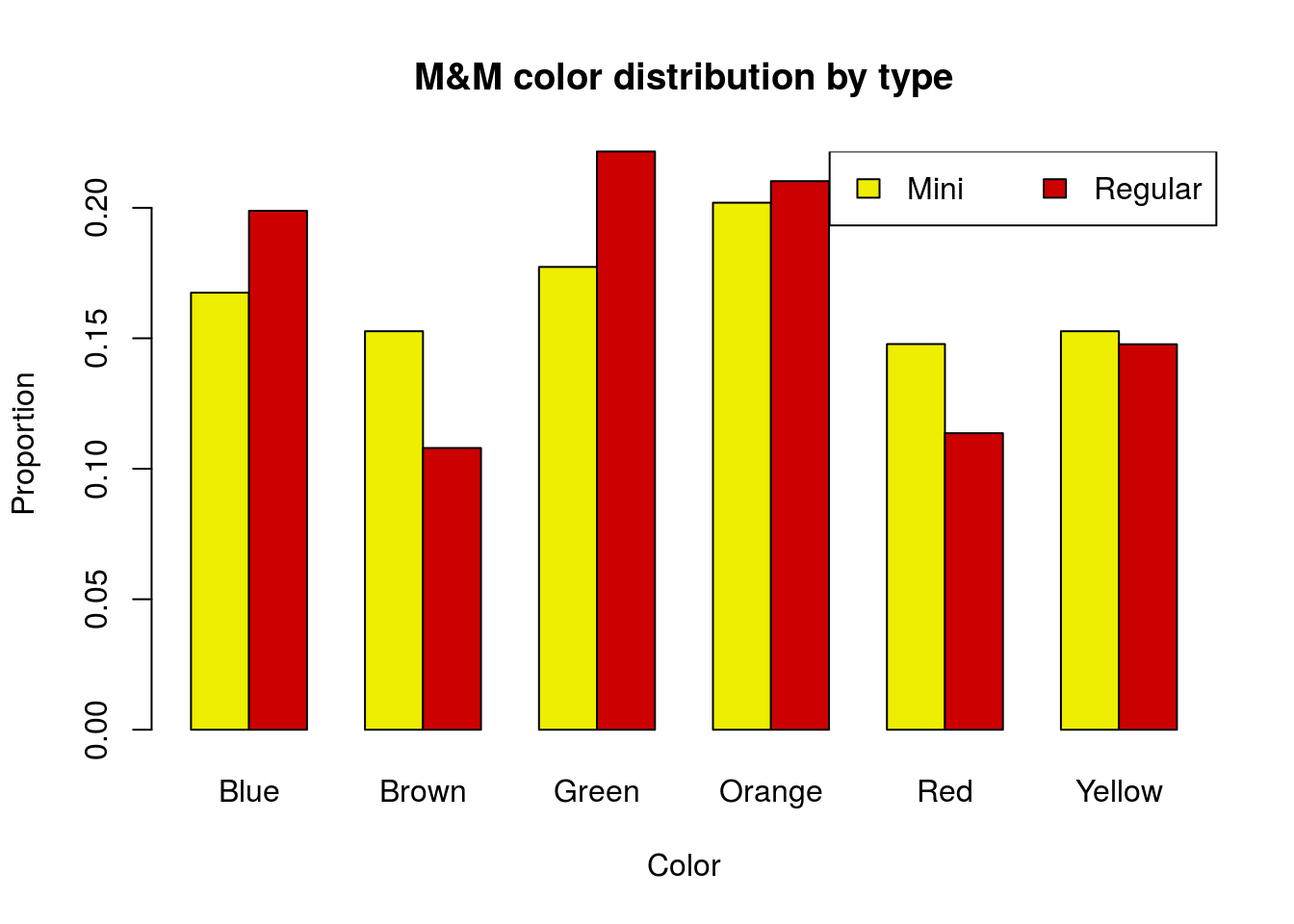
30.6 Chi-square test for association
30.6.1 Expected counts
That plot is helpful, but what if we want to know if the two samples have the same distribution? In statistics, we say that we are looking for an association between two variables. Here, we ask if the distribution of colors is associated with the type of M&M’s. As always, we need to start with our hypotheses, and we want our null to be the “status quo” and as boring as possible.
H0: Color is not associated with M&M type
Ha: Color is associated with M&M type
But, what the heck do we mean by “associated”? Essentially, we want to see if the distribution is different in each category, and we call this an association because it means that what color M&M’s you get is influenced by (associated with) the type of M&M’s you get.
For this, we will again calculate a Chi-square statistic. However, it is not immediately clear what our “Expected” counts should be. Let’s play with this a bit. First, because sample size matters, we need to work with our table with the counts instead of the proportions (the mmCounts matrix).
| Blue | Brown | Green | Orange | Red | Yellow | |
|---|---|---|---|---|---|---|
| Mini | 34 | 31 | 36 | 41 | 30 | 31 |
| Regular | 35 | 19 | 39 | 37 | 20 | 26 |
Next, we want to see what the distribution would look like if we thought that everything came from the same pool. This could mean either the distribution of colors if all M&M’s are the same or the distribution of M&M types if we ignore colors. This means that we need to add the marginal totals with addmargins().
# Display with marginal totals
addmargins(mmCounts)| Blue | Brown | Green | Orange | Red | Yellow | Sum | |
|---|---|---|---|---|---|---|---|
| Mini | 34 | 31 | 36 | 41 | 30 | 31 | 203 |
| Regular | 35 | 19 | 39 | 37 | 20 | 26 | 176 |
| Sum | 69 | 50 | 75 | 78 | 50 | 57 | 379 |
This tells us how many we would get if pooled, but we can go a step further. Let’s see what proportions (of the total, not the rows) are in each “cell” (position) of the table. We will again use addmargins() because one of the things we are interested in is how what proportion of the total are each color and each type. (Round is used to make the printing a bit prettier.)
# Display proportions
round(addmargins( mmCounts/ sum(mmCounts)),3)| Blue | Brown | Green | Orange | Red | Yellow | Sum | |
|---|---|---|---|---|---|---|---|
| Mini | 0.090 | 0.082 | 0.095 | 0.108 | 0.079 | 0.082 | 0.536 |
| Regular | 0.092 | 0.050 | 0.103 | 0.098 | 0.053 | 0.069 | 0.464 |
| Sum | 0.182 | 0.132 | 0.198 | 0.206 | 0.132 | 0.150 | 1.000 |
So, this tells us that 53.6% of the M&M’s are Mini M&M’s and that 18.2% are Blue. Now, if there is no relationship between color and type, that means we should expect that 18.2% of the Mini M&M’s are Blue (and that 18.2% percent of Regular M&M’s are blue too). For this, our expected counts could be expressed as the proportion of all M&M’s that are blue times the number of Mini M&M’s (and times the number of Regular M&M’s for that expected count). In mathematical notation, that is:
\[ \text{Expected} = \frac{\text{Column Total}}{\text{Overall Total}}*\text{Row Total} \]
We could also say that we expect 53.6% of the Blue M&M’s to be Mini M&M’s (and the same for each color). In mathematical notation, that is:
\[ \text{Expected} = \frac{\text{Row Total}}{\text{Overall Total}}*\text{Column Total} \]
These are equivalent (check the algebra), and can be written as:
\[ \text{Expected} = \frac{\text{Row Total}*\text{Column Total}}{\text{Overall Total}} \]
By making these calculations for each cell, we can figure out our Expected counts for each Color-Type cell. So, we could go through, do each of these calculations by hand[*] To do this, we would have lots of options in R, including loops, apply() and (most likely) crossprod(). , then calclate the chi-sqaure statistic from these. However, as usual we have a shortcut, and in this case, it is worth more to us to jump straight to it.
30.6.2 Running chi-square test for association
In R, that shortcut is the same as the shortcut for the chi-square test for goodness of fit: the chisq.test() function. Here, instead of a vector and (optional) expected proportion, we pass in our table and let R calculate all of those expected values.
# Run chisq.test for association
chisq.test(mmCounts)
##
## Pearson's Chi-squared test
##
## data: mmCounts
## X-squared = 3.7538, df = 5, p-value = 0.5854Here, the p-value tells us how likely we are to get data that are this different from our expected values.
Incidentally, assuming that the p-value doesn’t allow us to reject, now is a good point to remind you again that not rejecting the null does not mean that the null is true, only that we don’t have enough evidence to reject it. In this case, the Mars Company has said that thier target distributions are different for the two types of M&M’s. The differences are modest, but real. They are small enough that we are unlikely to detect them in a sample this small, but that doesn’t mean they don’t exist (though it may mean that they don’t matter).
30.6.3 What does the difference mean?
This tests tells us if the variables are associated, but it doesn’t tell us where those differences are. For that, we need to compare the observed and expected counts. Does that mean we need to calculate the expected after all? Didn’t R have to do that? Can’t we use that somehow?
In short: yes, we can use what R calculated, we just need to know how to ask for it. Recall that, in R, everything can be saved as a variable, that includes the output of a test. Let’s try it here:
# Save the output of the test
myChiSq <- chisq.test(mmCounts)

# Display it
myChiSq
##
## Pearson's Chi-squared test
##
## data: mmCounts
## X-squared = 3.7538, df = 5, p-value = 0.5854Note that nothing (except potential warnings) is displayed when you first run it. Instead, it saves it so you can look at it later. But, it does even more than that. We have used the function names() before to look at the column headers, but the function is even more powerful than that. It will tell us the “names” of any variable that has them. For example, we used it above to access the names of the colors in the count vectors for plotting. Here, we can use it to see what is in the test.
# See what the test has
names(myChiSq)
## [1] "statistic" "parameter" "p.value" "method" "data.name" "observed"
## [7] "expected" "residuals" "stdres"This has a lot of useful information that we may want for other things. Each can be accessed using the $ operator, just like for columns of a data.frame. We will be using these values for several other tests in the remainder of this semester. Let’s look at a few. As with other tests (including t.test() and prop.test()), chisq.test() stores the test statistic, in this case the chi-squared vale (and the t-statistic for a t-test).
# Display the test stat
myChiSq$statistic
## X-squared
## 3.753786It also makes it easy to access the p-value:
# Display the p-value
myChiSq$p.value
## [1] 0.5853806Note that this gives us the chi-square stat and p-value from the test (this can be useful, for example if I want to include in this text that the p-value was exactly 0.5853806 even though I wrote this before the class collected the data on Mini M&M’s).
But, the two we are interested in at the moment are the observed and expected values. Let’s look at them.
# Check observed
myChiSq$observed| Blue | Brown | Green | Orange | Red | Yellow | |
|---|---|---|---|---|---|---|
| Mini | 34 | 31 | 36 | 41 | 30 | 31 |
| Regular | 35 | 19 | 39 | 37 | 20 | 26 |
Note that this is just our input data.
# Check expected
myChiSq$expected| Blue | Brown | Green | Orange | Red | Yellow | |
|---|---|---|---|---|---|---|
| Mini | 36.96 | 26.78 | 40.17 | 41.78 | 26.78 | 30.53 |
| Regular | 32.04 | 23.22 | 34.83 | 36.22 | 23.22 | 26.47 |
Here, we have the expected counts, which R calculated as we described above. We can see that these match the row/column totals from our inputs as we expected (note, round is used to make the display prettier):
# Add margins to each
addmargins(myChiSq$observed)
round(addmargins(myChiSq$expected), 2)| Blue | Brown | Green | Orange | Red | Yellow | Sum | |
|---|---|---|---|---|---|---|---|
| Mini | 34 | 31 | 36 | 41 | 30 | 31 | 203 |
| Regular | 35 | 19 | 39 | 37 | 20 | 26 | 176 |
| Sum | 69 | 50 | 75 | 78 | 50 | 57 | 379 |
| Blue | Brown | Green | Orange | Red | Yellow | Sum | |
|---|---|---|---|---|---|---|---|
| Mini | 36.96 | 26.78 | 40.17 | 41.78 | 26.78 | 30.53 | 203 |
| Regular | 32.04 | 23.22 | 34.83 | 36.22 | 23.22 | 26.47 | 176 |
| Sum | 69.00 | 50.00 | 75.00 | 78.00 | 50.00 | 57.00 | 379 |
To see the differences, which will tell us in what way our values are different than the expected values, we can just subtract them
# Display diff from expected
round(myChiSq$observed - myChiSq$expected , 2)| Blue | Brown | Green | Orange | Red | Yellow | |
|---|---|---|---|---|---|---|
| Mini | -2.96 | 4.22 | -4.17 | -0.78 | 3.22 | 0.47 |
| Regular | 2.96 | -4.22 | 4.17 | 0.78 | -3.22 | -0.47 |
This tells us that there were, for example 2.96 fewer Blue Mini M&M’s than we expected and 3.22 fewer Regular Red M&M’s than we expected[*] I said magically, based on class data I didn’t have, see if you can figure out how, if you are interested .
30.6.4 Try it out
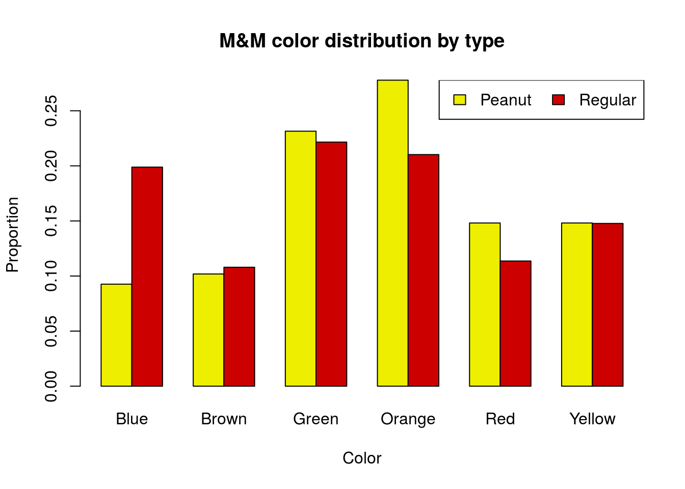
An earlier class collected data on Peanut M&M’s instead of Mini M&M’s. Their data (along with the Regular M&M data) are below. Graph the distributions for both groups in a way that allows direct comparison. Then, run and interpret a chi-square test.
# Enter new data
peanutMMdata <- rbind(
  Peanut  = c(10, 11, 25, 30, 16, 16),
  Regular = c(35, 19, 39, 37, 20, 26)
  )
colnames(peanutMMdata) <-
  c("Blue", "Brown", "Green",
    "Orange", "Red", "Yellow")
You should get a p-value of 0.24 and a plot like this:
30.7 Compare to randomization
Here we are working in a bit of a reverse order. For most of this guide, we have started with randomization, then moved on to the shortcut. For Chi-Squared tests of association, however, the easiest way to calculate our test statistic (the \(\chi^2\) statistic), is built into the shortcut for the test.
However, it is still important that we see the randomization results. This is incredibly helpful to understand what the Chi-Square test is actually telling us.
So, let’s first consider what it is we are randomizing. Our null hypothesis is that there is no association between the two variables. In this case, that means that Type of M&M is independent of the color. Said another way, we could imagine that it were like we were randomly drawing a type of M&M and a color of M&M separately.
In R, we can accomplish this the same way we did for other tests between two variables (such as groups for proportions or means, or for correlations). We will randomize each of the variables then make a table of the counts.
For Chi-Square testing, it is generally appropriate to do the sampling without replacement. This keeps the row and column totals consistent between samples, which simplifies things a bit when working with the chi-square distribution. However, there are, as always, philisophical debates among statisticians about whether or not this is actually appropriate given that we don’t need to use the Chi-Square distribution as an approximation if we are re-sampling.
To get our data into a usable format for that, we will use rep() to create a vector that has the correct number of each type and and a separate vector that has the correct number of each color. Our types are stored as the row names, so we will use row.names() to access them. The colors are column names, so we will use colnames() to access them. For each, we will use apply() to calculate the row or column totals. Note that, because I am being lazy efficient, the vectors will not be in an order that can recreate our mmCounts data.
# Create type vector
types <- rep(row.names(mmCounts),
             apply(mmCounts,1,sum))

# Create color vector
color <- rep(colnames(mmCounts),
             apply(mmCounts,2,sum))

# View each to make sure they are right
table(types)
table(color)| Mini | Regular | |
|---|---|---|
| types | 203 | 176 |
| Blue | Brown | Green | Orange | Red | Yellow | |
|---|---|---|---|---|---|---|
| color | 69 | 50 | 75 | 78 | 50 | 57 |
As always, we start by doing one re-sample, just to make sure it is correct. The sample() function, when given just a vector, will randomize the order of that vector. Here, we will only randomize the types (because that is sufficient to make the two be not associate), but it wouldn’t hurt anything to also randomize the colors.
# Randomize the types and make a table
randTable <- table(sample(types), color)
randTable| Blue | Brown | Green | Orange | Red | Yellow | |
|---|---|---|---|---|---|---|
| Mini | 39 | 24 | 40 | 40 | 27 | 33 |
| Regular | 30 | 26 | 35 | 38 | 23 | 24 |
We can then run chisq.test() on the table
# Run chi-squared test
chisq.test(randTable)
##
## Pearson's Chi-squared test
##
## data: randTable
## X-squared = 1.4635, df = 5, p-value = 0.9172We don’t expect an association, but what we are interested in is the test statistic (the chi-square value). To access it, we can just add $statistic after the call to chisq.test() without saving the result (saving it is fine too).
# See the statistic
chisq.test(randTable)$statistic
## X-squared
## 1.463526Now, for our randomization, we want to see what chi-squared values happen by chance. So, we will loop through many times, store the chi-squared values, then compare them to our observed data. Note that, because we have worked out the details above, I am reducing the loop to a single command:
#Initialize variable
nullChiSq <- numeric()

# Run loop
for(i in 1:13586){
  nullChiSq[i] <- chisq.test(table(sample(types),
                                   color))$statistic
}

# Visualize result
hist(nullChiSq)

# Add line for our observed data
abline(v = myChiSq$statistic,
       col = "red 3",
       lwd = 3)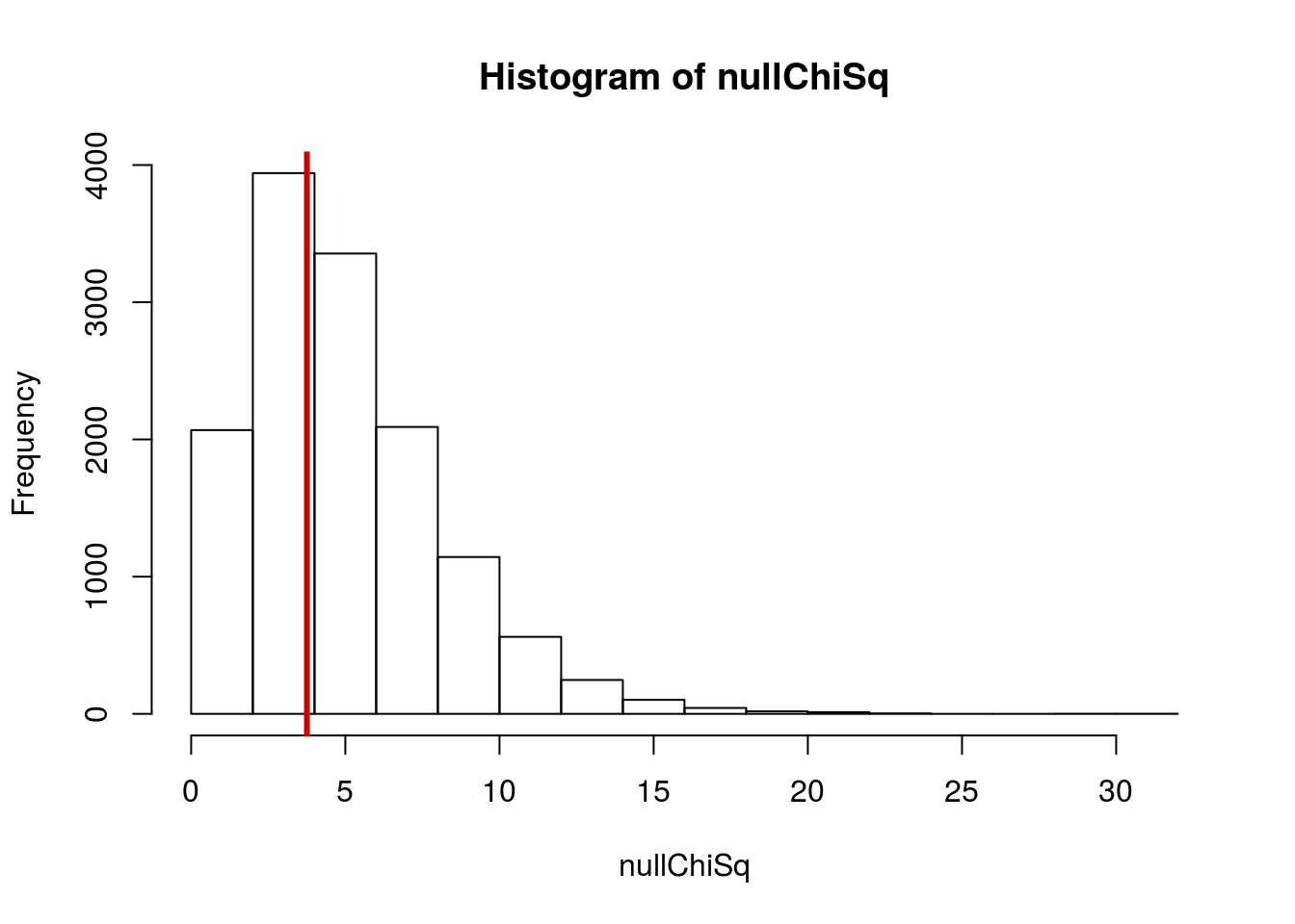
Then, we can see how often the null distribution gives resulsts as extreme as, or more extreme than, our observed data (that is the p-value):
# Prop more extreme
mean(nullChiSq >= myChiSq$statistic)
## [1] 0.5923745Which should be very similar to the value from the chi-squared test:
myChiSq##
## Pearson's Chi-squared test
##
## data: mmCounts
## X-squared = 3.7538, df = 5, p-value = 0.5854All that the chi-squared test is doing is estimating the distribution from this randomization – just like t.test() and prop.test().
30.7.1 Try it out
Make a sampling distribution for the Peanut M&M data and compare it to the results from chisq.test(). They should give very similar values.
30.8 Working from data in the computer
Sometimes we will want to use data that we already have loaded. The process is the same, we just need to get it into a usable format first. Let’s do it for the Montana Economic Outlook data (outlook).
When we talked about two-sample porportion tests, we always had to limit ourselves to just two groups (e.g. “concious” vs. “not concious”) when testing the distribution of a variable, even if there were more groups (e.g. “not concious” meant either “coma” or “deep stupor”). Now, we can do a more complete analysis.
To explore this, we can look to see if the different areas of Montana have different political affiliations. Here, our H0 is the most boring thing we can think of: that areas all have the same distribution of political affiliations (and that each affiliation has the same distribution of areas). The Ha is that they have different distributions. Put more formally:
H0: Political affiliation and area are not associated
Ha: Political affiliation and area are associated
First, let’s make a table to see what the data look like.
# Make table
polArea <- table(outlook$POL,
                 outlook$AREA)

# View it
polArea| Northeastern Montana | Southeastern Montana | Western Montana | |
|---|---|---|---|
| Democrat | 15 | 30 | 39 |
| Independent | 12 | 16 | 12 |
| Republican | 30 | 31 | 17 |
As with all of our data, it is generally a good idea to plot it before going any further. This gives us a good overview of what the data contain, and can make it easier for us to make good decisions about it. It doesn’t make much of a difference which order we plot the data in for this broad analysis. However, if you are presenting data, make sure that the order makes sense for the question you are asking.
# plot the data
barplot(polArea,
        beside = TRUE,
        legend.text = TRUE
        )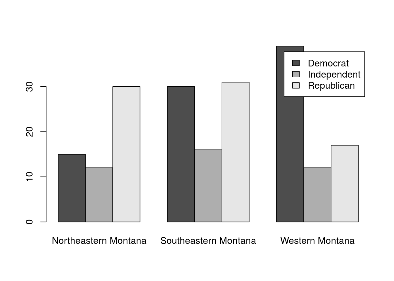
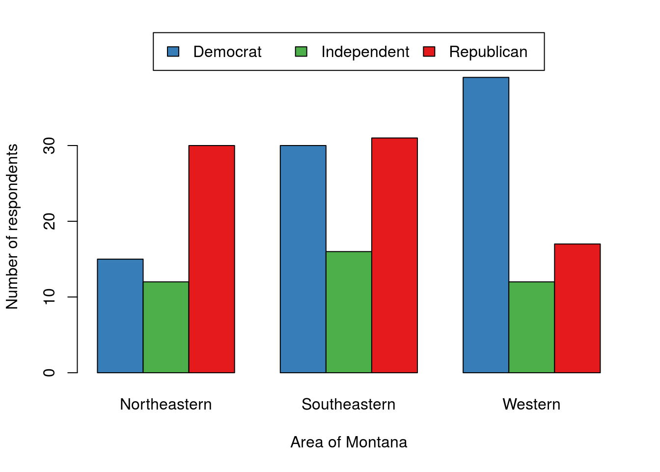
For a quick view of the data, that is sufficient, even if it is a bit ugly. For a presentation, you would want to make sure to move the legend and possibly clean up the axis labels. The below is an example of what it could look like, but don’t worry about it for this example or this class; it is just here to show you what is possible with a few extra steps[*] I used names.arg = gsub(" Montana","",colnames(polArea)) to remove the ‘Montana’ from each, and the args.legend = argument to barplot() to move the legend. If you want the full code, email me and I will happily share it. .
This does seem to show a few clear differences. However, some things, particularly the frequency of independent voters, will be easier to assess if we plot the proportions within each area instead of the raw counts. For this, we could use apply(), however, the function prop.table() works a little bit cleaner for this purpose. The prop.table() function takes a matrix or table (like the data we have) and a margin (like apply(), 1 is for rows, 2 is for columns) and calculates the proportions.
# plot the proportions
barplot(prop.table(polArea,2),
        beside = TRUE,
        legend.text = TRUE
        )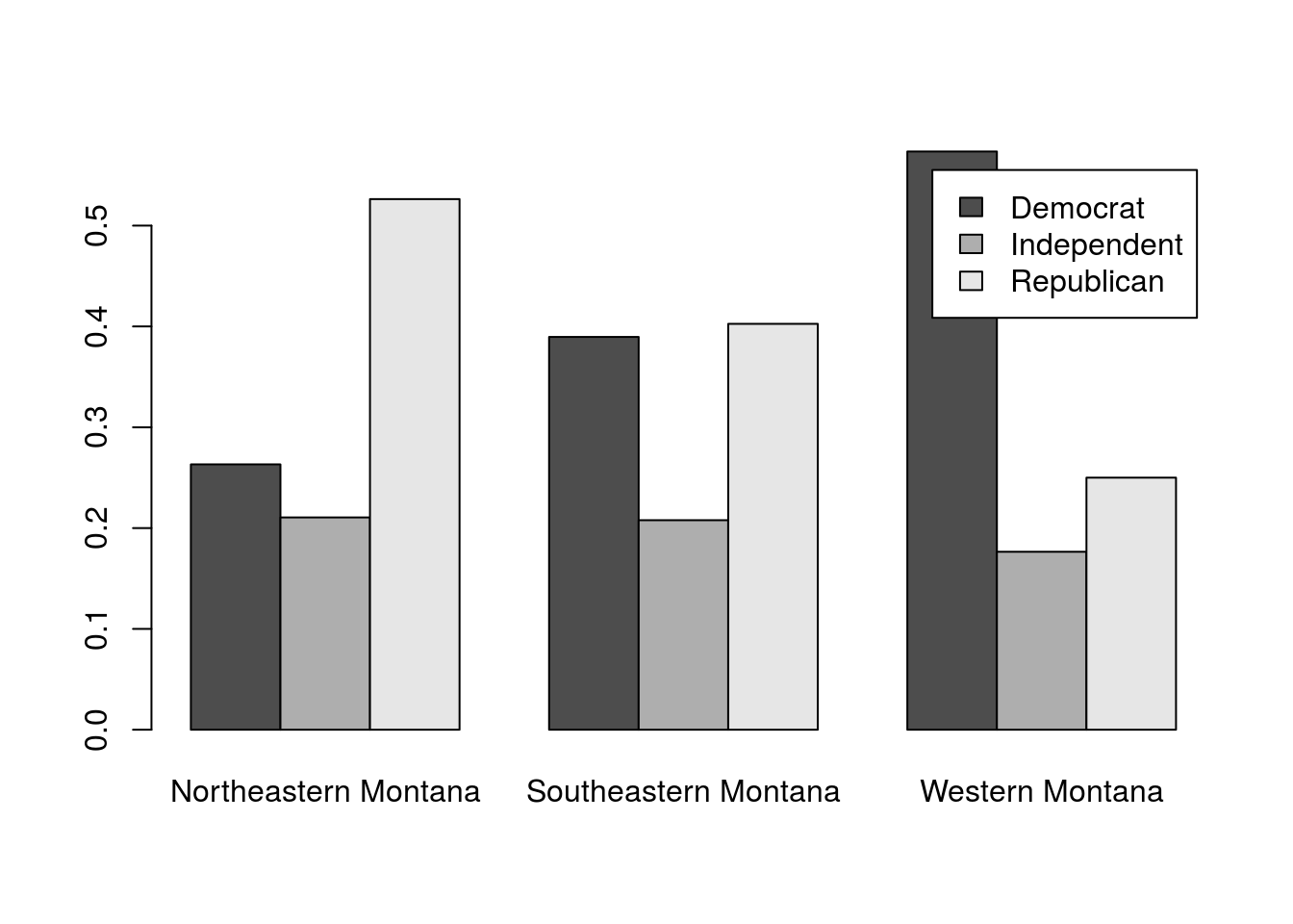
This seems to make it more clear. In this poll from 1992, the proportion of Indpendents was pretty consistent across Montana. However, there were a lot more Democrats than Republicans in Western Montana, a pretty even balance in Southeastern Montana, and more Republicans than Democrats in Northeastern Montana.
But, we want to know if that is different than we would expect by chance if the area was not associated with political affiliation. Let’s test it, again using chi-square. As above, we will save the output so that we can look at the results more closely
# Test for an association
polAreaTest <- chisq.test(polArea)

# View it
polAreaTest
##
## Pearson's Chi-squared test
##
## data: polArea
## X-squared = 13.849, df = 4, p-value = 0.007793So, if we were using a threshold of 0.05, we would reject the null of no association. This suggests that the areas might really have different distributions of political affiliations. But, we still want to see where those diffences are:
# Find differences
round(polAreaTest$observed - polAreaTest$expected, 2)| Northeastern Montana | Southeastern Montana | Western Montana | |
|---|---|---|---|
| Democrat | -8.70 | -2.02 | 10.72 |
| Independent | 0.71 | 0.75 | -1.47 |
| Republican | 7.99 | 1.27 | -9.26 |
As expected from our plot above, the big deviations from an expected distribution with no association lies in the difference in the number of Republicans and Democrats.
30.8.1 Try it out
Is there an association between an individuals perceived change in financial status (column FIN) and zir perception of the direction the state is going in is (column STAT)? Assume that the outlook data are a representative sample of all Montana residents, and run an appropriate test. Don’t forget to make a plot.
You should get a p-value of 0.00975 and a plot that looks something like this (colors, labels etc. are all up to you). No, you do not need to worry abouot all of those tweaks, but you are welcome to try them if you are up for a challenge. I will share my code with anyone that sends me their plot and the code they used to get something similar.
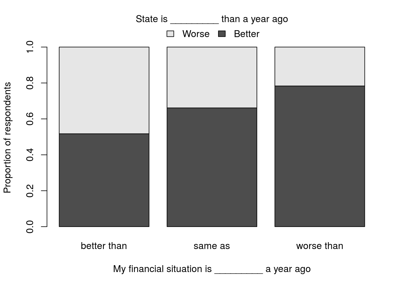
Note that for 2 (and only for 2) groups, I like the use of stacked bars. It visually allows a comparison of either those that said “better” or “worse,” and it wastes less space. However, with 3 (or more) groups, it becomes too hard as the middle groups no longer line up well for easy comparisons (unless the group orders are meaningful, such as a five point ranking of how the state is doing).