An introduction to statistics in R
A series of tutorials by Mark Peterson for working in R
Chapter Navigation
- Basics of Data in R
- Plotting and evaluating one categorical variable
- Plotting and evaluating two categorical variables
- Analyzing shape and center of one quantitative variable
- Analyzing the spread of one quantitative variable
- Relationships between quantitative and categorical data
- Relationships between two quantitative variables
- Final Thoughts on linear regression
- A bit off topic - functions, grep, and colors
- Sampling and Loops
- Confidence Intervals
- Bootstrapping
- More on Bootstrapping
- Hypothesis testing and p-values
- Differences in proportions and statistical thresholds
- Hypothesis testing for means
- Final thoughts on hypothesis testing
- Approximating with a distribution model
- Using the normal model in practice
- Approximating for a single proportion
- Null distribution for a single proportion and limitations
- Approximating for a single mean
- CI and hypothesis tests for a single mean
- Approximating a difference in proportions
- Hypothesis test for a difference in proportions
- Difference in means
- Difference in means - Hypothesis testing and paired differences
- Shortcuts
- Testing categorical variables with Chi-sqare
- Testing proportions in groups
- Comparing the means of many groups
- Linear Regression
- Multiple Regression
- Basic Probability
- Random variables
- Conditional Probability
- Bayesian Analysis
Approximating for a single mean
22.1 Load today’s data
- NFLcombineData.csv
- Data on the Height, Weight, and position type of all 4299 players that participated in the NFL combine during the collection period
- icuAdmissions.csv
- Data on patients admitted to the ICU.
# Set working directory
# Note: copy the path from your old script to match your directories
setwd("~/path/to/class/scripts")

# Load data
nflCombine    <- read.csv("../data/NFLcombineData.csv")
icu           <- read.csv("../data/icuAdmissions.csv")
22.2 Applying the CLT to means
We have explored a good deal about the Central Limit Theorem with regard to proportions. Here, we will start to apply it to means as well. Before we do, recall our definition:
Central limit theorem
For sufficiently large sample sizes, the means (or proportions) from multiple samples will be approximately normally distributed and centered at the value of the population parameter (e.g. mean or proportion).
As we have seen in previous chapters, this means that we can often use the normal model to describe a sampling distribution. To illustrate this point, let’s take a population (All NFL combine participants), and look at the results if we were to randomly draw many samples.
# intialize
sampleMean <- numeric()

# Take many samples, compare
for(i in 1:12345){
  sampleMean[i] <- mean(sample(nflCombine$Weight,40))
}

# Visualize
hist(sampleMean)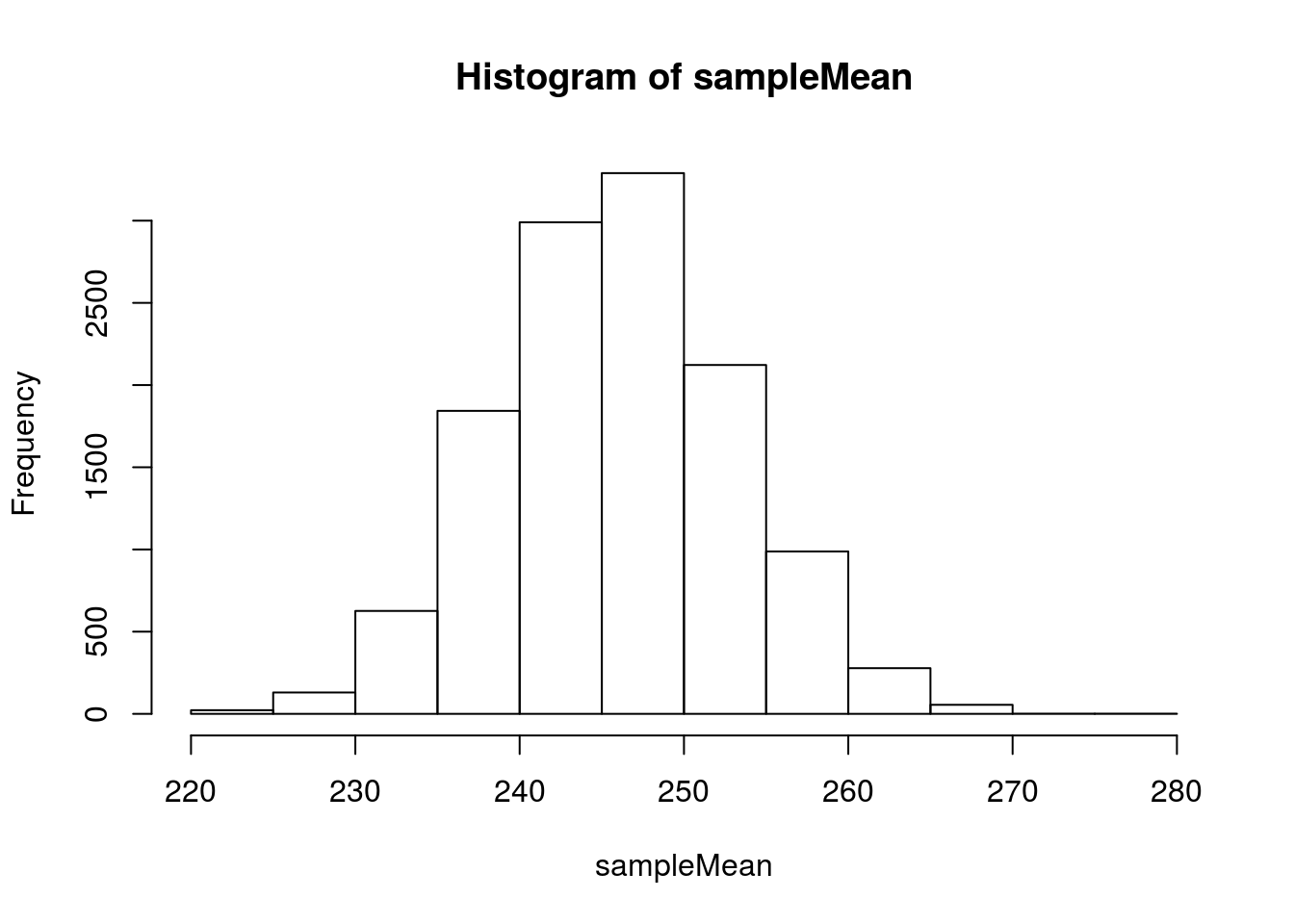
As we saw for proportions, we can model this with a normal model.
# Visualize with the normal model
hist(sampleMean,
     freq = FALSE,
     breaks = 20)

# Add curve
curve(dnorm(x,
            mean = mean(sampleMean),
            sd   =   sd(sampleMean)),
      col = "purple", lwd = 3,
      add= TRUE,
      xpd = TRUE) # xpd allows line outside the plot area
We can see why a normal model might help, but we would like a shortcut, like what we had for proportions. Well, let’s compare the distribution of our samples to the actual data and see what is there.
First, we compare the means:
# Calculate mean
mean(sampleMean)
## [1] 245.8828# Actual mean
mean(nflCombine$Weight)## [1] 245.8232And we can see that our sampling distribution (distribution of sample means) is centered at the same place as the population. However, we also need a shortcut to the standard deviation. Can we just use the standard deviation of the population?
# Calculate sd
sd(sampleMean)
## [1] 7.221109# Population sd
sd(nflCombine$Weight)## [1] 45.69181Not even close! We need some sort of correction. As we have seen in previous chapters, the standard error gets smaller as the sample size gets larger. So, we can try dividing by the sample size:
# Try a correction
sd(nflCombine$Weight) / 40
## [1] 1.142295That is now way too small. It turns out that, much like for proportions, we need to use the square root of the sample size for our scaling. We simply divide the population standard deviation by the square root of the sample size. However, its derivation is outside the scope of this class.
# Calculate sd
sd(sampleMean)
## [1] 7.221109# Population sd
sd(nflCombine$Weight) / sqrt(40)## [1] 7.224509Which is now nearly identical to what we calculated from our sampling distribution. We can see this work by adding a curve to the sampling distribution based on just information from the population.
# Visualize with the normal model
hist(sampleMean,freq = FALSE,
     breaks = 30)

# Add curve
curve(dnorm(x,
            mean = mean(nflCombine$Weight),
            sd   =   sd(nflCombine$Weight) / sqrt(40) ),
      col = "purple", lwd=3,
      add= TRUE,
      xpd = TRUE) # xpd allows line outside the plot area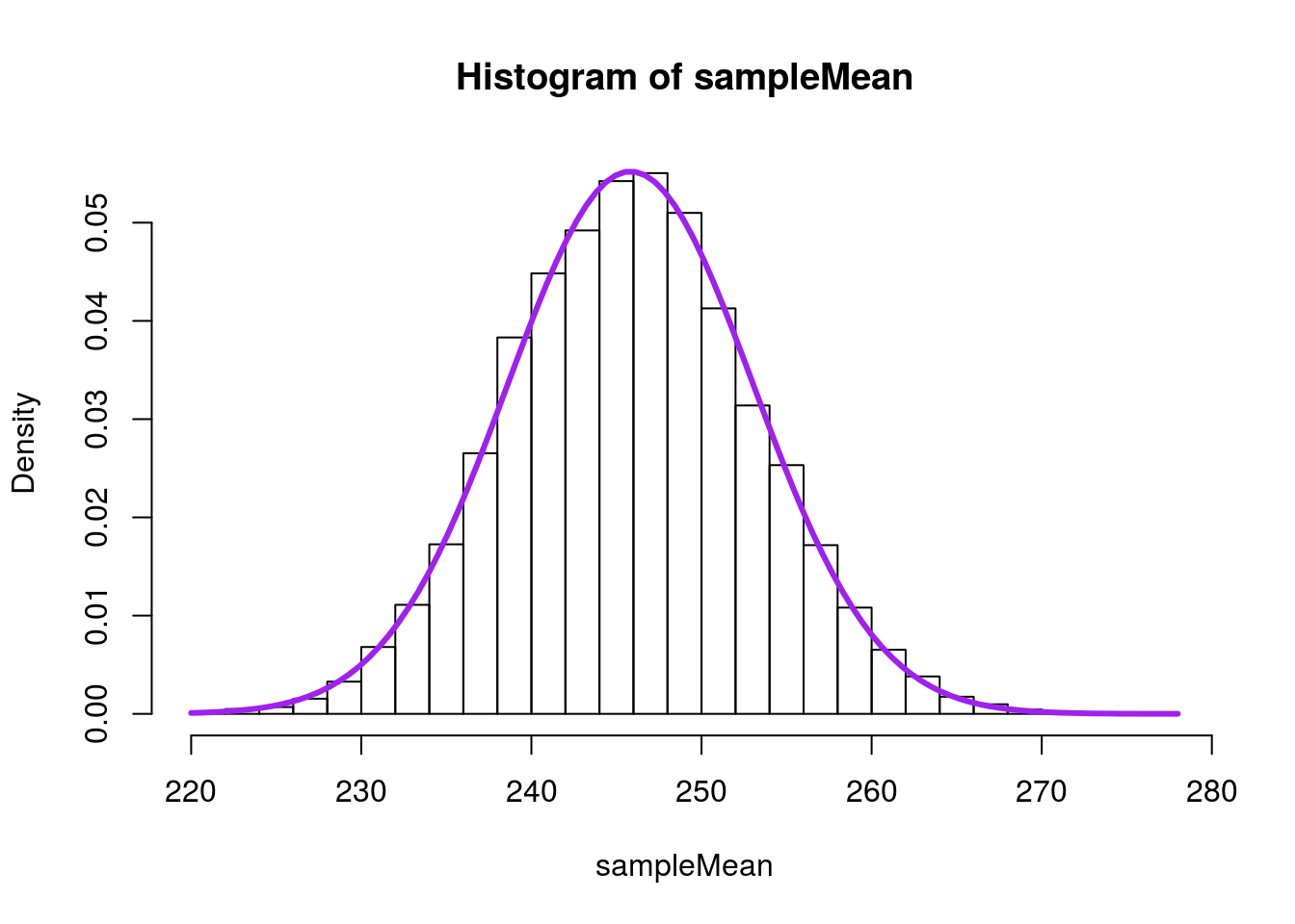
In mathematical notation, this equation to estimate the standard error is:
\[ SE = \frac{\sigma}{\sqrt{n}} \]
Where n is the sample size and σ is the population standard deviation.
22.3 A problem
This is a great shortcut, and incredibly useful. However, when we collect only a sample, we do not have the populations standard deviation. We can use the sample standard deviation as an estimate, but it turns out that a sample often leads us to underestimates the width of the distribution by just a little bit[*] This is because in a small sample, the values we draw strongly influence the mean, which has the result of pulling the mean close to the values, which in turn makes the standard deviation smaller. .
Such an underestimate can lead us to over-confidence in our predictions. So, instead of using the normal distribution, we use the t-distribution, which was developed to brew better beer.
The shape of the t-distribution changes based on the sample size, but is very similar to the normal distribution, especially with large sample sizes. The metric that matters is the “degrees of freedom” which we calculate as 1 less than the sample size. R has built-in functions for the t-distribution (pt(), qt(), etc.), which are very similar to their normal counterparts, but require us to specify the degrees of freedom with the argument df =.
As the degrees of freedom increases, the t-distribution gets closer and closer to the normal distribution. Thus, the t-distribution is most important with small sample sizes (like testing four samples of barley to make sure it is good for the beer you are brewing), but is still appropriate even for larger sample sizes.
One additional note, these functions assume that all data have been converted to z-scores (mean of 0, sd of 1). That is, we can not set the mean or standard deviation like in the functions for the normal distribution. So, to use them in practice, we need to convert our values to and from z-scores, similar to when we used the z* values. Luckily, R provides a fast approach in the function scale(), which returns the z-score transformed data for any vector by default (other scaling is possible).
22.3.1 An example
From our nfl samples, we can calculate the standard deviation of each sample as well when we take the mean. This will allow us to see what the calculated standard deviation would look like. This example is the equivalent of weighing only 4 NFL combine participants. The original development used a similar procedure, generating 750 samples of the heights of 4 criminals (Student, 1908) in order to develop the t-distribution.
# intialize
sampleMean <- numeric()
sampleSD <- numeric()

# Take many samples, compare
for(i in 1:12345){
  tempSample <- sample(nflCombine$Weight,4)
  sampleMean[i] <- mean(tempSample)
  sampleSD[i] <-     sd(tempSample)
}

# Visualize
hist(sampleSD)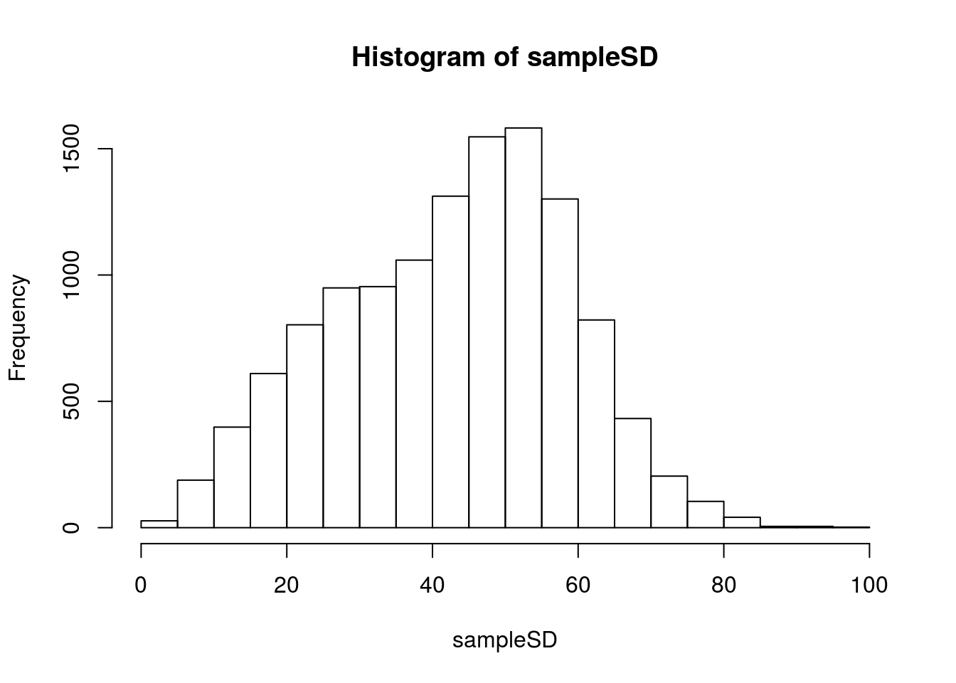
Recall that we are trying to get to the \(\frac{s}{\sqrt{n}}\) so, let’s plot it as that.
# Visualize
hist(sampleSD / sqrt(4))

# Add line for where we should be
abline(v = sd(nflCombine$Weight) / sqrt(4),
       col = "red", lwd = 3)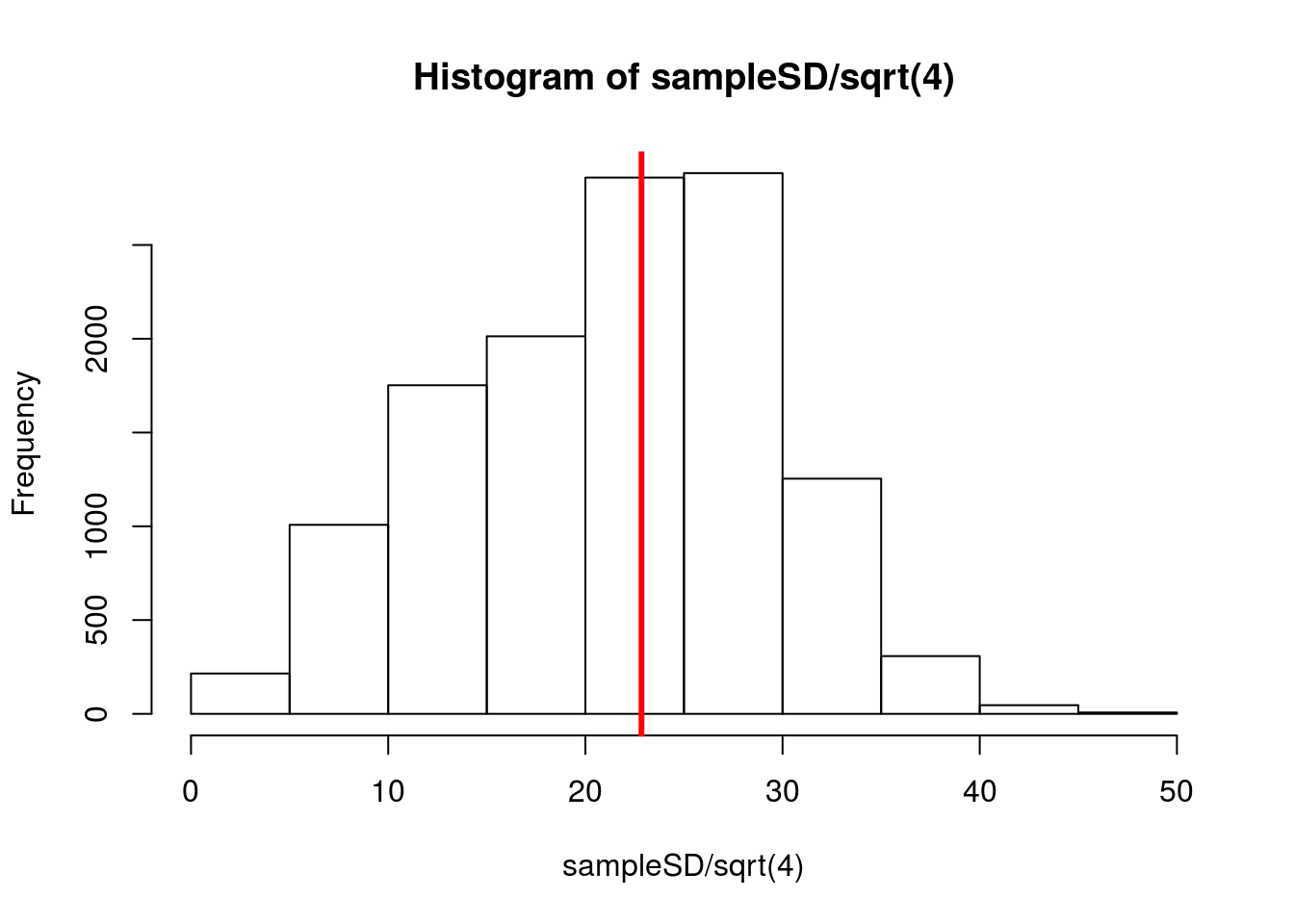
Notice that a lot of the calculated values, which we would use in our approximation, fall well below where they should be. If we used these in the normal model, we would be misled to think we had a more accurate model than we actually did. We can see this if we add a curve to our sample means using 15 as our SD (a value that is not going to be very uncommon).
# Visualize with the normal model
hist(sampleMean,
     freq = FALSE,
     breaks = 30)

# Add normal curve
curve(dnorm(x,
            mean = mean(nflCombine$Weight),
            sd   =   15),
      col = "purple", lwd=3,
      add= TRUE,
      xpd = TRUE) # xpd allows line outside the plot area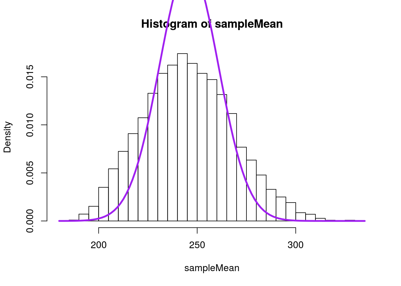
Notice how much steeper the curve is. The tails are far too narrow, and would likely mislead us about where to expect our data. If, instead, we use a t-distrution, we can account for some of this. Here, I am essentially calculating a z-score using 15 as the value of the standard error, which we would be likely to do if using this approximation on real data. In our example, the t-distribution has 3 degrees of freedom (sample size of 4 minus 1 equals 3).
# Visualize with the normal model
hist( (sampleMean-mean(sampleMean) ) / 15,
      xlab = "Scaled sample means",
      main = "",
      freq = FALSE,
      breaks = 30)

# Add the normal curve again
# Note that we are using the standard normal by default
curve(dnorm(x),
      col = "purple", lwd=3,
      add= TRUE,
      xpd = TRUE) # xpd allows line outside the plot area

# Add curve for the t-distribution
curve(dt(x,df = 3),
      col = "red3", lwd=3,
      add= TRUE,
      xpd = TRUE) # xpd allows line outside the plot area

# Add legend
legend("topright",
       legend = c("Normal","T"),
       col = c("purple","red3"),
       lwd = 3,
       title = "Distributions")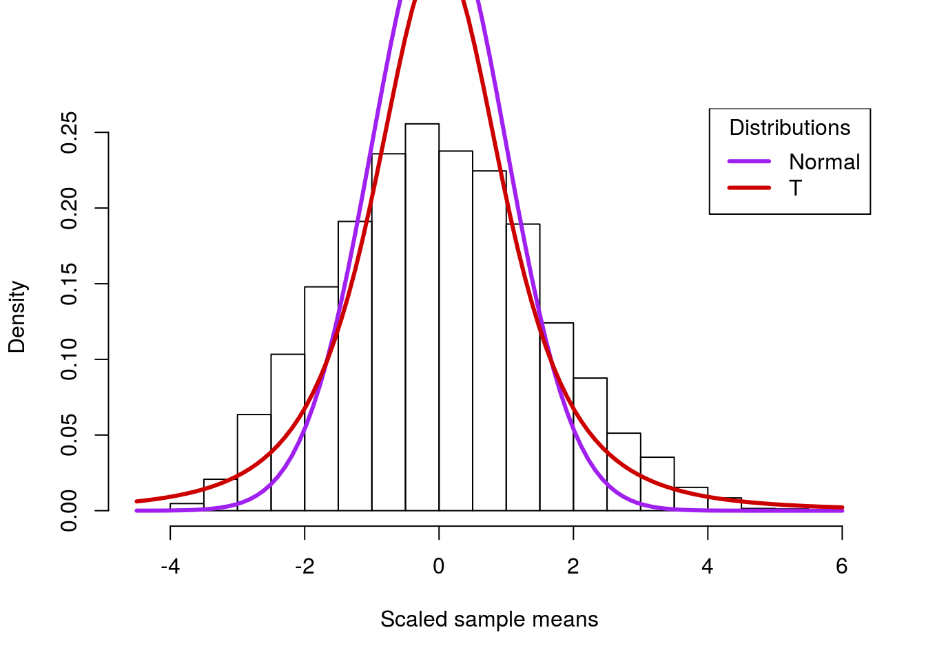
Note that the t-distribution is still not perfect, and we wouldn’t expect it to be. However, because of the “fatter” tails, it gets a lot closer to the actual distribution. This is important to avoid misleading ourselves in cases when we don’t have access to the full population – which is nearly all the time.
22.4 Using the t-distribution in practice
Ordinarily, we won’t have a full population to compare to. For example, what if we want to know the mean blood pressure of a coma patient in the ICU?
# Save the data for easy access:
comaSyst <- icu$Systolic[icu$Consciousness == "coma"]

# Plot the values
hist(comaSyst)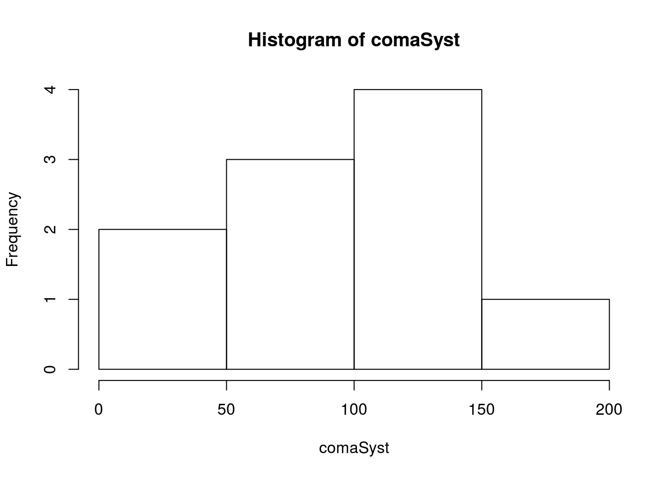
Note that there are very few values (only 10), so we want to be careful trusting the calculated statistics too much, particularly the standard deviation. First, let’s calculate a bootstrap distribution so that we can compare against it.
# Initialize
bootMean <- numeric()

# Loop
for(i in 1:12345){
  bootMean[i] <- mean(sample(comaSyst,replace = TRUE))
}

# Visualize
hist(bootMean)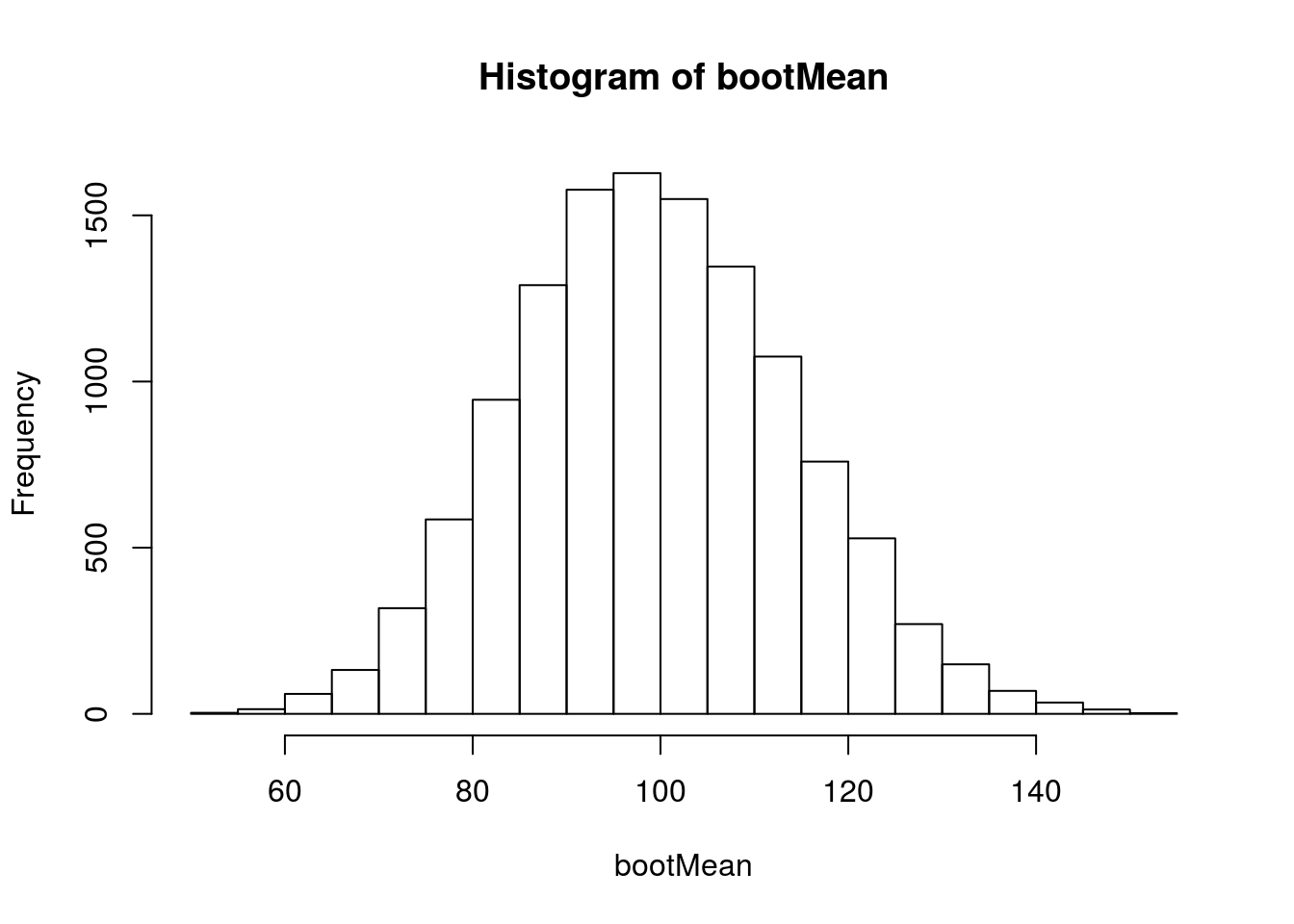
This looks more or less normal, but we know that we probably shouldn’t trust the normal distribution. So, we will convert the values to z-scores with scale(), and plot each distribution against it.
# Visaulize
hist(scale(bootMean),
     breaks = 20,
     freq = FALSE)

# Add curve
curve(dt(x,
         df = length(comaSyst) - 1),
      col = "red3", lwd=3,
      add= TRUE, xpd = TRUE) # xpd allows outside the plot area

# Comare to the normal
curve(dnorm(x),
      col = "purple", lwd=3,
      add= TRUE, xpd = TRUE) # xpd allows outside the plot area

# Add legend -- copied directly from above
legend("topright",
       legend = c("Normal","T"),
       col = c("purple","red3"),
       lwd = 3,
       title = "Distributions")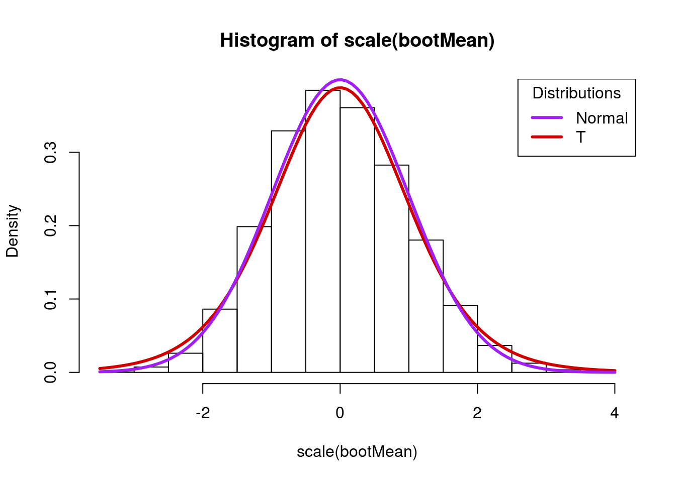
Note here that the tails in the normal distribution (the purple line) are much smaller. If our estimate of the standard deviation is off, this may give us too much confidence in our estimates. The t-distribution, on the other hand, is a little bit wider, and captures more of the sample values. Importantly, its tails are a little bit too “fat” – this ensures that they account for some of the error in the estimation of the standard deviation.
From this t-distrubution, we can calculate confidence intervals and p-values from this distribution, and that is where we will be going starting in the next chapter.
22.5 Working with the t-distribution
We have gotten accustomed to working with the normal distribution, which allowed us to set the mean and standard deviation (sd) directly. Now, we are going to work with the t-distribution, which assumes that data are scaled to the z-distribution (mean of 0, sd of 1) before being passed.
This means that we need to scale the data and be able to reverse that scaling reliably. Fortunately, in R this is fairly straight forward, and will allow us to do a few additional things (like easily calculate the sample size needed to make certain statements).
22.5.1 Finding probabilities
First, let’s look at how the t-distribution functions work on the standard scale, assuming 5 degrees of freedom (df). Ordinarily, we would calculate df from the data, but this will allow us to visualize easily. Starting with pt(), we can see that it returns the area under the curve to the left of a point. We will use the curve function to visualize each calculation.
# Draw a standard t-distribution
curve(dt(x, df = 5),-3,3)

# Add line to show where we are looking
abline(v = -1, col = "red",lwd =3)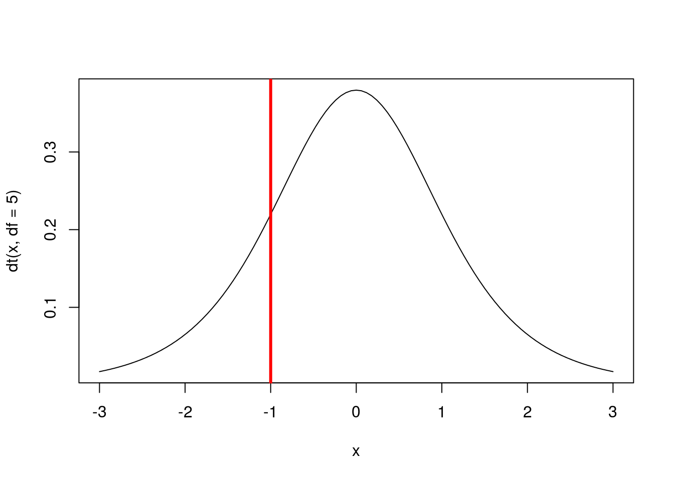
# Calculate the area to the left of -1
pt(-1, df = 5)
## [1] 0.1816087Here, we can see that about 18% of the area under the curve is to the left of -1. To reverse this, we can find the area to the right of 1.
# Draw a standard t-distribution
curve(dt(x, df = 5),-3,3)

# Add line to show where we are looking
abline(v = 1, col = "blue",lwd =3)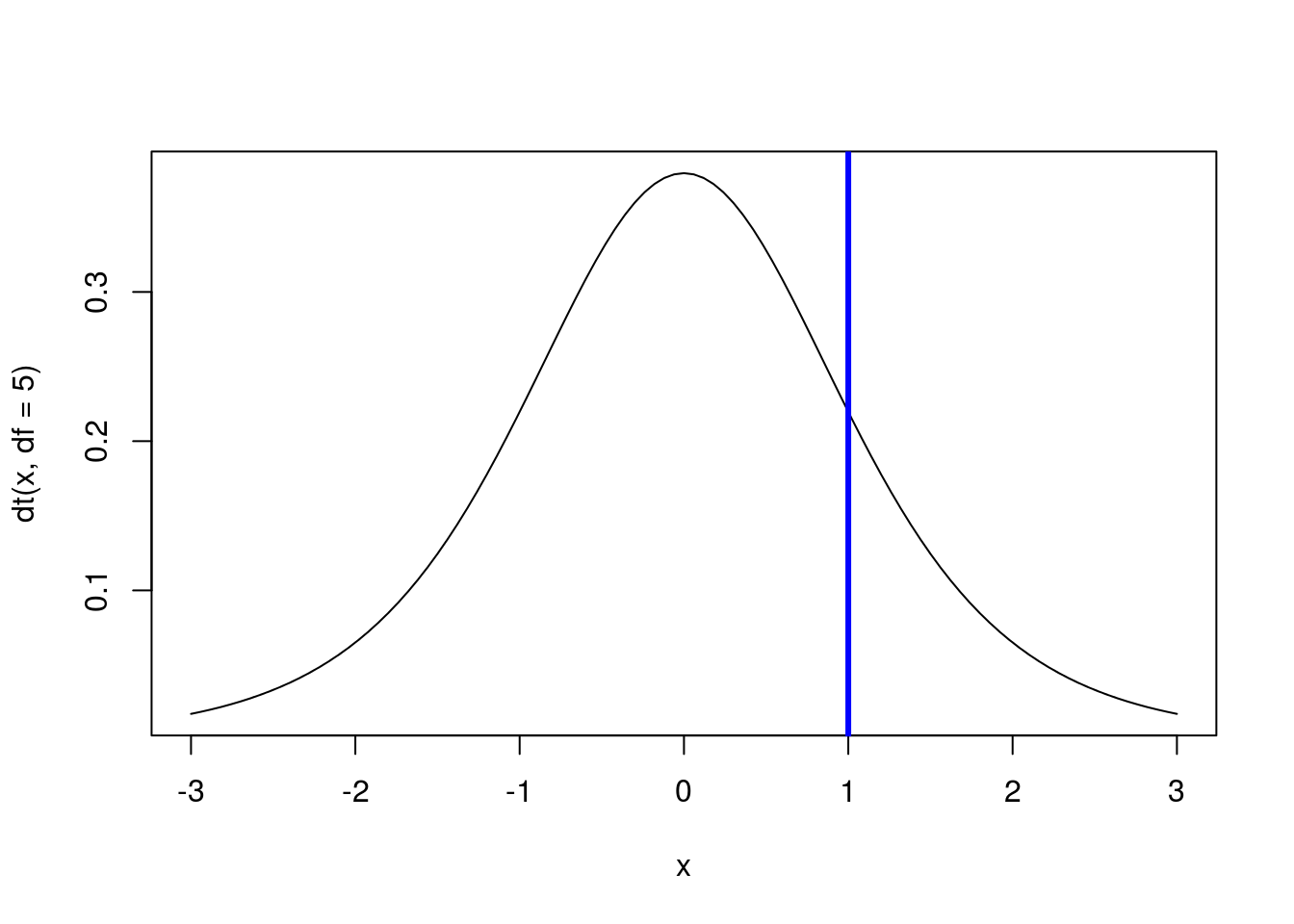
# Calculate the area to the right of 1
#   Note, this is 1 - area to the left
1 - pt(1, df = 5)
## [1] 0.1816087Because the distribution is symmetrical, we get the same value as what is to the left of -1. Recall from our use of the normal model that we can find the area between two points by finding the area to the left of the furthest point and subtracting the area to the left of the leftmost point. For example, to find the area between -1 and 1, we can use:
# Draw a standard t-distribution
curve(dt(x, df = 5),-3,3)

# Add line to show where we are looking
abline(v = c(-1,1), col = "blue",lwd =3)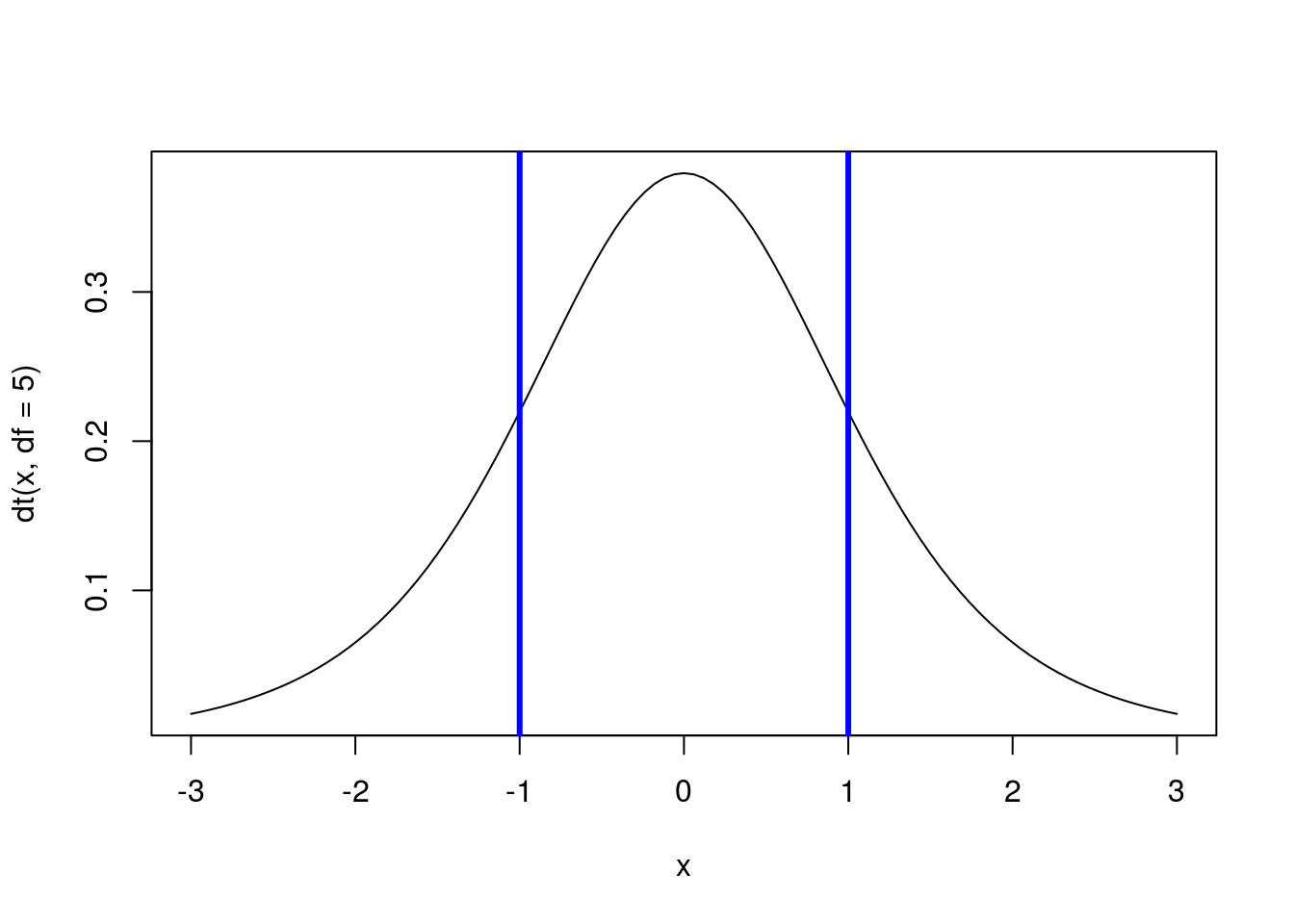
# Calculate the area between -1 and 1
pt(1, df = 5) - pt(-1, df = 5)
## [1] 0.6367825Note that this value is also what is left after we subtract out both tails.
22.5.1.1 Try it out
In a standard t-distribution with 8 degrees of freedom (i.e. the sample size was nine):
- What is the area to the left of 1?
- What is the area to the right of 2?
- What is the area between 1 and 2?
22.5.2 Finding quantiles
Next, we can find cut off points on the distribution, just like we did when using quantile() and qnorm(). Continuing our focus on the standard (z) distribution with 5 degrees of freedom, we can find the point that has 90% of values to it’s left with:
# Calculate the point with 90% of value to left
qt(0.9, df = 5)
## [1] 1.475884# Draw a standard t-distribution
curve(dt(x, df = 5),
from = -3,
to = 3)
# Add line to show where we are looking
abline(v = qt(0.9, df = 5),
col = "blue",lwd =3)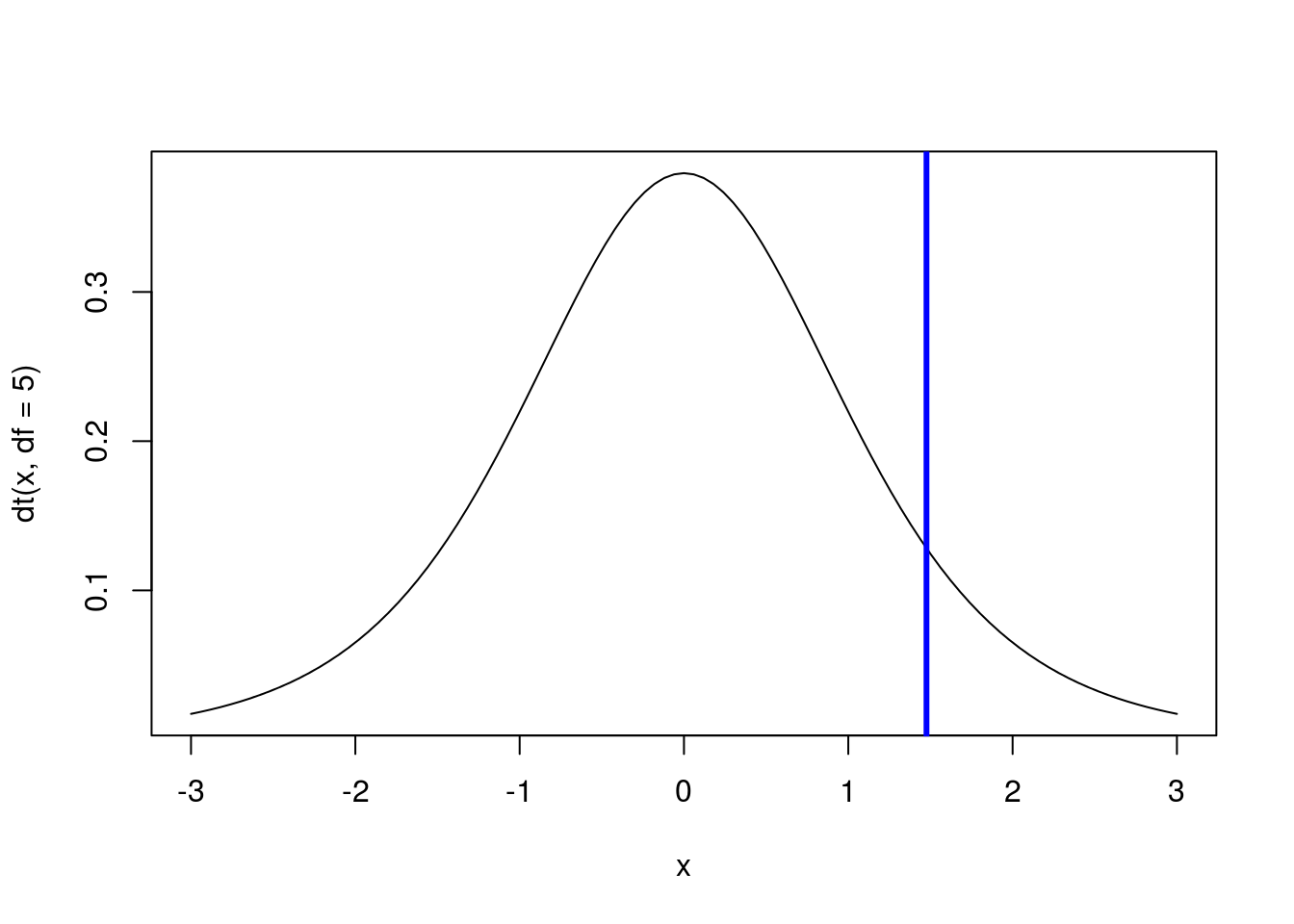
To find the point with 90% of values to it’s right, we just substract 0.9 from 1 before finding the quantile (because if 90% of values are to the right, 10% are to the left).
# Calculate the point with 90% of value to left
qt(1 - 0.9, df = 5)
## [1] -1.475884# Draw a standard t-distribution
curve(dt(x, df = 5),-3,3)
# Add line to show where we are looking
abline(v = qt(1 - 0.9, df = 5),
col = "blue",lwd =3)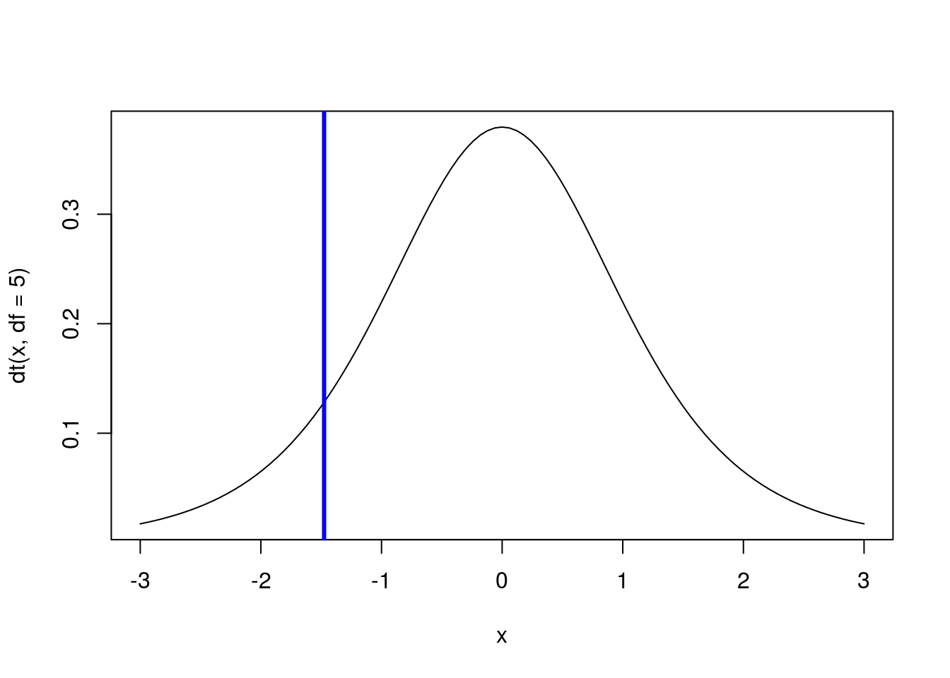
And, just like with quantile() and qnorm(), we can find the middle 90% by taking an equal number out of each tail (here, find the bottom and top 5%).
# Calculate the point with 90% of value to left
qt(c(0.05,0.95), df = 5)
## [1] -2.015048 2.015048# Draw a standard t-distribution
curve(dt(x, df = 5),-3,3)
# Add line to show where we are looking
abline(v = qt(c(0.05,0.95), df = 5),
col = "blue",lwd =3)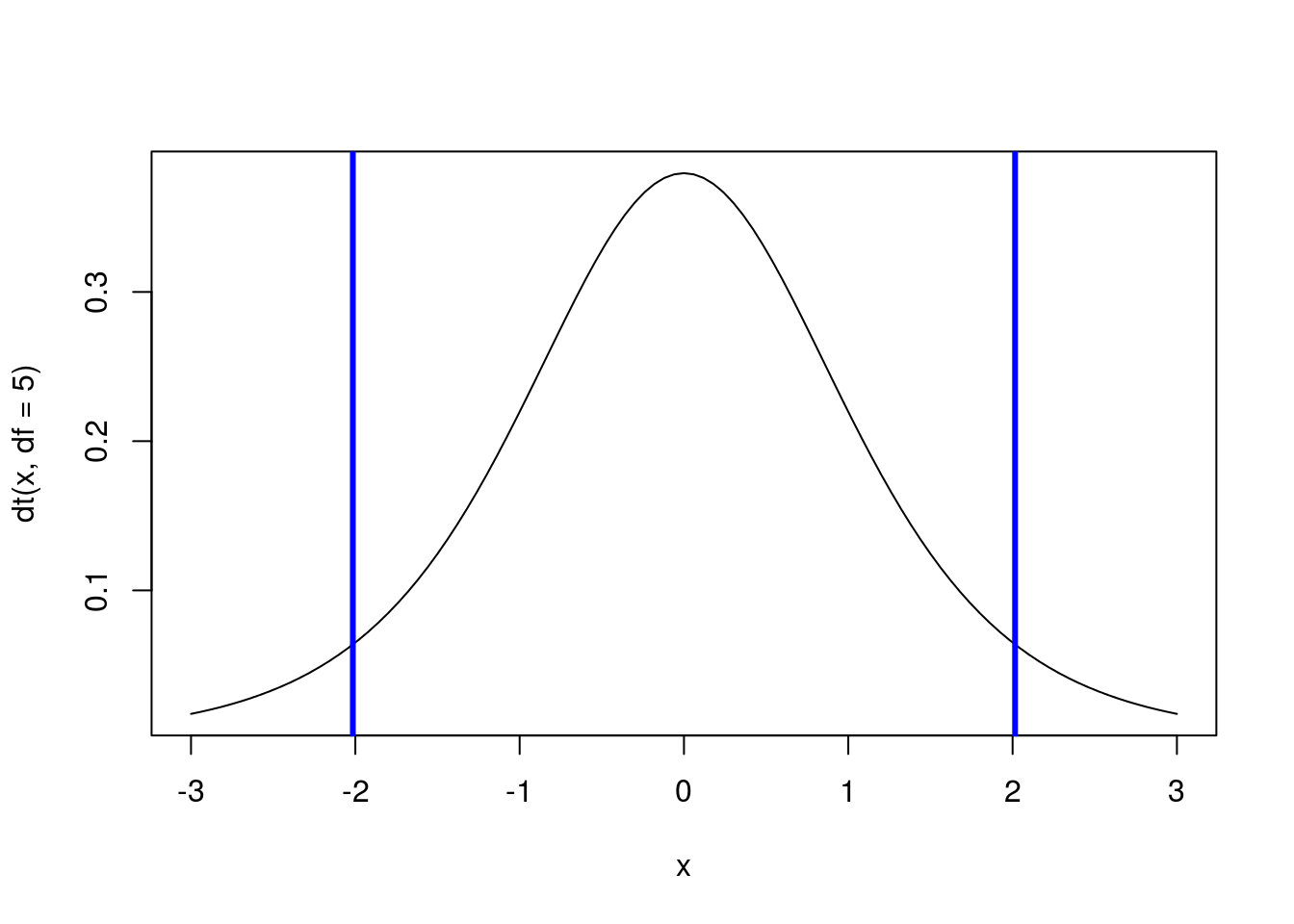
22.5.2.1 Try it out
For a t-distribution with 7 degreess of freedom (i.e. sample size of 8):
- What is the point at which 20% of values are to its right?
- What is the point at which 15% of values are to it left?
- What two points capture the middle 60% of data between them?