An introduction to statistics in R
A series of tutorials by Mark Peterson for working in R
Chapter Navigation
- Basics of Data in R
- Plotting and evaluating one categorical variable
- Plotting and evaluating two categorical variables
- Analyzing shape and center of one quantitative variable
- Analyzing the spread of one quantitative variable
- Relationships between quantitative and categorical data
- Relationships between two quantitative variables
- Final Thoughts on linear regression
- A bit off topic - functions, grep, and colors
- Sampling and Loops
- Confidence Intervals
- Bootstrapping
- More on Bootstrapping
- Hypothesis testing and p-values
- Differences in proportions and statistical thresholds
- Hypothesis testing for means
- Final thoughts on hypothesis testing
- Approximating with a distribution model
- Using the normal model in practice
- Approximating for a single proportion
- Null distribution for a single proportion and limitations
- Approximating for a single mean
- CI and hypothesis tests for a single mean
- Approximating a difference in proportions
- Hypothesis test for a difference in proportions
- Difference in means
- Difference in means - Hypothesis testing and paired differences
- Shortcuts
- Testing categorical variables with Chi-sqare
- Testing proportions in groups
- Comparing the means of many groups
- Linear Regression
- Multiple Regression
- Basic Probability
- Random variables
- Conditional Probability
- Bayesian Analysis
Linear Regression
32.1 Load today’s data
Start by loading today’s data. If you need to download the data, you can do so from these links, Save each to your data directory, and you should be set.
- rollerCoaster
- Data on the tallest drop and highest speed of a set of roller coasters
- hotdogs.csv
- Data on nutritional information for various types of hotdogs
We also want to make sure that we load any packages we know we will want near the top here. Today, will be wanting to use things from gplots so make sure it is loaded
# Set working directory
# Note: copy the path from your old script to match your directories
setwd("~/path/to/class/scripts")

# Load needed libraries
library(gplots)

# Load data
rollerCoaster <- read.csv("../data/Roller_coasters.csv")
hotdogs       <- read.csv("../data/hotdogs.csv")
32.2 Background
Earlier in this tutorial, we introduced regression and correlation as ways to identify the relationship between two continuous variables. There, we used bootstrapping and re-sampling to assess confidence intervals and null hypotheses. In this chapter, we will introduce the models that allow us to short cut some of those steps.
Both of these approaches use the t-distribution. However, calculations of Standard Error is complicated, so we will, once again, rely on R to calculate things for us. I hope that, by now, we have developed enough intuition about p-values that leaping straight to this, without working examples by hand first, will work.
In this chapter, we will start with some fairly simple examples. In the next chapter, we will rapidly add layers of complexity that will put you in a position to analyze just about anything you might be interested in. Make sure to follow these examples closely, as they are the base on which everything else is going to be built.
32.3 A simple slope example
In an earlier chapter, we calculated the relationship between Speed and Drop for roller coasters. We used boot strapping for confidence intervals and re-sampling to build null distributions to calculate p-values. These distributions both follow the t-distribution (because of how the Standard Error – SE – is calculated). Let’s see quickly how to do this in R.
First, always plot your data. If there isn’t a linear relationship, don’t bother running any test that assumes linearity. We saw this before, but will be more explicit about it later in the chapter. There are many ways to handle non-linear data. We will encounter some, but the rest are beyond the scope of this class.
# Plot the relationship
plot(Speed ~ Drop,
     data = rollerCoaster)
Here, we see a fairly nice, linear relationship, so we can proceed. Recall that the directionality matters here. When we plot (and especially when we run regressions), the values on the y-axis are thought of as the “response” variable to the “explanatory” variable on the x-axis. Here, this implies that we think changing the Drop is likely to change the Speed, not the other way around (though, without an experiment, we cannot say this with certainty).
Next, let’s go ahead and calculate the line, just like we did before (and similar to how we did for ANOVA and our earlier plotting) – using the lm() function.
# Calculate and save a regression line
coasterLine <- lm(Speed ~ Drop,
                  data = rollerCoaster)

# Plot the line
plot(Speed ~ Drop,
     data = rollerCoaster)
abline(coasterLine,
       col = "red3", lwd = 4)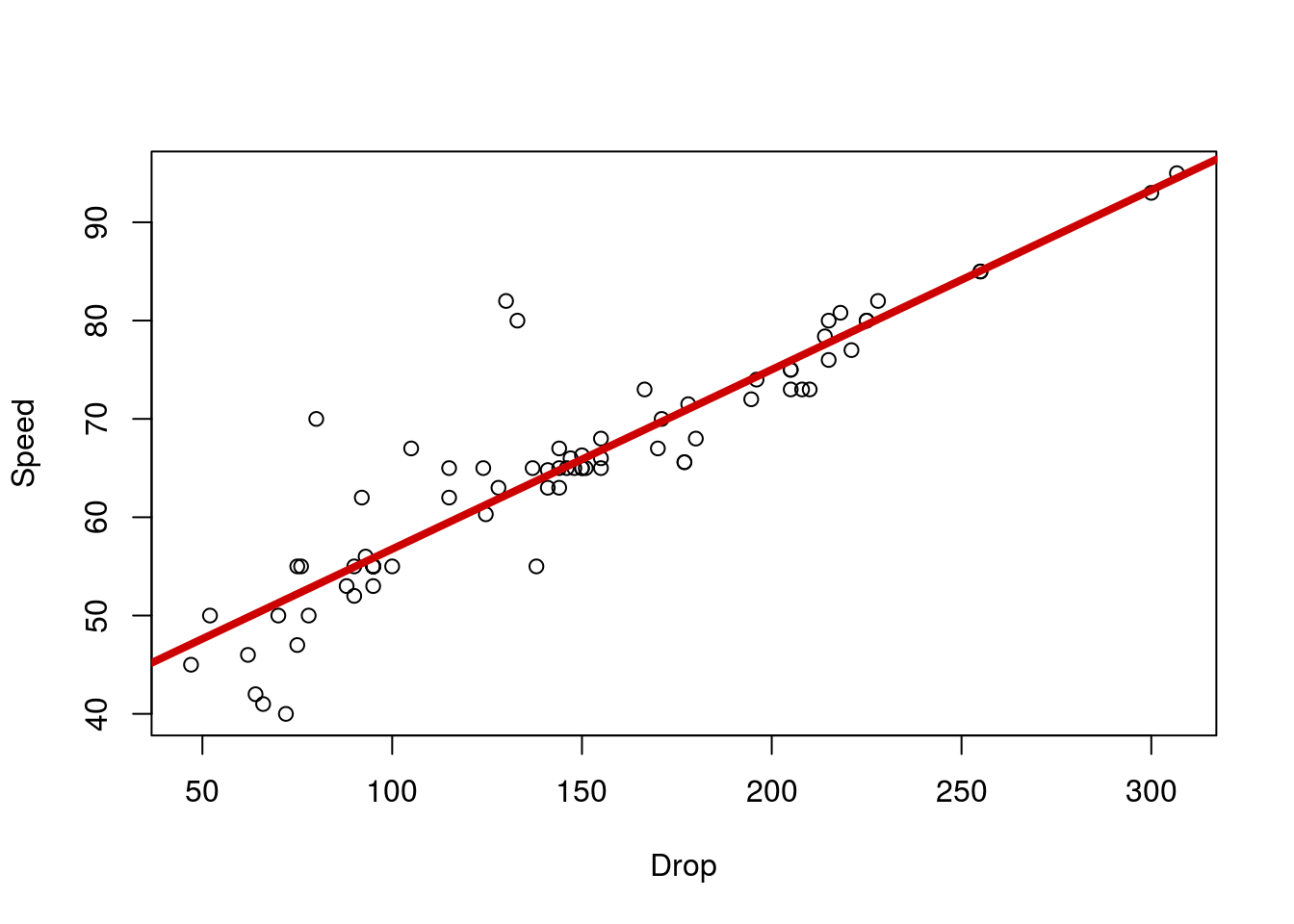
# View the line
coasterLine
##
## Call:
## lm(formula = Speed ~ Drop, data = rollerCoaster)
##
## Coefficients:
## (Intercept) Drop
## 38.4997 0.1826As before, this tells us that, for every unit increase in Drop, we expect the Speed to rise by 0.183 MPH. But – and this has become our key question – is that relationship significant? How can we tell? Before, we had to randomize and resample, but R has been hiding the answer all along. Like the anova() function, R has a way to look at the details of a regression test: the summary() function. If this function seems familiar, that’s because it is. The summary() function tells us the details about a number of different types of variables (such as data.frames and vectors), including the outputs of test statistics. Let’s check it out for the coaster data.
# Look at the regression details
summary(coasterLine)
##
## Call:
## lm(formula = Speed ~ Drop, data = rollerCoaster)
##
## Residuals:
## Min 1Q Median 3Q Max
## -11.6450 -1.8235 -0.7986 0.9803 19.7658
##
## Coefficients:
## Estimate Std. Error t value Pr(>|t|)
## (Intercept) 38.499731 1.533175 25.11 <2e-16 ***
## Drop 0.182573 0.009755 18.72 <2e-16 ***
## ---
## Signif. codes: 0 '***' 0.001 '**' 0.01 '*' 0.05 '.' 0.1 ' ' 1
##
## Residual standard error: 4.968 on 73 degrees of freedom
## Multiple R-squared: 0.8275, Adjusted R-squared: 0.8252
## F-statistic: 350.3 on 1 and 73 DF, p-value: < 2.2e-16Here, we see that we get a ton of information, including a p-value (in the Pr(>|t|) column; short for “Probability of getting a t value more extreme than observed”) for both the intercept and the Drop prediction. Here, we don’t need to worry too much about the intercept as it doesn’t make sense to think of the Speed of a roller coaster with 0 drop. However, in some cases it will be helpful.
Here, though, we can focus on the row for our predictor: Drop. The p-value tells us that this line is significant. The t-value gives us an indication of how far we are from our null, scaled in the number of SE’s (also provided) we are away.
Finally, we can also get a confidence interval for the slope of the line using confint(), which takes a model object (such as we saved) as it’s input.
# Calculate a CI
confint(coasterLine)
## 2.5 % 97.5 %
## (Intercept) 35.4441168 41.5553446
## Drop 0.1631319 0.2020143Here, we see that it gives use the upper and lower bounds of a confidence interval by default. So, we are 95% certain that the true value of the slope in the population is between 0.163 and 0.202. We could also get a different CI using the argument level =.
# Calculate a 99% CI
confint(coasterLine, level = .9)
## 5 % 95 %
## (Intercept) 35.9454665 41.0539950
## Drop 0.1663217 0.198824532.3.1 Try it out
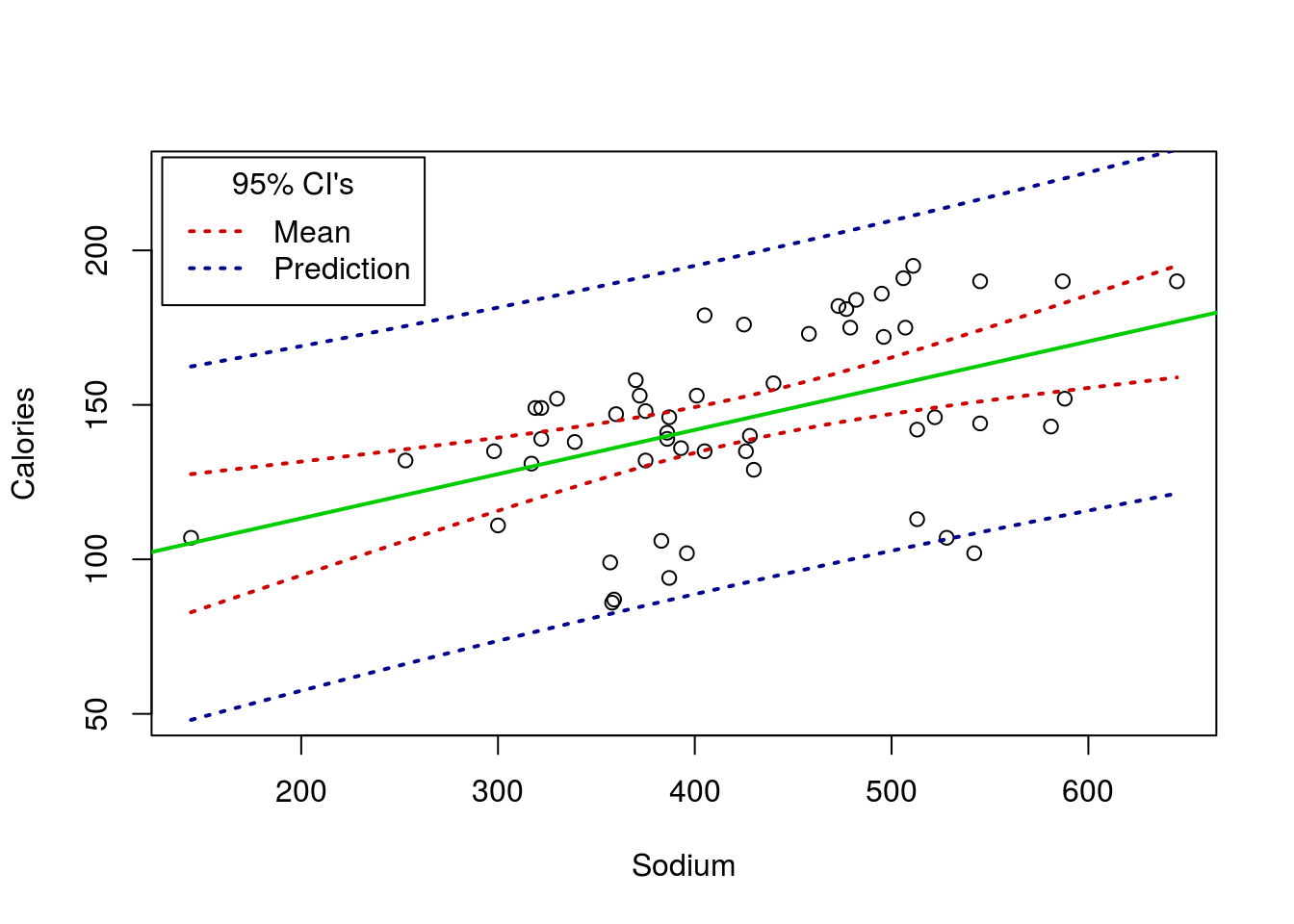
Test the relationship between Calories and Sodium in the hotdogs data set. You should get a plot like this:

and a p-value of 0.000369.
32.4 Predicting values
One of the things we often want to use a linear model for is to predict future values. Here, for instance, we might want to predict how fast a new roller coaster will be, based on its largest Drop. How can we do this? One simple way is to calculate it by hand.
First, let’s look at the equation for the line again.
# See the model again
coasterLine
##
## Call:
## lm(formula = Speed ~ Drop, data = rollerCoaster)
##
## Coefficients:
## (Intercept) Drop
## 38.4997 0.1826Recall that we interpret this with the “Drop” value as a slope, and using the intercept as a starting point. Here, this looks like:
Speed = 38.4997 + 0.1826 * Drop
So, if we just plug in our new value for Drop, say 200 feet, we can get the mean predicted value.
# Predict a Spped for a 200 ft drop
predDrop <- 38.4997 + 0.1826 * 200
predDrop
## [1] 75.0197So, we expect this coaster to have a max speed of around 75.02 MPH. This makes sense if we look at the plot again as well: that is right were the line falls at 200 feet.
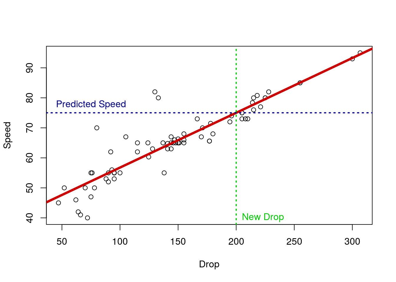
We can, instead, find this value with the function predict. This function takes a model and some new data, and does the calculations for you. This is always in the form of a data.frame, and it only works if you use the data = approach to build the model in lm() – one (of many) reasons I have pushed that formatting. It may seem like a bit of extra work right now. However, we will soon see examples, including plotting, where letting R do this work for us is very helpful.
# Predict values, making R do the work
predict( coasterLine,
         data.frame(Drop = 200) )
## 1
## 75.01436This simple approach just give you the same number we just calculated – the differences are due just to rounding errors.
32.4.1 Confidence intervals
However, we can see that not every coaster will land exactly on the line. We might also want to calculate a confidence interval for our prediction. There are two things we might want an interval on: the mean Speed and the actual speeds. The first is based on our CI for the slope, and the second includes information about the rest of the variability as well.
To get the CI, we had the argument interval = "confidenc" here, asking for a CI of the mean value.
# Predict values, getting a CI
predict( coasterLine,
         data.frame(Drop = 200),
         interval = "confidence"
         )
## fit lwr upr
## 1 75.01436 73.45893 76.56979Here, we now have an upper and lower bound on the mean prediction – this is just like the confidence intervals we have calculated for the mean before (e.g. like the t-test). But, we might can see that a lot of the actual data falls further from the line than that. So, what if we want to predict a particular value with 95% confidence? We change the interval = paramater to equal interval = "prediction".
# Predict values, getting a CI for prediction
predict( coasterLine,
         data.frame(Drop = 200),
         interval = "prediction"
         )
## fit lwr upr
## 1 75.01436 64.99145 85.03727Now, we see that we expect 95% of coasters with a Drop of 200 feet to have a Speed inside of that range. We can change the size of the interval to anything we want. For example, let’s say we just want to know about the middle half: add the argument level = 0.50 and R does the rest.
# Predict values, getting a CI for prediction
predict( coasterLine,
         data.frame(Drop = 200),
         interval = "prediction",
         level = 0.50
         )
## fit lwr upr
## 1 75.01436 71.60533 78.42339It is also worth noting that you can fit multiple values at the same time, which may be useful for many applications.
# Predict values, getting a CI for prediction
predict( coasterLine,
         data.frame(Drop = c(50, 100, 150, 200, 250)),
         interval = "prediction"
         )
## fit lwr upr
## 1 47.62839 37.48875 57.76802
## 2 56.75704 46.75015 66.76394
## 3 65.88570 55.91808 75.85332
## 4 75.01436 64.99145 85.03727
## 5 84.14302 73.97178 94.31425The math of this calculation is somewhat more complicated, and beyond the scope of what I intend to cover in this tutorial.
32.4.2 Try it out
Calculate a 90% Confidence interval for the mean number of Calories in a hotdog 300 mg of Sodium. Then, determine the range of Calories in which 75% of hotdogs with 500 mg of Sodium will land.
You should get ranges of 117.7 to 137.4 and 125.2 to 187.2 respectively.
32.5 R-squared
If we look at the lm output again, we see another similarity:
summary(coasterLine)##
## Call:
## lm(formula = Speed ~ Drop, data = rollerCoaster)
##
## Residuals:
## Min 1Q Median 3Q Max
## -11.6450 -1.8235 -0.7986 0.9803 19.7658
##
## Coefficients:
## Estimate Std. Error t value Pr(>|t|)
## (Intercept) 38.499731 1.533175 25.11 <2e-16 ***
## Drop 0.182573 0.009755 18.72 <2e-16 ***
## ---
## Signif. codes: 0 '***' 0.001 '**' 0.01 '*' 0.05 '.' 0.1 ' ' 1
##
## Residual standard error: 4.968 on 73 degrees of freedom
## Multiple R-squared: 0.8275, Adjusted R-squared: 0.8252
## F-statistic: 350.3 on 1 and 73 DF, p-value: < 2.2e-16The R-squared value is simply the ‘r’ value from the correlation squared. The R2 value is the proportion of variance explained by the model. So, in our case 82.75% of the variance in Speed is explained by the model. To see this in action, we can compare boxplots of the raw data to the residuals (a measure of how “wrong” the line is). (Note: we need to move the center of the raw data to 0 to make them directly comparable, as that is where residuals are centered.)
# Compare variablity
boxplot( rollerCoaster$Speed - mean(rollerCoaster$Speed),
         resid(coasterLine),
         names = c("Raw data","Residuals")
         )
Note how much less the residuals vary. We can see that directly by calculating the variances (similar to standard deviations, but with one less scaling step).
# Calculate variance
var(rollerCoaster$Speed)
## [1] 141.1902var(resid(coasterLine))## [1] 24.34886# Compare variances
var(resid(coasterLine)) / var(rollerCoaster$Speed)## [1] 0.1724544# Compare to R-squared
1 - var(resid(coasterLine)) / var(rollerCoaster$Speed)## [1] 0.8275456Note that the R-squared value is the same as 1 - the proportion of variance left unexplained by the model.
32.5.1 Try it out
Look again at the output from your relationship between Calories and Sodium. What is the R-squared value?
32.6 Assumptions
The assumptions of regressions apply, not (directly) to the data, as has usually been the case (otherwise, how could we use categorical data?). Instead, the assumptions largely apply to the residuals.
Residuals, as we discussed earlier in the course, and have hinted at a few times, are the difference between the predicted value (the line) and the actual value. We want to make sure that those residuals (the error left after our model) are:
- Normally distributed, and
- Don’t show any clear patterns (such as change in magnitude)
As is usually the case, plotting is usually the way to go. In R, there are several ways to access the residuals, though the simplest may be the resid() function, which returns the residuals of a model.
For this, I want to show you four cases for each type of plot we might want. So, I am going to show you the anscombe data sets for this. Set them up like this:
# Load anscombe data
data(anscombe)

# View the data
anscombe
## x1 x2 x3 x4 y1 y2 y3 y4
## 1 10 10 10 8 8.04 9.14 7.46 6.58
## 2 8 8 8 8 6.95 8.14 6.77 5.76
## 3 13 13 13 8 7.58 8.74 12.74 7.71
## 4 9 9 9 8 8.81 8.77 7.11 8.84
## 5 11 11 11 8 8.33 9.26 7.81 8.47
## 6 14 14 14 8 9.96 8.10 8.84 7.04
## 7 6 6 6 8 7.24 6.13 6.08 5.25
## 8 4 4 4 19 4.26 3.10 5.39 12.50
## 9 12 12 12 8 10.84 9.13 8.15 5.56
## 10 7 7 7 8 4.82 7.26 6.42 7.91
## 11 5 5 5 8 5.68 4.74 5.73 6.89# Creat anscombe models
ansA <- lm(y1 ~ x1, data = anscombe)
ansB <- lm(y2 ~ x2, data = anscombe)
ansC <- lm(y3 ~ x3, data = anscombe)
ansD <- lm(y4 ~ x4, data = anscombe)Now, let’s plot each, with their line of best fit (recall from earlier in the tutorial that each of these gives the same line).
# Set to put all four in one plot
# This is optional, but makes it easier to compare
par( mfrow = c(2,2))


# Set margins to make them fit better
par( mar = c(5, 4, 1, 2) + 0.1)

# Plot them
plot(y1 ~ x1, data = anscombe)
abline(ansA, col = "red3",lwd = 2)

plot(y2 ~ x2, data = anscombe)
abline(ansB, col = "red3",lwd = 2)

plot(y3 ~ x3, data = anscombe)
abline(ansC, col = "red3",lwd = 2)

plot(y4 ~ x4, data = anscombe)
abline(ansD, col = "red3",lwd = 2)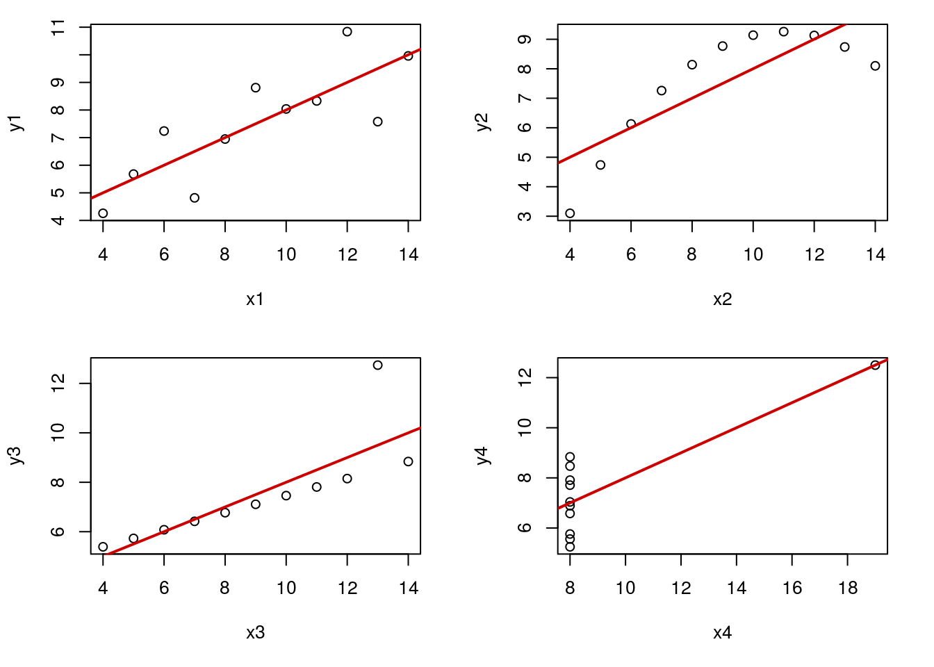
Now, we can tell that some of these lines are better than others, but here we will use the plots of residuals to check them as well. The pair x1 and y1 make a good linear model. The others each have a flaw, including lack of linearity (top right, pair 2), or outliers of varying severity (bottom, pair 3 and 4).
32.6.1 Normally distributed
First, lets just plot a hisotgram to see how normal our residuals look. With only ten data points, this is a bit difficult to assess, but it will give you the idea, which you can then use on bigger data sets. As always, the bigger the data set, the more we can tolerate a little bit of deviation from normal.
However, two additional concerns are addressed by these plots as well. First, a small number of large outliers can have a dramatic effect on the line we calculate, and so should be handled cautiously. Second, a bimodal plot of residuals may suggest something about the structure of your data and warrants further investigation (this is addressed with muliple linear regression in a coming chapter).
Plot the data sets:
# Set to put all four in one plot
# This is optional, but makes it easier to compare
par( mfrow = c(2,2))

# Set margins to make them fit better
par( mar = c(5, 4, 1, 2) + 0.1)

# Plot the histograms
hist( resid(ansA), main = "" )
hist( resid(ansB), main = "" )
hist( resid(ansC), main = "" )
hist( resid(ansD), main = "" )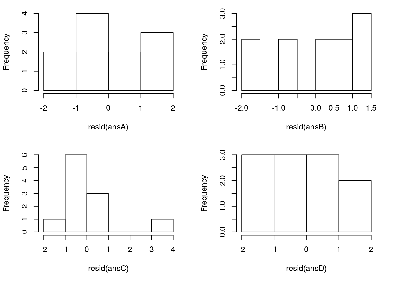
Here, only one of these stands out as particularly exceptional: pair 3 in the bottom left. The large oulier in the data (near the top right) is also a large outlier in the histogram. This (along with the original plot) should give us pause and make us consider carefully before moving on. This does NOT, however, mean that we can just discard that point. That may be our most interesting point, at the very least, you need to report it and justify any decision to remove it.
32.6.2 Patterns
We get a pretty good picture of the linear relationship from the initial plot, but it is often even more apparent when looking at plots of residuals. In these plots, we can also get a picture of other patterns, such as changes in the magnitude of the variance.
It is possible to plot residuals against X values, and in many cases, that is the easiest thing to interpret quickly. However, once we add multiple X values, deciding which one gets tricky (plots like this are often used, but have different meanings in multiple regression). Instead, we will plot the residuals against the predicted values, as those will always be simple to identify.
# Set to put all four in one plot
par( mfrow = c(2,2))

# Set margins to make them fit better
par( mar = c(5, 4, 1, 2) + 0.1)

# Plot the residutals
plot( resid(ansA) ~ predict(ansA) )
plot( resid(ansB) ~ predict(ansB) )
plot( resid(ansC) ~ predict(ansC) )
plot( resid(ansD) ~ predict(ansD) )
Here, we quickly see that ansA gives us a nice, clean, pattern-free plot – which is what we want to see. The others quickly (and even more clearly than the original plots) tell us that something is wrong. For ansB, that parabolic shape is diagnostic of a non-linear relationship – always be on the look out for that type of pattern, though it will rarely be as obvious ansC shows us that outlier even more clearly than before. Finally, ansD shows us two interesting (and bad for regression) patterns: first, the outlier is apparent, but secondly, we see a change in the magnitude of the residuals as well. In many other cases, this will not be so stark (and usually the “fan” opens in the other direction), but it is a good thing to be on the look out for. Here is a different example that shows a more “typical” pattern:

This shows the “typical” bad pattern, where large predicted values have bigger residuals.
Each of these are problems that should arouse caution. Many can be “fixed” with some advanced techniques, but those are, alas, beyond the scope of this class.
32.7 Using categories in linear models
We have now seen that ANOVA and linear modelling use very similar mechanisms. We can see this even more clearly if we look at the output from lm() for a categorical variable.
This may seem like an added complication, but consider that we may (and soon will) want to be able to use both categorical and numeric predictors in the same model. By working through these simple examples, hopefully that will be easier for you.
Let’s start by looking at the relationship between Calories and types of hotdogs.
# Make the linear model
hotdogModel <- lm(Calories ~ Type,
                  data = hotdogs)
anova(hotdogModel)
## Analysis of Variance Table
##
## Response: Calories
## Df Sum Sq Mean Sq F value Pr(>F)
## Type 2 17692 8846.1 16.074 3.862e-06 ***
## Residuals 51 28067 550.3
## ---
## Signif. codes: 0 '***' 0.001 '**' 0.01 '*' 0.05 '.' 0.1 ' ' 1As before, we saw that there was a significant relationship, and we can look at that using plotmeans() (or a boxplot).
# Plot the data
plotmeans(Calories ~ Type,
          data = hotdogs,
          connect = FALSE,
          n.label = FALSE)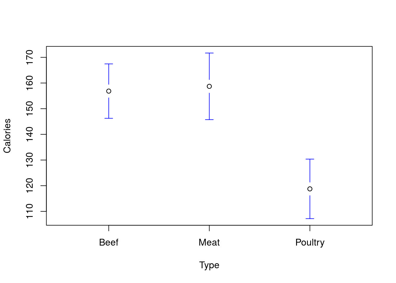
We saw that we can get the means of each of these groups from the aov() model.
# View the means
model.tables(aov(hotdogModel),
             type = "means")
## Tables of means
## Grand mean
##
## 145.4444
##
## Type
## Beef Meat Poultry
## 156.8 158.7 118.8
## rep 20.0 17.0 17.0So, we see that the means are rather different. From this simple model, we are essentially saying that, instead of guessing that everything is roughly the grand mean of the data (in this case 145.44 calories), we recognize that the different types have different means, and so can treat the “standard” Poultry hotodog differently. To be specific, we now think of each type as being close to its mean. We can see this if we use predict().
# Predict a value
predict(hotdogModel,
        data.frame(Type = c("Beef","Meat","Poultry"))
        )
## 1 2 3
## 156.8500 158.7059 118.7647This means that each residual, instead of being the difference from the Grand Mean, is the difference from its type’s mean. We can even plot this.
# Plot residuals
plot(resid(hotdogModel) ~ hotdogs$Type )
Now, they are each centered near 0, and are a lot smaller than if we we were just comparing to the grand mean.
# Plot to show var of resid vs raw
boxplot( hotdogs$Calories - mean(hotdogs$Calories),
         resid(hotdogModel),
         names = c("Raw data","Residuals")
         )
Now, we can see exactly how much of that variabilty is explained by looking at the R2 value. We know we have a saved lm() output (that is how we made hotdogModel), and that summary() will show it to us. So, let’s try that.
# Run summary to see the R-sq value
summary(hotdogModel)
##
## Call:
## lm(formula = Calories ~ Type, data = hotdogs)
##
## Residuals:
## Min 1Q Median 3Q Max
## -51.706 -18.492 -5.278 22.500 36.294
##
## Coefficients:
## Estimate Std. Error t value Pr(>|t|)
## (Intercept) 156.850 5.246 29.901 < 2e-16 ***
## TypeMeat 1.856 7.739 0.240 0.811
## TypePoultry -38.085 7.739 -4.921 9.39e-06 ***
## ---
## Signif. codes: 0 '***' 0.001 '**' 0.01 '*' 0.05 '.' 0.1 ' ' 1
##
## Residual standard error: 23.46 on 51 degrees of freedom
## Multiple R-squared: 0.3866, Adjusted R-squared: 0.3626
## F-statistic: 16.07 on 2 and 51 DF, p-value: 3.862e-06Here, we see that the R2 says we explained 38.66% of the variance. More than that though, we also see some new information. We first see an intercept, which should look familiar: it is the mean of the Beef hotdogs. Looking at the model table, we see something else as well:
# Look at model table again
model.tables(aov(hotdogModel), type = "means")
## Tables of means
## Grand mean
##
## 145.4444
##
## Type
## Beef Meat Poultry
## 156.8 158.7 118.8
## rep 20.0 17.0 17.0The difference beween the Beef and Meat hotdog means is 1.86 – the same as the effect size for “TypeMeat” in the output. Simiarly the effect size for “TypePoultry” (-38.09) is the difference between the Beef and Poultry hotdog means.
This is not a coincidence. The linear model picks one value as the “baseline” and treats everything else as a change from that (by default the first alphabetically, though that can be changed; see below). If we think then, about what the equation for the line would like like, we can treat it as:
Calories = 156.85 + 1.86*(Type == “Meat”) + -38.09*(Type == “Poultry”)
Where Type == "Meat" and Type == "Poultry" are treated as 1 when TRUE and 0 when FALSE (as we have been using them throughout the tutorial). This means we only add those to the intercept when the hotdog matches those types. So, when the hotdog is “Beef” the line is just:
Calories = 156.85
When it is is “Meat”:
Calories = 156.85 + 1.86
and when it is “Poultry”
Calories = 156.85 + -38.09
You will notice that these are just flat, horizontal lines. There is no “slope” parameter here, just an intercept (or, the slope here is 0). We will see in the next chapter what happens when we add a second, numerical, predictor to a model with a categorical variable like this.
32.8 Correlation
Finally, we can also look directly at correlations now. Before, we used the function cor to give us the correlation statistic “r”. As a reminder:
# Run a simple correlation
cor(rollerCoaster$Drop, rollerCoaster$Speed)
## [1] 0.9096954Here, the “formula” method does not work, so we need to use the commas. But, that doesn’t give us a p-value or confidence interval. However, the function cor.test will. Try it now:
# Run a simple correlation test
cor.test(rollerCoaster$Drop, rollerCoaster$Speed)
##
## Pearson's product-moment correlation
##
## data: rollerCoaster$Drop and rollerCoaster$Speed
## t = 18.7163, df = 73, p-value < 2.2e-16
## alternative hypothesis: true correlation is not equal to 0
## 95 percent confidence interval:
## 0.8603710 0.9421377
## sample estimates:
## cor
## 0.9096954Here, we get the information we are interested in, including p-value and CI. Of note, the p-value here is identical to that in the lm approach.
32.9 Asides
The following are long, detailed explanations of how to do a few interesting things in R. Neither is necessary for this level of statistics introduction, but each can be incredibly valuable to some users. Read the following if you are interested. If not, feel free to skip it.
32.9.1 Changing the order of factors
Below is a quick note on how to change the order of factors, if desired, to get a different baseline. This is not something you will need to do for this class, but it may be something you want to do for plotting your own data at some point in the future.
For both regression and many plotting functions, R treats factors specially. One of the things it uses is the levels of the factor, which we can view like this:
# See the Types of hotdogs we have
levels(hotdogs$Type)
## [1] "Beef" "Meat" "Poultry"Note that they are, by default, in alphabetical order (hence why all of our table rows and columns and boxplots have been in alphabetical order). We can also use that function to change the levels, though we should be careful. R simply changes the label on each. This is great for things like setting colors, but not so great for our end goal.
# make a new variable for colors
hotdogs$color <- hotdogs$Type

# Change the levels to be colors
levels(hotdogs$color) <- c("red3","green3","darkblue")

# Compare the hotdog types and colors
table( hotdogs$Type,
       hotdogs$color)
##
## red3 green3 darkblue
## Beef 20 0 0
## Meat 0 17 0
## Poultry 0 0 17In addition, R let’s us change the order, but it takes a little bit of caution. Essentially, we are creating a new factor, and just setting the levels at that time. We can either do this with a new variable or by overwriting the original variable (as below).
# Change the levels order
hotdogs$Type <- factor( hotdogs$Type,
                        levels = c("Poultry","Beef","Meat"))

# See the different order
levels(hotdogs$Type)
## [1] "Poultry" "Beef" "Meat"This not only changes the order for printing the levels, it also changes the order of all the other things that use levels. See examples for table(), boxplot(), plotmeans() here:
# Make a table with new order
table(hotdogs$Type)
##
## Poultry Beef Meat
## 17 20 17# Boxplot order
boxplot(Calories ~ Type,
data = hotdogs)
# Plotmeans order
plotmeans(Calories ~ Type,
          data = hotdogs,
          connect = FALSE,
          n.label = FALSE)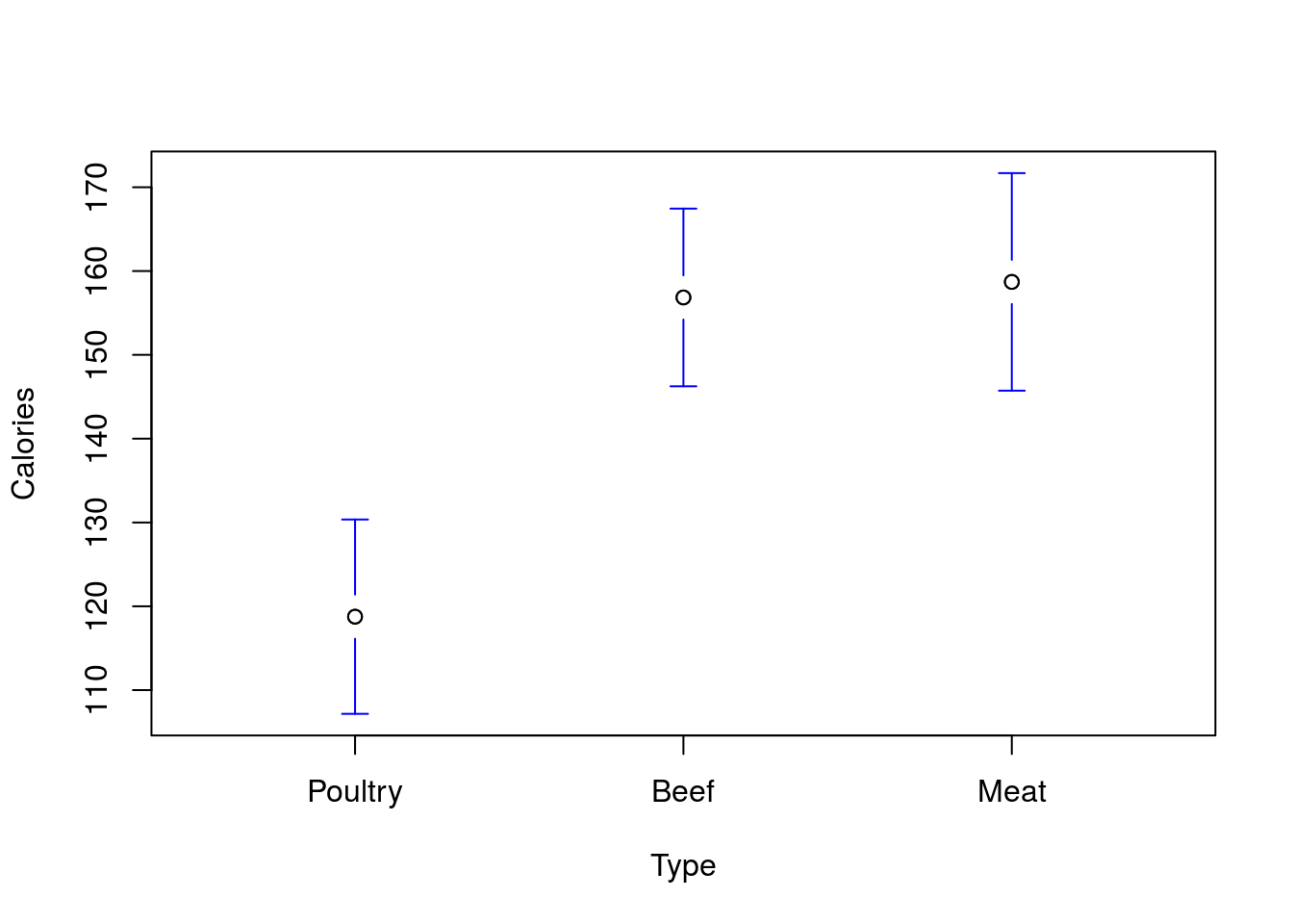
This is great for plotting and making tables, as sometimes there is a more sensible order for the values than alphabetical. However, for interpretting linear models, it can be incredibly helpful. Here, we see that the “Poultry” is now our starting point, so the values given are the differnence from Poultry. If these were from an experiment, being able to set that value to your controls or whatever your reference set is can take a lot of the headache out of interprettation.
# New model with different order
diffOrderModel <- lm(Calories ~ Type, data = hotdogs)
summary(diffOrderModel)
##
## Call:
## lm(formula = Calories ~ Type, data = hotdogs)
##
## Residuals:
## Min 1Q Median 3Q Max
## -51.706 -18.492 -5.278 22.500 36.294
##
## Coefficients:
## Estimate Std. Error t value Pr(>|t|)
## (Intercept) 118.765 5.690 20.874 < 2e-16 ***
## TypeBeef 38.085 7.739 4.921 9.39e-06 ***
## TypeMeat 39.941 8.046 4.964 8.11e-06 ***
## ---
## Signif. codes: 0 '***' 0.001 '**' 0.01 '*' 0.05 '.' 0.1 ' ' 1
##
## Residual standard error: 23.46 on 51 degrees of freedom
## Multiple R-squared: 0.3866, Adjusted R-squared: 0.3626
## F-statistic: 16.07 on 2 and 51 DF, p-value: 3.862e-06Note that nothing has changed about the model over all. The p-values, R2 and other statistics for the full model are still the same. the interpretation of the line for each type is still the same (you are now just starting with 118.76 and adding either 38.09 or 39.94 for Beef and Meat hotdogs respectively. What has changed is that now each is reported as the difference from the Poultry, which can make interpretation a lot easier.
32.9.2 Plotting CI’s
Below is just an example plotting the CI’s (both the CI of the mean and the predicted value) for the Roller Coaster Data. Not something I expect you to do, but something that may be illustrative, both to understand the concepts and to see another plotting method in action.
# Plot with CIs
# Make the base plot
plot(Speed ~ Drop, data = rollerCoaster)

# Add the line
abline(coasterLine,
       col = "green3"
       , lwd = 2)

# Add the lower mean CI
curve( predict(coasterLine,
               data.frame(Drop = x),
               interval = "confidence")[,"lwr"],
       add = TRUE, col = "red3",lwd = 2, lty = 3
       )
# Add the upper mean CI
curve( predict(coasterLine,
               data.frame(Drop = x),
               interval = "confidence")[,"upr"],
       add = TRUE, col = "red3",lwd = 2, lty = 3
       )
# Add the lower prediction CI
curve( predict(coasterLine,
               data.frame(Drop = x),
               interval = "prediction")[,"lwr"],
       add = TRUE, col = "darkblue",lwd = 2, lty = 3
       )
# Add the upper prediction CI
curve( predict(coasterLine,
               data.frame(Drop = x),
               interval = "prediction")[,"upr"],
       add = TRUE, col = "darkblue",lwd = 2, lty = 3
       )
# Add a legend
legend("topleft",inset = 0.01,
       title = "95% CI's",
       legend = c("Mean","Prediction"),
       lwd = 2, lty = 3,
       col = c("red3","darkblue"))
For the hotdogs, you would get this: