An introduction to statistics in R
A series of tutorials by Mark Peterson for working in R
Chapter Navigation
- Basics of Data in R
- Plotting and evaluating one categorical variable
- Plotting and evaluating two categorical variables
- Analyzing shape and center of one quantitative variable
- Analyzing the spread of one quantitative variable
- Relationships between quantitative and categorical data
- Relationships between two quantitative variables
- Final Thoughts on linear regression
- A bit off topic - functions, grep, and colors
- Sampling and Loops
- Confidence Intervals
- Bootstrapping
- More on Bootstrapping
- Hypothesis testing and p-values
- Differences in proportions and statistical thresholds
- Hypothesis testing for means
- Final thoughts on hypothesis testing
- Approximating with a distribution model
- Using the normal model in practice
- Approximating for a single proportion
- Null distribution for a single proportion and limitations
- Approximating for a single mean
- CI and hypothesis tests for a single mean
- Approximating a difference in proportions
- Hypothesis test for a difference in proportions
- Difference in means
- Difference in means - Hypothesis testing and paired differences
- Shortcuts
- Testing categorical variables with Chi-sqare
- Testing proportions in groups
- Comparing the means of many groups
- Linear Regression
- Multiple Regression
- Basic Probability
- Random variables
- Conditional Probability
- Bayesian Analysis
Plotting and evaluating one categorical variable
2.1 Background
Now that we have learned how to get data into R, let’s start looking at that data. In this chapter, we will focus on viewing categorical data, that is, things that fall into groups or categories. Next chapter, we will start looking at numerical data: data that consists of numbers.
Here, we will encounter for the first (of many) time a fundamental approach to statistics: Plot your data and see how it makes you feel.
We will explore several different styles of plots, each with their own strengths and weaknesses. Make sure that the plot you choose for any particular dataset is appropriate and shows what you want it to. Often, the right plot can make the path of the rest of your analysis clear. The right plot is also crucial to displaying your data for others to evaluate. The default plots in R (and thier extensive options) are one of the very powerful aspects of this tool.
2.2 Categorical data
2.3 Getting started
Let’s try this out with a simple example that we have already loaded once: the hotdogs data (hotdogs.csv). Go back to your script from the previous chapter. Copy the lines to set the working directory and read in the hotdogs data and paste them into your new script for this chapter. It should look something like this:
# Manually set working directory
# Make sure that this is set for your computer, not mine
setwd('~/Documents/learningR/scripts')

# Read in the data directly
hotdogs <- read.csv("../data/hotdogs.csv")
A few notes on the process here. First, this approach of copy-pasting old code is going to be incredibly common. This goes for both your own code, and for code you find elsewhere. There is a common saying among computer programmers:
Never write what you can steal [*](It is often alternately phrased as “good programmers write good code; great programmers steal great code.” I can’t find an original attribution for either phrasing, though both appear to be modifications of the saying: “Good artists copy, great artists steal” which was, perhaps improperly, attributed to Pablo Picaso by Steve Jobs, as it can be traced to a related statement made in 1892. All of this to say: copying can lead down a long rabbit hole.)
An important note before your other teachers draw and quarter me for telling you to plagarize: This only applies to code! Do NOT turn in a Wikipedia page for your next writing assignment and expect this saying to defend you. Most of the computer code you find is explicitly released under a very open licence, which allows you to use the code for other things. Importantly (both ethically and for usability) you should still attribute the code you have stolen. If you find a great function on a website – paste the url into your code along with the snippet. That way, if (really: when) it breaks or you share it with someone, you can go back to the site and figure out what went wrong or how to extend it.
A second note: you will almost always want to set your working directory and load all of your files near the top of your script. This makes it easy for you to change the data if you need to, to change the path if you move to a different computer, or to figure out what files you need to download.
In this chapter (and the next few) we will load data as we go. This is an explicit decision to help you get used to the process of loading data. As we move to more complicated analyses, we will start loading all of our data at the very top of our scripts.
2.4 Counting occurences
First, let’s look, again, at what kind of data are in the hotdogs dataset. As we did last chapter, let’s start by using head():
# Look at the hotdogs data
head(hotdogs)
## Type Calories Sodium
## 1 Beef 186 495
## 2 Beef 181 477
## 3 Beef 176 425
## 4 Beef 149 322
## 5 Beef 184 482
## 6 Beef 190 587Here, it looks like the Type column has catergorical data for the type of hotdogs in the dataset. So, let’s investigate that column a bit more closely. First, let’s look at all of the entries.
# Check all of the enteries
hotdogs$Type
## [1] Beef Beef Beef Beef Beef Beef Beef Beef
## [9] Beef Beef Beef Beef Beef Beef Beef Beef
## [17] Beef Beef Beef Beef Meat Meat Meat Meat
## [25] Meat Meat Meat Meat Meat Meat Meat Meat
## [33] Meat Meat Meat Meat Meat Poultry Poultry Poultry
## [41] Poultry Poultry Poultry Poultry Poultry Poultry Poultry Poultry
## [49] Poultry Poultry Poultry Poultry Poultry Poultry
## Levels: Beef Meat PoultryThis shows us two things that will be helpful. First, it shows us there are about 50 enteries (we will see a more accurate count soon). Second, it tells us what “Levels” are in the column. This is because this column (like all text columns by default) is a special kind of variable called a factor. In R, factors allow some really cool and efficient processes, and a big part of that is that the available options are stored as the levels of the factor. [*](For those with computer science backgrounds, the data are stored as intergers that are linked to the labels for each level.)
We can also view these levels directly with the function levels().
# Check just the levels
levels(hotdogs$Type)
## [1] "Beef" "Meat" "Poultry"So, we know that there are about 50 enteries with three possible levels. We probably, if we care about this variable, would like to know how many of each type there is. For this, we want to make a table with the count of how often each variable is present. In R, the function to make such a table is simply: table(). Let’s try it here.
# Make a table of hotdog types
table(hotdogs$Type)
##
## Beef Meat Poultry
## 20 17 17Now we can see that there are 20 Beef, 17 Meat, and 17 Poultry hotdogs in the dataset.
2.5 Manipulating the count data
From the above table, simple addition can tell us how many there are total, but we can do that a bit more programatically. This may seem like a longer approach. However, we will see in the next chapter that with more complicated data, solutions like this are incredibly helpful. In addition, by using variables, instead of typing numbers, it is much easier to adapt this to the next set we create.
First, we need to save the table as a variable. Just like (nearly) everything else in R, we can save the output from table as a variable using the <- assignment that we use for everything. Go back to the line where you created the table above and add a variable name. It could be anything you wanted, but using the one I use below (typeCounts) will make it easier to follow the rest of this chapter.
# Make a table of hotdog types
typeCounts <- table(hotdogs$Type)
Make sure that you run the line so the variable is saved. You will notice now that the table was not output in the console. This is not an error. When you save an output as a variable, the information is “caught” by the variable instead of displayed. To see the table again, just type typeCounts on a separate line and run it (or, highlight the variable name and run just that).
Now that we have the variable saved, we can use the variable to do more. The simplest, perhaps, is just to count how many there are total. To do this, we will introduce the function sum(), which does exactly what it sounds like: it sums up the values it is given.
# See how many total hotdogs are in the data
sum(typeCounts)
## [1] 54Even for this small dataset, this is a bit quicker (and certainly less error prone) than having to manually add up each of the counts. Importantly, this total will allow us to do even more. Let’s start by looking at the proportion of hotdogs that are each type.
A proportion is an important concept in statistics. It is the share of all the data that are a particular thing. This is the same idea as a percent, except that percents are out of 100 and proportions are out of 1. The two will often be used interchangably throughout the text. When reporting results, it is more natural to say something like “65% of students got A’s” than to use a proportion. However, when we are using the proportions, it is often easier to just use the equivalent proportion (in this case 0.65).
In the hotdogs data set, we are interested in what proportion of the hotdogs tested were classified as each type. So, we want to divide the number of each by the total number. For example, we might want to look use \(\frac{20}{54} = 0.37\) to calculate the proportion that are Beef in the data. However, and this will be more important for bigger datasets, we can do this directly using that sum we calculated above.
# Calculate proportions for each
typeCounts / sum( typeCounts )
##
## Beef Meat Poultry
## 0.3703704 0.3148148 0.3148148Here, we are given the proportions of each type of hotdog. Recall from our previous discussion of vectors, when we do arithmetic using a vector (such as our table entries) and a single value (such as the sum), the single value is applied to each value in the vector. Here, that means that each count is divided by the total. Importantly, this means that the proportions will always add up to 1.
As we will find is often the case, R has many, many ways to address the same question. There is a built-in function that generates the same result that we just got before. While it doesn’t save much effort here, in the coming chapters we may find it very useful. The function, prop.table(), calculates proportions when given a table. We will see a simple case here, but it offers some flexibility when working with more complex tables (which we will encounter in a few chapters).
# Use prop.table
prop.table(typeCounts)
##
## Beef Meat Poultry
## 0.3703704 0.3148148 0.31481482.6 Plotting the count data
The final thing we want to do is use these counts to make a representative plot. There are two plots that are often used for this approach: pie charts and bar charts. As we will see below, pie charts can be very difficult to interpret, so we will very rarely use them [*]I dislike pie charts, but they are ubiquitous, so they are included here for completeness.
Since we already have the count data saved as a variable, we can just pass it to one of R’s built in functions. Let’s start with a pie chart, which is made with the function pie().
# Make a pie chart
pie(typeCounts)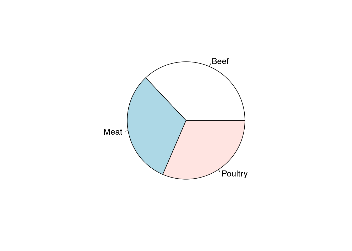
From that plot: Are all three types equally represented? If not, which one(s) are different? By how much? We know from the count data that there are 3 more Beef hotdogs in the dataset than either Meat or Poultry (which have the same numbers). However, that is not very clear in the plot. Humans are really bad at estimating the relative sizes of angles that are presented in such a rotating fashion – so pie charts are rarely a good way of presenting data.
Instead, let’s try making a barchart. The function, barplot() works very similarly to the pie() function, but with (obviously) different outcomes.
# Make a barchart
barplot(typeCounts)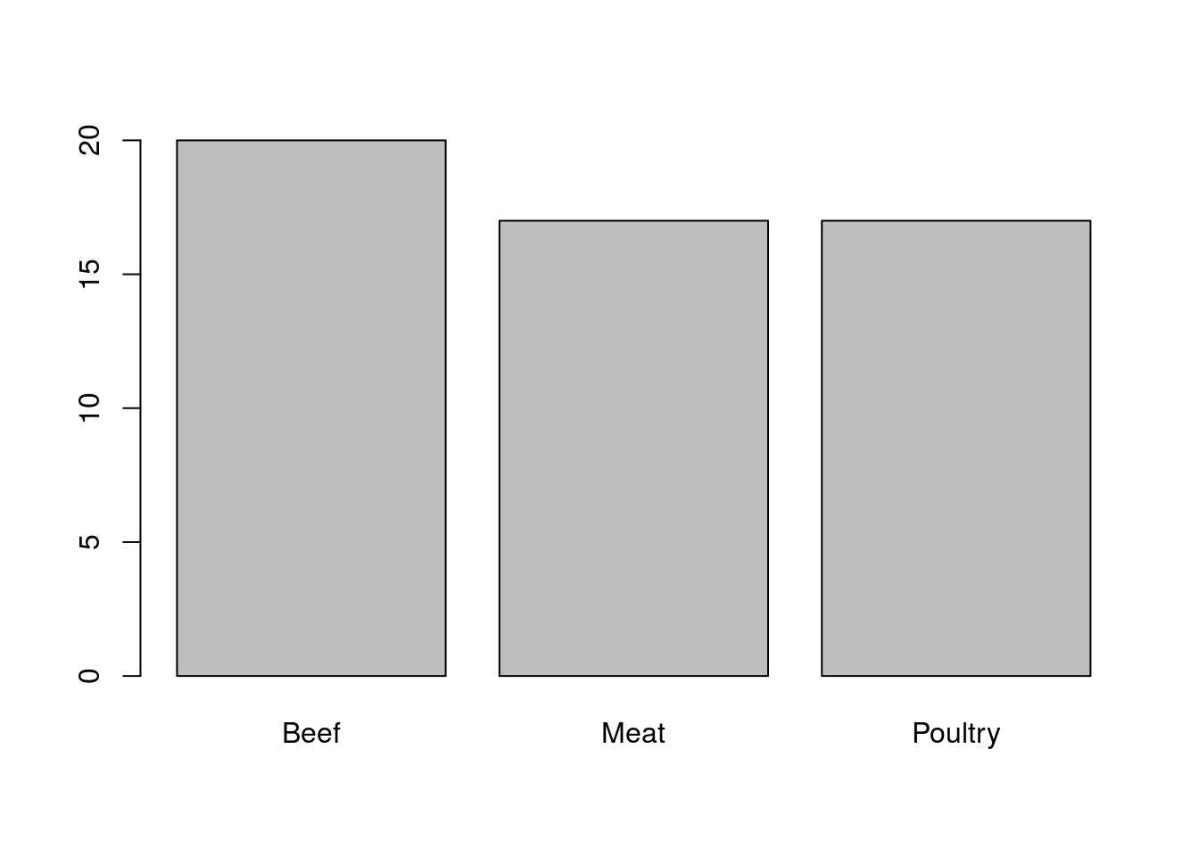
Here, R has produced a simple bar chart that shows the relative numbers quite clearly. R has left a few spots blank, however, as it doesn’t have any way of knowing what was in our variable. Let’s add a title and labels for each axis.
To add these labels, we will use named arguments. All of the arguments we have passed (typed) to functions so far have been implicitly named. That is, R assumes what they are because they are given in order. If we want to give the variables out of order, we instead use names in the format argument = value. For barplot(), we want to set the arguments, main (for the title), xlab (for an x-axis label), and ylab (for a y-axis label).
Because we are entering more information, it is often helpful to split the arugments onto multiple lines. This is not necessary, but it can be really helpful, especially as we add more arguments. R will assume that anything between the open parenthesis ( and the close parenthesis ) belongs to that function, and RStudio will automatically indent the lines to make that easy to see.
# Beautify the plot
barplot( typeCounts,
         main = "Distribution of Hotdog Types",
         xlab = "Hotdog Type",
         ylab = "Count")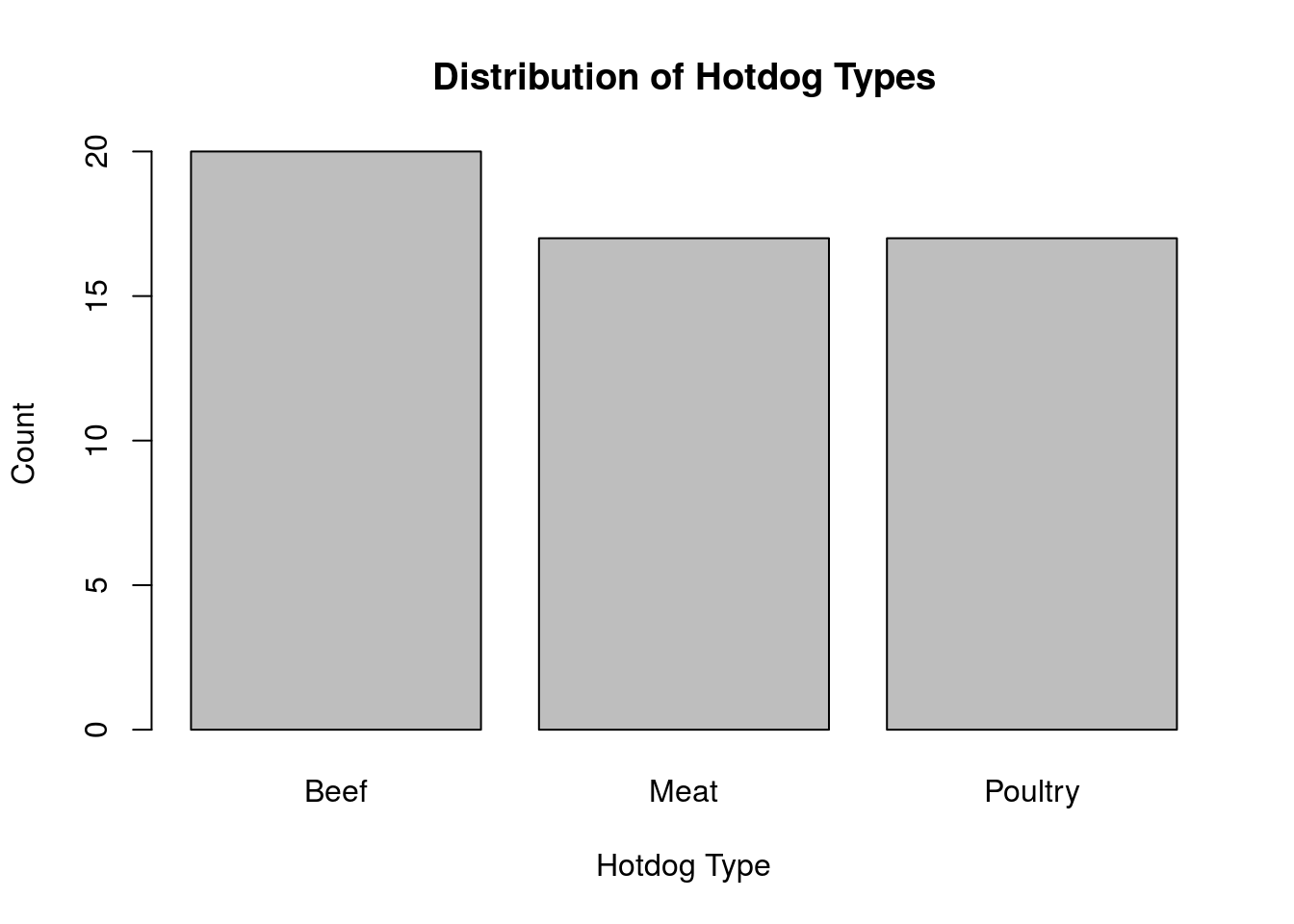
Throughout these tutorials, we will focus on making graphs that are complete, informative, and easy to read.
2.7 Putting it all together
Now that we have gone through all of this with long explanations, I want to put it all together in one place to make it easy to see everything in one place.
First, let’s load a new data set. For this, we are going to use the data from the Titanic [*]The data is also available in R directly with data(Titanic), but the format is substantially different than other data you will have access to.. Download it to your data directory from here: titanicData.csv. Since you have already set your working directory, you should now just be able to copy the line below:
# Load Titanic data
titanicData <- read.csv("../data/titanicData.csv")
Alternatively, you could have typed read.csv("../data/ then hit Tab and found the data set you wanted. As always, let’s look at the top of the data set to see what we have.
# Check the data
head(titanicData)
## class age gender survival
## 1 First Adult Male Alive
## 2 First Adult Male Alive
## 3 First Adult Male Alive
## 4 First Adult Male Alive
## 5 First Adult Male Alive
## 6 First Adult Male AliveThere are four variables class, age, gender, and survival which gives information on each passenger on the Titanic, including whether they lived or died. For this first pass, let’s focus on living and dying, which is in the survival column.
When typing variable names, remember that capitalization and spelling both matter. One easy way to avoid mistakes is to use the same tab-complete trick we’ve been using for the files. Start typing the name of a variable, hit Tab, and options for completion will popup. To select a column name, type the $ after the data.frame name, hit Tab, and options for completion will popup.
# Save and display the counts of living and dead
titanicSurvival <- table(titanicData$survival)
titanicSurvival
##
## Alive Dead
## 711 1490This shows us how many people lived and died, and we can get a sense of the relative numbers. Let’s see how many total people there were, and then what proportion lived and died.
# How many people were on the Titanic?
sum(titanicSurvival)
## [1] 2201# What proportion lived and died?
prop.table(titanicSurvival)##
## Alive Dead
## 0.323035 0.676965So, there were 2201 people on board and 67.7% of them died. We will be investigating a bit more about this in a future chapter.
Finally, let’s plot this result. Use this code, and the arguments main =, xlab =, and ylab = to add a title and labels similar to make a plot similar to this [*]Note that this was (obviously) not the code used to make the plot.
# Make a plot of survival
barplot(titanicSurvival)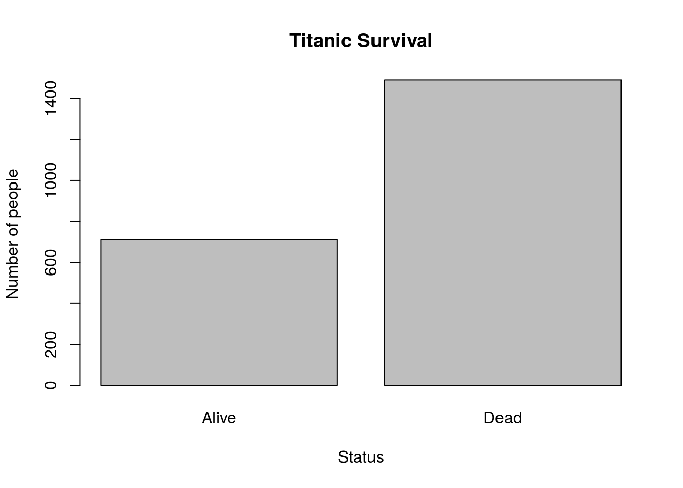
2.8 Try it out
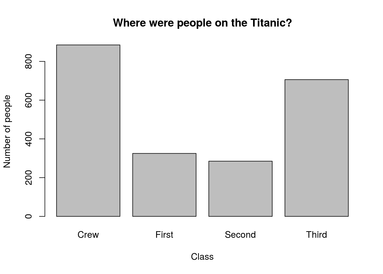
Now that you have seen it in action, use what we have used above to analyze the column class and
- Count how many people were in each class
- What proportion of people were in each class
- Plot the number of people in each class
Your plot should look something like this: