An introduction to statistics in R
A series of tutorials by Mark Peterson for working in R
Chapter Navigation
- Basics of Data in R
- Plotting and evaluating one categorical variable
- Plotting and evaluating two categorical variables
- Analyzing shape and center of one quantitative variable
- Analyzing the spread of one quantitative variable
- Relationships between quantitative and categorical data
- Relationships between two quantitative variables
- Final Thoughts on linear regression
- A bit off topic - functions, grep, and colors
- Sampling and Loops
- Confidence Intervals
- Bootstrapping
- More on Bootstrapping
- Hypothesis testing and p-values
- Differences in proportions and statistical thresholds
- Hypothesis testing for means
- Final thoughts on hypothesis testing
- Approximating with a distribution model
- Using the normal model in practice
- Approximating for a single proportion
- Null distribution for a single proportion and limitations
- Approximating for a single mean
- CI and hypothesis tests for a single mean
- Approximating a difference in proportions
- Hypothesis test for a difference in proportions
- Difference in means
- Difference in means - Hypothesis testing and paired differences
- Shortcuts
- Testing categorical variables with Chi-sqare
- Testing proportions in groups
- Comparing the means of many groups
- Linear Regression
- Multiple Regression
- Basic Probability
- Random variables
- Conditional Probability
- Bayesian Analysis
Hypothesis testing for means
16.1 Load today’s data
Start by loading today’s data. If you need to download the data, you can do so from these links, Save each to your data directory, and you should be set.
- icuAdmissions.csv
- Data on patients admitted to the ICU.
- cornDiff.csv
- Data on corn planted after two different methods of drying (regular:
REGand kiln-driedKILN) - Originally published in W.S. Gosset, “The Probable Error of a Mean,” Biometrika, 6 (1908), pp 1-25.
- Retrieved from: http://lib.stat.cmu.edu/DASL/Datafiles/differencetestdat.html
- Data on corn planted after two different methods of drying (regular:
- laborForce.csv
- Data on the participation of women in the labor force in 1968 and 1972 for 19 cities
- Originally from the United States Department of Labor Statistics
- Retrieved from: http://lib.stat.cmu.edu/DASL/Datafiles/LaborForce.html
# Set working directory
# Note: copy the path from your old script to match your directories
setwd("~/path/to/class/scripts")

# Load data
icu        <- read.csv("../data/icuAdmissions.csv")
cornDiff   <- read.csv("../data/cornDiff.csv")
laborForce <- read.csv("../data/laborForce.csv")
16.2 Overview
Are male and female ICU patients the same age?
This question probably feels a bit more like what you were expecting in statistics class. We start with proportions in large part because they are easier to visualize, easier to think about, and their null distributions are a bit more clear. However, there are a limited number of interesting questions about proportions (though, we will expand that number in later chapters).
Today we are going to switch gears a little bit and talk about means. Many of the same tools you have developed in analyzing proportions will apply here as well.
16.3 Difference in two means
Let’s start with the question posed above: Are male and female ICU patients the same age?
As always, we need to think about what this question means, and write out our hypotheses. Generally, this type of question is asking whether the mean value is different for the two groups. What is the status quo, base (boring) assumption about this? …
As is (almost) always the case, the most boring thing that could be true is that the two groups have the same mean age. Our alternative, in this case, will be that they are not the same mean age. I don’t think we have any a priori expectation (knowledge before looking at the data) to suggest a directional (on-tailed) test is appropriate. Let’s put these into hypotheses.
H0: mean age of men is equal to the mean age of women
Ha: mean age of men is not equal to the mean age of women
Now that we have hypotheses in mind, let’s take a look at the data. It is always good to start with a picture:
plot(Age ~ Sex, data = icu)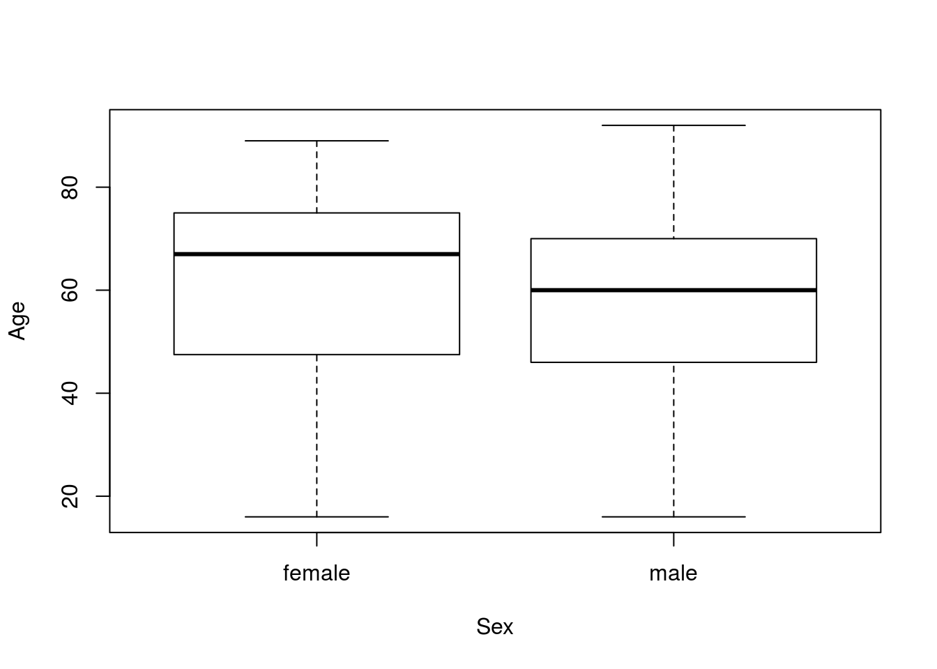
There is a lot of overlap there, but the medians (the dark lines in the center) are a bit different. However, our question asked about the means. We can use by() to find the means for each group. Note that I am saving the output, as I intend to use it directly in a moment.
# Calculate the means
ageMeans <- by(icu$Age, icu$Sex, mean)
ageMeans
## icu$Sex: female
## [1] 60
## --------------------------------------------------------
## icu$Sex: male
## [1] 56.04032By saving these values, we can access the numbers directly by name:
# View the male mean
ageMeans["male"]
## male
## 56.04032So to calculate the difference between the two, we can just call them directly:
# Calculate the difference
ageDiff <- ageMeans["male"] - ageMeans["female"]
ageDiff
## male
## -3.959677So, men are about 4 years younger than women in this sample. But, we need to find out how unlikely that difference is if our H0 is true.
Thus, we next need to figure out how to build a null distribution. There are a few reasonable approaches, but I think the simplest is to change our way of thinking about the null (just a little). One way to get two groups with the same mean is for them to all be drawn from the same population. That is, if age is not related to sex, we would expect to get the same mean in each group.
To do this by hand, we might write the ages on slips of paper, draw them out randomly, assign them to groups, and calculate the difference between the groups. In this exampl, that is as simple as treating the entire Age column as a sample from which to draw in R. So, just like when looking at the difference between two proportions, we will draw randomly from a pool and then find the differences.
As a reminder, if you were bulding this from scratch, you could either copy an old loop (like one comparing two proportions), or start with the for(i in 1:17654){ } and build up the inside, considering exactly what you would do for one sample.
# Initialize variable
nullAgeDiff <- numeric()

for(i in 1:17654){
  # draw a randomized sample of ages
  tempAges <- sample(icu$Age,
                     size =  nrow(icu),
                     replace = TRUE)

  # calculate the means
  tempMeans <- by(tempAges, icu$Sex, mean)

  # Store the parameter of interest (the difference in means here)
  nullAgeDiff[i] <- tempMeans["male"] - tempMeans["female"]
}
As always, we want to visualize our null distribution to make sure that things went correctly. I always like to put lines on the graph to show my samples as well.
# Visualize
hist(nullAgeDiff,
     main = "Null distribution of age difference by sex",
     xlab = "Sample difference in age (male - female)")
abline(v = c(ageDiff, - ageDiff),
       col = "green3",
       lwd = 3, lty = 3)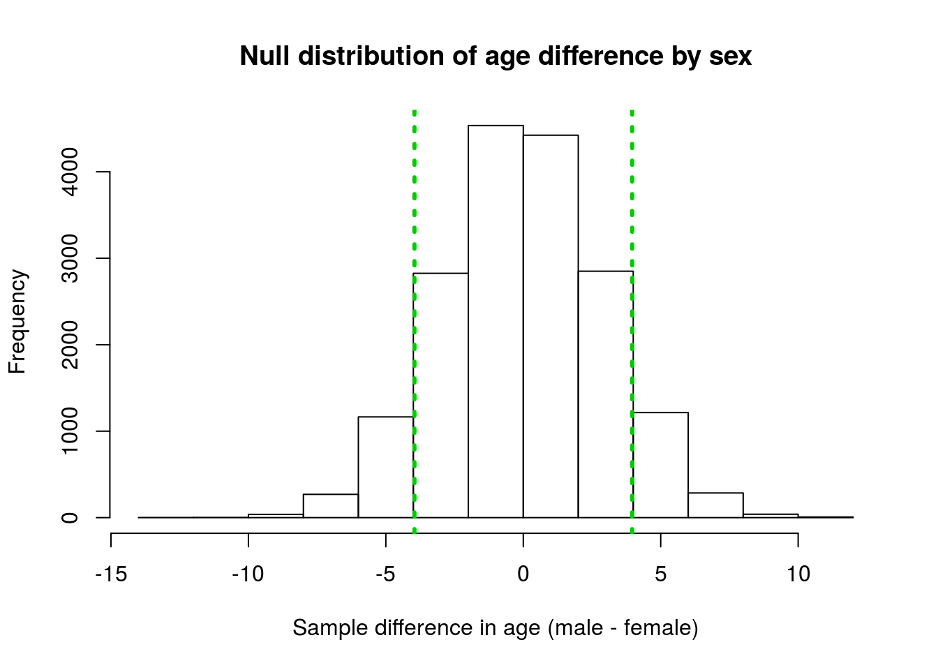
Our observed difference is a little ways out in the distribution, but certainly doesn’t seem very extreme. What proportion look like they are more extreme than our observed values? Maybe, one-quarter? Let’s put an exact number on it.
Just like when we looked at the difference in two proportions, we want to know how many values generated under the null distribution are as extreme as (or more extreme than) the value we saw. Remember that, because our Ha is “not equal to” (rather than “greater than” or “less than”), we need to consider both tails.
# Calculate p value
mean(nullAgeDiff >=  ageDiff |
     nullAgeDiff <= -ageDiff  )
## [1] 1Does a p-value of 1 seem right to you?
…
That implies that all of the values are more extreme than our lines, and that simply isn’t what we see on the plot. Any guesses as to what happened?
Here, we are asking which points are either greater than the left line, or less than the right line, which will always capture all of the points no matter how far the lines are from the middle. We need to be careful about which side is our negative, and which side is our positive difference. We also need to remember to compare our answer to our intuition and our plots (this is why we make you practice estimating).
One solution is to always check your directions every time, but that can lead to mistakes. Another option that works particularly well for differences (where our mean is almost always 0), is to simply take the absolute value of the difference using the function abs().
# Safer p-value calculation
mean(nullAgeDiff >=  abs(ageDiff) |
     nullAgeDiff <= -abs(ageDiff)  )
## [1] 0.1759375That seems a lot better. This means that this difference is likely to occur by chance about 1 in 6 random samples will have a difference this great between the two groups if the null is true. That doesn’t seem very rare, so we do not reject the H0 of no difference between the sexes.
Importantly, this does not mean that we are saying the mean age of male and female ICU patients is equal. All we can say with this type of a test is that we can’t say that they are different.
16.3.1 Try it out
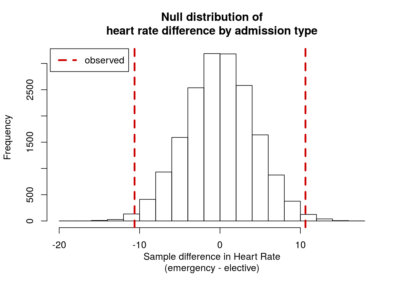
Using the icu data as a sample, is heart rate (column HeartRate) different between “elective” and “emergency” visits (column Type)?
State your null and alternate hypotheses, build and plot a null distribution, and calculate a p-value. Make sure to interpret the p-value.
You should get a p-value of around 0.013, and a distribution like this:
16.4 Testing a single mean
Often times we may not be interested in comparing two groups. Instead, we might want to test whether or not the mean of some population matches a pre-conceived value. For example, the top range of “normal” systolic blood pressure is about 120 (measured in millimeters of Mercury; mmHg). We might want to know if the average systolic pressure of ICU patients is different than that.
We start with our hypotheses. The null is the status quo: ICU patients are just like everyone else. The alternate here is that they are different. We could argue for a direction, but I think that would be hard to justify without a lot of additional information about patients. This gives us:
H0: mean blood pressure of ICU patients equals 120
Ha: mean blood pressure of ICU patients does not equal 120
With that set, let’s start by looking at the data we have. As always with distributions, it helps to plot the data first.
# Check distribution
hist(icu$Systolic,
     main = "Histogram of blood pressure",
     xlab = "Patient systolic blood pressure (mmHg)")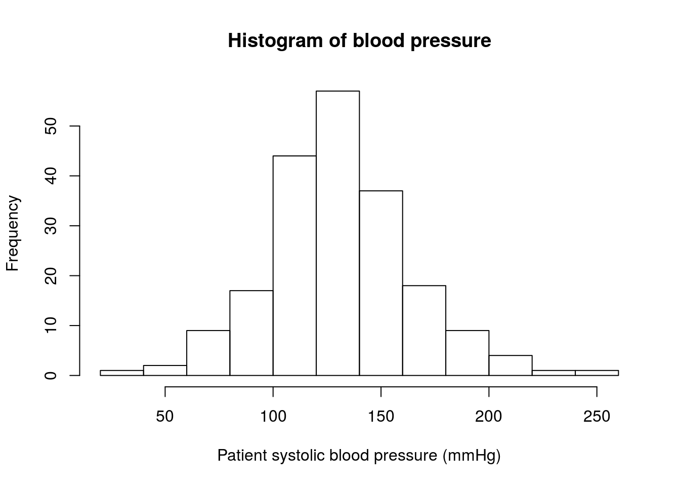
The distribution definitely includes 120 mmHg (our H0 value), but it seems to be centered a little bit higher. Let’s calculate the mean to see how much different it is.
mean(icu$Systolic)## [1] 132.28Because we have a two-tailed hypothesis, we are most interested in the difference between our data and the null. Here, I am saving it because we will use it again.
# Store the difference
diffBP <- mean(icu$Systolic) - 120
diffBP
## [1] 12.28Now we need to create a null distribution to see how often a similar sample will be 12.28 mmHg above or below 120 if the null hypothesis is true. This distribution is a little bit trickier. How can we create a distribution with a mean of 120? How wide should it be? Can we even control that width?
The answer to all of these questions is related, and simpler than it may first seem. Just like when constructing confidence intervals with bootstrap distributions, we can assume that the general shape and width of our sample is roughly the same as the population, even if its center is a little different.
So, to create our null distribution we simply shift the center of our data to match the null hypothesis. Just like when we centered for z-scores, this is as simple as subtracting (or adding) and doesn’t change the shape. We need to move it by the same amount that our original sample was off by, so we can subtract the diffBP value that we saved above. It is always a good idea to double check the resulting variable to make sure it matches your expectation.
# Create null population
nullBPvalues <- icu$Systolic - diffBP

# Check the mean
mean(nullBPvalues)
## [1] 120So, we now have a sample with a mean that matches our H0. We are assuming that this is representative of our overall null population, so (like in bootstrapping) we want to sample with replacement a large number of times.
# Initialize variable
bpNullSamples <- numeric()

for(i in 1:16897){
  # Create a sample
  tempSamp <- sample(nullBPvalues,
                     size = nrow(icu),
                     replace = TRUE)
  # Store the mean
  bpNullSamples[i] <- mean(tempSamp)
}
As always, we need to visualize the sample. Here, to add the lines, we can use the null value ± the difference.
# Visualize
hist(bpNullSamples,
     main = "Null distribution of Blood Pressure",
     xlab = "Sample mean Systolic Pressure (mmHg)")
abline(v = c(120 + diffBP,
             120 - diffBP),
       col = "darkblue",
       lwd = 3, lty = 3)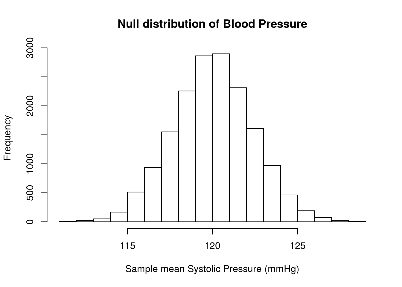
Where are the lines? Look again at the graph – our lines should be 12.28 above and below 120 (107.72 and 132.28), but those values are off of the plot area. We can see how much by setting the xlim = argument to hist()
# Visualize
hist(bpNullSamples,
     main = "Null distribution of Blood Pressure",
     xlab = "Sample mean Systolic Pressure (mmHg)",
     xlim = c(105,135))
abline(v = c(120 + diffBP,
             120 - diffBP),
       col = "darkblue",
       lwd = 3, lty = 3)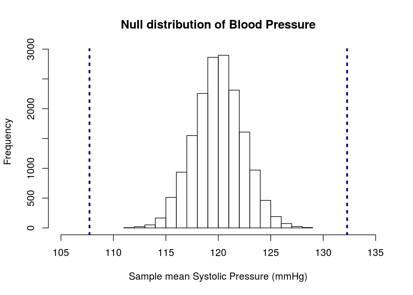
This shows us that our observed values are substantially different than the null hypothesis of 120 mmHg. In fact, our p-value will be zero because none of the samples are as extreme as (or more extreme than) our observed data.
mean(bpNullSamples <= 120 - abs(diffBP) |
     bpNullSamples >= 120 + abs(diffBP) )
## [1] 0Our conclusion is that we reject the null hypothesis that the mean Systolic blood pressure of ICU patients is 120 mmHg. We haven’t calculated what the value actually is, but we could use bootstrapping to calculate a confidence interval if we wanted.
This is an important place to remember two things. First, it is still possible to have gotten a value of 132.3 mmHg if the null is true. It is exceedingly unlikely, but if we took 10 million samples, we may get one that extreme. Second, this result tells us about the mean blood pressure of ICU patients. It does not tell us about the individual values. As we saw above, many of the patients have values very close to our null hypothesis.
16.4.1 Try it out
Is the mean heart rate of ICU patients similar to other hospital patients?
I once heard that the average heart rate of hospital patients was 100 beats per minute (probably bad information, but it gives us a starting point).
State your null and alternate hypotheses, build and plot a null distribution, and calculate a p-value. Make sure to interpret the p-value.
You should get a plot that looks something like this:
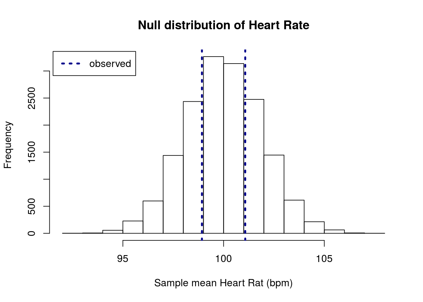
and a p-value of about 0.57.
16.5 Paired difference in means
Let’s take a look at slightly different type of data, which will show us a different perspective.
The data set laborForce has information about the labor force participation rate of women (a measure of what portion of women are working) for 19 U.S Cities in both 1968 and 1972. Take a look at the top:
head(laborForce)| City | in1972 | in1968 |
|---|---|---|
| N.Y. | 0.45 | 0.42 |
| L.A. | 0.50 | 0.50 |
| Chicago | 0.52 | 0.52 |
| Philadelphia | 0.45 | 0.45 |
| Detroit | 0.46 | 0.43 |
| San Francisco | 0.55 | 0.55 |
We would like to know if the labor force participation rate (LFPR) of women changed between 1968 and 1972. As always, our null is the status quo: nothing changed. Our alternative will be that something did change.
H0: LFPR of women in 1968 is equal to LFPR of women in 1972
Ha: LFPR of women in 1968 is not equal to LFPR of women in 1972
We can approach this problem much like we did before for the difference in means. We calculate a difference, then pool the samples to create a null distribution. First, calculate the actual difference. Because the data aren’t in one column, we can’t use by(). Instead, we will use apply(), and ignore the first column (that is what the -1 does).
# Display the data
boxplot(laborForce$in1972, laborForce$in1968,
        names = c("1972","1968"),
        xlab = "Year",
        ylab = "City LFPR")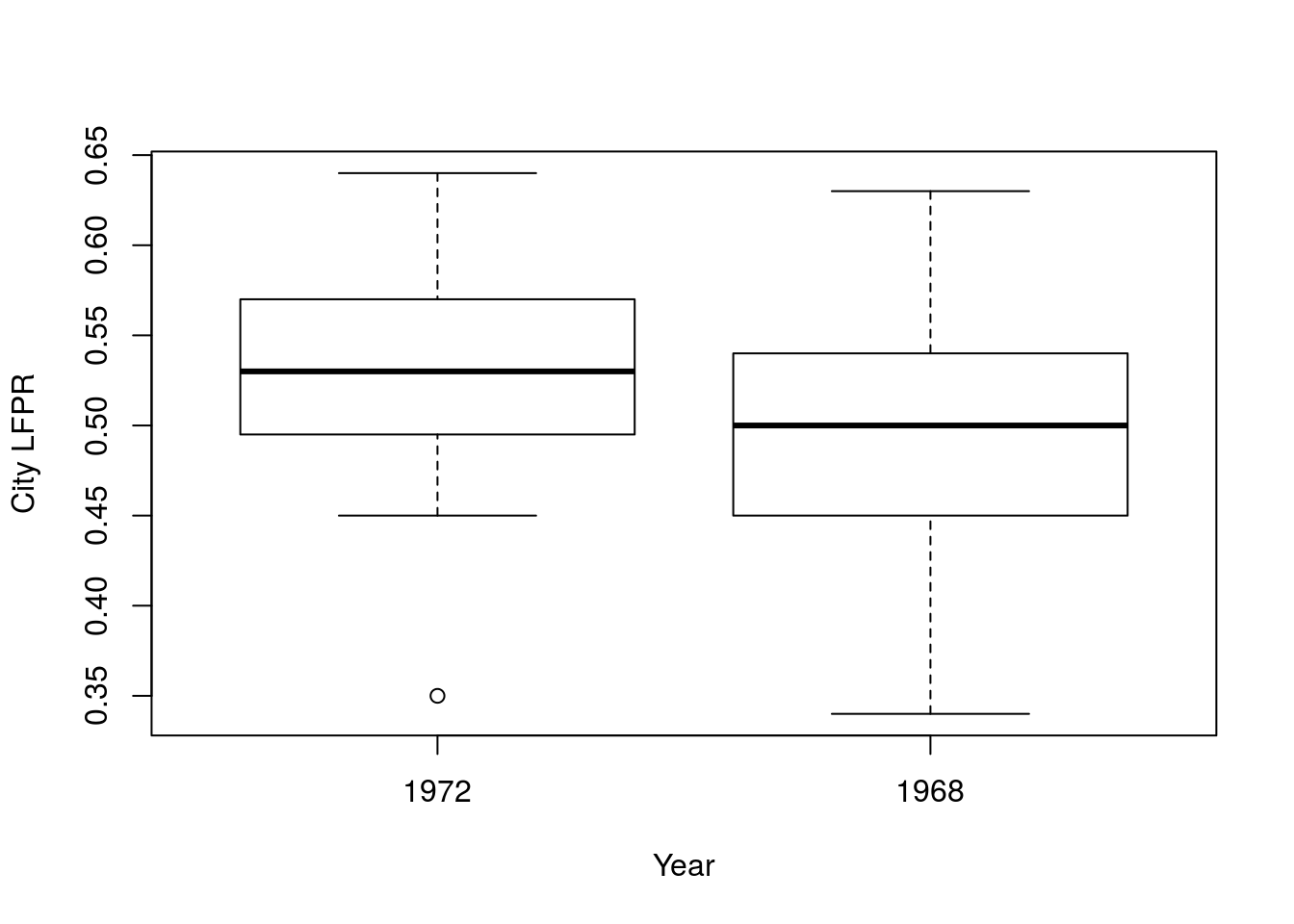
# Calculate the means
lfprMeans <- apply(laborForce[, -1], 2, mean)
lfprMeans
## in1972 in1968
## 0.5268421 0.4931579# Calculate the diffence
lfprDiff <- lfprMeans["in1972"] - lfprMeans["in1968"]
lfprDiff## in1972
## 0.03368421So, the LFPR for women went up by 0.034, but are those values significantly different? That is, does this sample of 19 cities suggest that the population (the whole US) LFPR for women changed? Looking at the boxplot, above, there is a lot of overlap. Let’s test it out.
As before, we will use a pool of data to create our null distribution, though here we must create it by combining the two columns. We’ll then sample, though here (because we don’t have a factor to use) we will create one sample for each year. Finally, we calculate the differnce and store it.
# Create pool
poolLFPR <- c(laborForce$in1972, laborForce$in1968)

#Initialize variable
nullLFPRdiffs <- numeric()

for(i in 1:16287){
  # Create samples
  temp1972 <- sample(poolLFPR,
                     size = nrow(laborForce),
                     replace = TRUE)
  temp1968 <- sample(poolLFPR,
                     size = nrow(laborForce),
                     replace = TRUE)

  # Store the difference
  nullLFPRdiffs[i] <- mean(temp1972) - mean(temp1968)
}
Then, we visualize the null distribution.
hist(nullLFPRdiffs,
     main = "Null distribution of LFPR",
     xlab = "Sample change in LFPR in women (1972 - 1968)")
abline(v = c(lfprDiff, -lfprDiff),
       col = "darkgreen",
       lwd = 3, lty =3)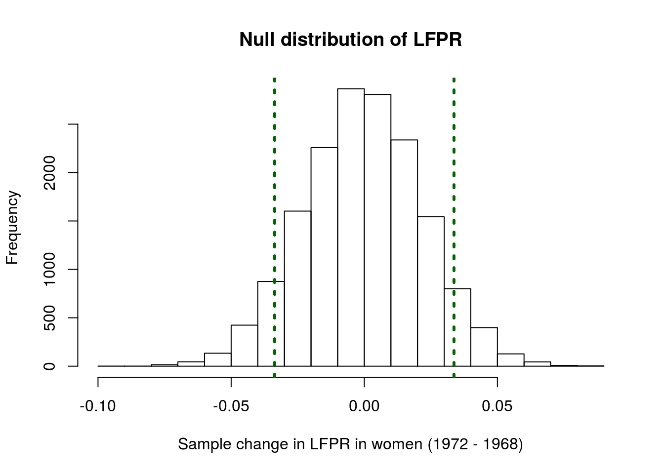
It looks like our data may be a bit extreme, but maybe not extreme enough to say that it is unlikely. Calculate the p-value to be sure:
mean(nullLFPRdiffs <= -abs(lfprDiff) |
     nullLFPRdiffs >=  abs(lfprDiff))
## [1] 0.1329281That p-value is a bit higher than any of the thresholds we have discussed. Thus, based on this analysis, we cannot reject the null hypothesis of no change in the LFPR.
But, we should ask – is this an appropriate analysis? Do you think it is reasonable to look at these cities and treat them as if they are the same? Do you think there might be any differences between N.Y., L.A., Chicago, Philadelphia, Detroit, San Francisco, Boston, Pitt., St. Louis, Connecticut, Wash. D.C., Cinn., Baltimore, Newark, Minn/St. Paul, Buffalo, Houston, Patterson, and Dallas?
What if some of them just have really low LFPR in general? Might that cause some problems?
Any time we have paired data, like these, where the measurements at two different times are related, we need to handle them specially. Instead of testing to see if the means are different, we are actually interested in whether the average change is 0 or not. Specifically, our hypotheses become
H0: The average change in LFPR of women from 1968 to 1972 is equal to 0
Ha: The average change in LFPR of women from 1968 to 1972 is not equal to 0
To test this question, we need to create a column for the differences between the two years. This allows us to ask if, on average, the LFPR of women in a given city changed in those four years.
# Save differences
laborForce$diff <- laborForce$in1972 - laborForce$in1968

# Save the mean change
meanChange <- mean(laborForce$diff)
meanChange
## [1] 0.03368421That value is the same, but what changed is the sample we will be drawing from. Now, we need to create a sample to draw from for which the mean change is 0. To do this, we apply the same correction as we did when testing a single mean. In fact, all of the mechanics are exactly the same as testing a single mean. The only difference is that we are now testing the mean of a change.
# Store sample that matches the null
nullChangeValues <- laborForce$diff - meanChange
mean(nullChangeValues)
## [1] 1.09508e-18I think that 17 zeroes followed by a 1 is probably close enough to zero (it is not exactly zero just due to rounding). Then, follow the steps for testing a single mean from above:
# Initialize variable
lfprNullSamples <- numeric()

for(i in 1:15987){
  # Create a sample
  tempSamp <- sample(nullChangeValues,
                     size = nrow(laborForce),
                     replace = TRUE)
  # Store the mean
  lfprNullSamples[i] <- mean(tempSamp)
}

# Visualize
hist(lfprNullSamples,
     main = "Null distribution of LFPR change",
     xlab = "Sample mean change in LFPR of women (1972-1968)"
     )
abline(v = c( meanChange,
             -meanChange),
       col = "darkblue",
       lwd = 3, lty = 3)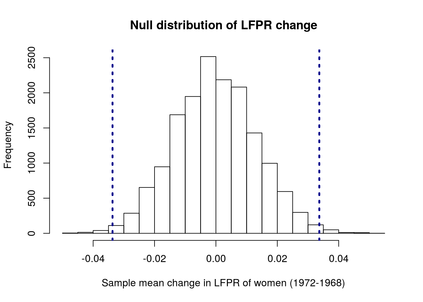
Now our observed value looks a lot more extreme – very few values from the null distribution are as extereme as, or more extreme than, our observed mean change. We can see exactly how extreme by calculating the p-value.
mean(lfprNullSamples <= -abs(meanChange) |
     lfprNullSamples >=  abs(meanChange) )
## [1] 0.01100894So, with this (much more appropriate) test that takes the paired nature of the samples into account, we can reject the null hypothesis of no change. This means we no longer believe that the LFPR rate of women did not change from 1968 to 1972.
16.5.1 Try it out
The data set cornDiff gives information on the yield (in lbs/acre) of corn planted after two methods of drying: regular (column REG) and kiln-dried (column KILN). Each row gives data from an adjacent pair of plots. Because the areas where these were planted varies substantially, we want to treat these as paired samples.
State your null and alternate hypotheses, build and plot a null distribution, and calculate a p-value. Make sure to interpret the p-value – and be very explicit with this one.
You should get a plot something like this:

and a p-value of about 0.075.