An introduction to statistics in R
A series of tutorials by Mark Peterson for working in R
Chapter Navigation
- Basics of Data in R
- Plotting and evaluating one categorical variable
- Plotting and evaluating two categorical variables
- Analyzing shape and center of one quantitative variable
- Analyzing the spread of one quantitative variable
- Relationships between quantitative and categorical data
- Relationships between two quantitative variables
- Final Thoughts on linear regression
- A bit off topic - functions, grep, and colors
- Sampling and Loops
- Confidence Intervals
- Bootstrapping
- More on Bootstrapping
- Hypothesis testing and p-values
- Differences in proportions and statistical thresholds
- Hypothesis testing for means
- Final thoughts on hypothesis testing
- Approximating with a distribution model
- Using the normal model in practice
- Approximating for a single proportion
- Null distribution for a single proportion and limitations
- Approximating for a single mean
- CI and hypothesis tests for a single mean
- Approximating a difference in proportions
- Hypothesis test for a difference in proportions
- Difference in means
- Difference in means - Hypothesis testing and paired differences
- Shortcuts
- Testing categorical variables with Chi-sqare
- Testing proportions in groups
- Comparing the means of many groups
- Linear Regression
- Multiple Regression
- Basic Probability
- Random variables
- Conditional Probability
- Bayesian Analysis
Final Thoughts on linear regression
8.1 Load today’s data
Start by loading today’s data. If you need to download the data, you can do so from these links, Save each to your data directory, and you should be set.
- hotdogs.csv
- Data on nutritional information for various types of hotdogs
- rollerCoaster
- Data on the tallest drop and highest speed of a set of roller coasters
- smokingCancer
- Data on the smoking and mortality rates of various professions in Great Britain.
Smokingcolumn gives a ratio with 100 meaning the profession smokes exactly the same amount as the general public and higher values meaning they smoke moreMortalitycolumn gives a ratio with 100 meaning the profession has exactly the same lung cancer mortality rate as the general public and higher values meaning they have a higher mortality rate
- AlcoholAndTobacco.csv
- Data on the average weekly household spending on each
AlcoholandTobaccoin 11 regions of Great Britain
- Data on the average weekly household spending on each
- icuAdmissions.csv
- Same data as presented in the book, but this set has actually named variables instead of the numeric indicators
# Set working directory
# Note: copy the path from your old script to match your directories
setwd("~/path/to/class/scripts")

# Load data
hotdogs        <- read.csv("../data/hotdogs.csv")
rollerCoaster  <- read.csv("../data/Roller_coasters.csv")
smokingCancer  <- read.csv("../data/smokingCancer.csv")
alcoholTobacco <- read.csv("../data/AlcoholAndTobacco.csv")
icu            <- read.csv("../data/icuAdmissions.csv")
8.2 Interpretation
Now that we’ve made a bunch of lines, we need to figure out what they mean (and what they don’t). Let’s start with a simple line to interpret. Copy in your plot for the relationship between Drop and Speed of a roller coaster. I’ll give you the line, but you copy in your plot as well
# Save the line for roller coasters
speedLine <- lm(Speed ~ Drop, data = rollerCoaster)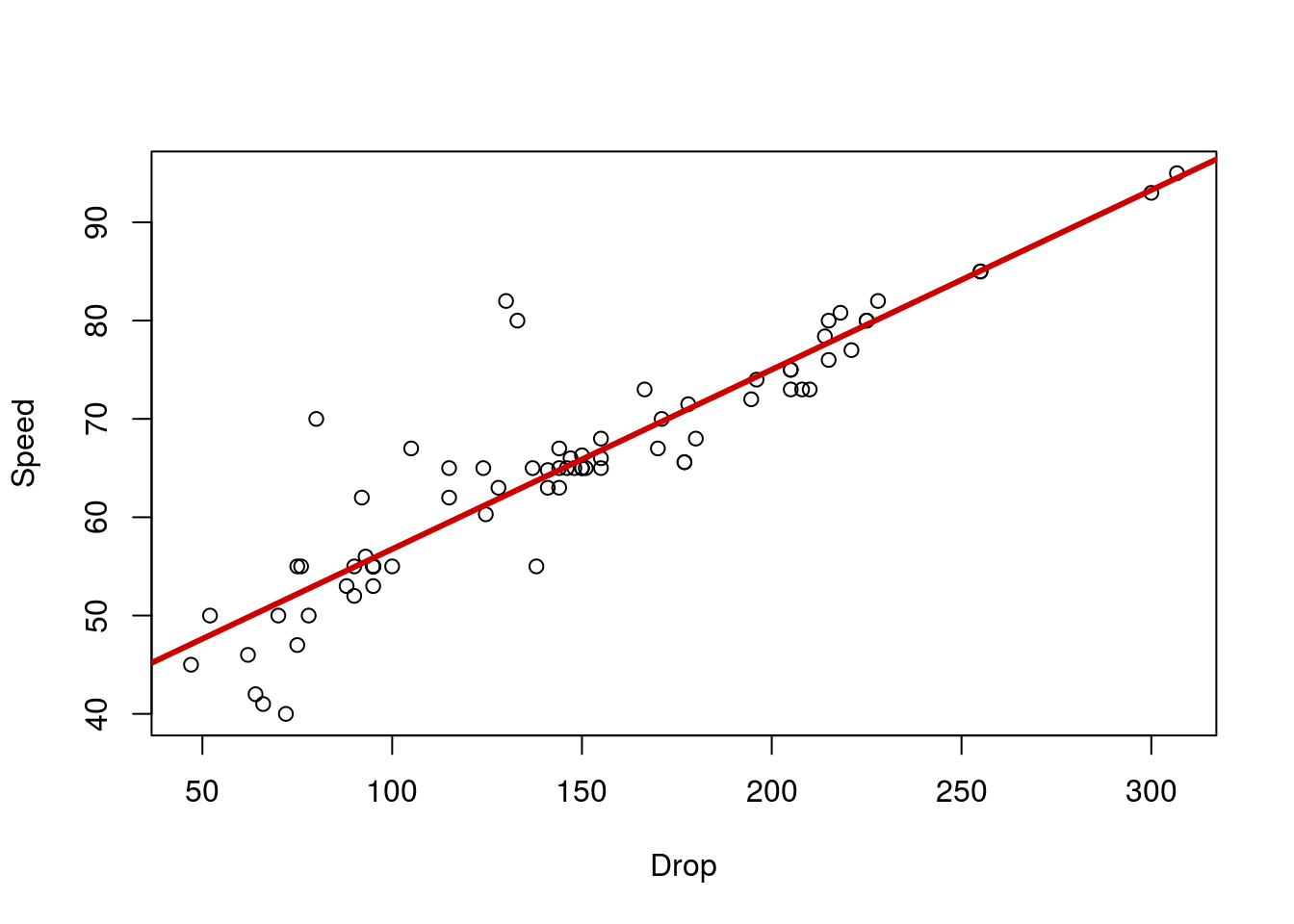
Looking at the output of the line we see:
# See the output of the line
speedLine
##
## Call:
## lm(formula = Speed ~ Drop, data = rollerCoaster)
##
## Coefficients:
## (Intercept) Drop
## 38.4997 0.1826Which we can convert to the following equation:
Speed = 38.5 + 0.18 * Drop
This means that, for every 1 unit (here, feet) increase in Drop, we expect a 0.18 unit (here MPH) increase in Speed. The intercept tells us the Speed we expect if the drop were 0 feet. In this case, it doesn’t make much sense to think about a roller coaster with a 0 foot drop (we’d probably just call that a train). However, intuitively, 38 MPH sounds like a reasonable place to start from (for a slow-ish car). Sometimes the intercept will be meaningful, especially if we ask about a variable that can be 0 in our data (e.g., how many packs of cigarettes smoked per day).
From our equation, we can calculate the Speed we expect given any Drop. Simply plug the Drop into the equation and go[*] There is a slightly more programatic way with the function predict(), but it is a bit of overkill for what we are doing here. We will use it later this semester when we make more complicated lines and want to ask more specific questions about the lines. . Let’s try it for 200 foot drop:
# Calculate predicted speed for 200 ft drop
38.4997 + 200 * 0.1826
## [1] 75.0197Thus, we predict that a 200 foot drop will give a speed of about 75 MPH. Change the 200 to a few other values on the plot. Notice that the output (the predicted speed) is always on the line. Visually, we can estimate the speed just by looking at the line.
8.3 Correlation does not imply causation
Before we go any further looking at the other warnings and information, it is important that we remember that we are not confirming causation with these lines. In the case of the roller coasters, we have a proposed mechanism (gravity) that could explain the relationship in a causitive way. However, without actually doing the experiment (e.g., building otherwise identical roller coasters with varying drop heights), we can not say definitively that one variable is causing the other.

In the everyday language we use to describe lines, it is easy to confuse correlation and causation. Just make sure that you are being careful about your interpretations. For example, in the smoking example we used last time, we got this plot:
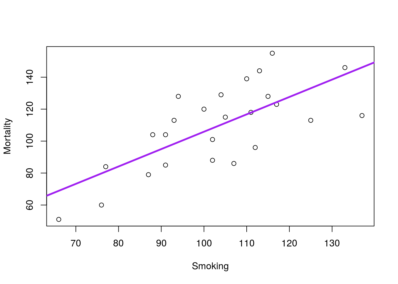
This line implies that increased smoking in a profession causes increased mortality due to lung cancer. However, it is possible that other factors are at play here. It could be that people in professions with high lung cancer rates (e.g. from exposure on the job) might choose to smoke more. It might be that people that choose specific professions are pre-disposed to lung cancer and more likely to smoke. Without an experiment (e.g. assigning one group of people to smoke, and one to never smoke, then recording lung cancer incidence), it is impossible to conclusively state that smoking causes lung cancer.
However, with:
- A preponderance of evidence (lots of data like these show a link between smoking and cancer),
- A proposed mechanism (cigarettes and other nicotine products are known carcinogens), and
- No reliable alternative explanation (do we really think there is something like a gene for being both a smoker and a carpenter?)
we can start to suspect a relationship. In this case, the experiment on humans is un-ethical, and it will likely never me conducted. However, animal experiments have shown the causitive relationship, albeit not in humans (reviewed in Proctor, 2012).
All of this to say: Be wary. As Randall Munroe said (see the hover text on the comic above): “Correlation doesn’t imply causation, but it does waggle its eyebrows suggestively and gesture furtively while mouthing ‘look over there’.” A correlation is not conclusive, but it may give a hint of where to look.
8.4 Residuals
One thing that we didn’t cover when introducing linear regression was how the line is actually found. The process works similarly to how you might draw the line by eye: you create a line that puts the points as close to it “on average” as possible. Now, the “on average” part is a bit tricky, but similar to other things we have done.
The line is made by the “least squares” method. In words, it finds the line where the squared vertical distance between the line and each point is smallest (the square is necessary because we expect points both above and below the line).
These vertical distances are called “residuals” because they account for the leftover (or, residual) error in the estimate. That is, they are a measure of how “wrong” the line is for each value. Let’s use the smoking data here to show this in action. Copy in the line and plot from last time:
# Save the line for the smoking data
smokeLine <- lm(Mortality ~ Smoking, data = smokingCancer)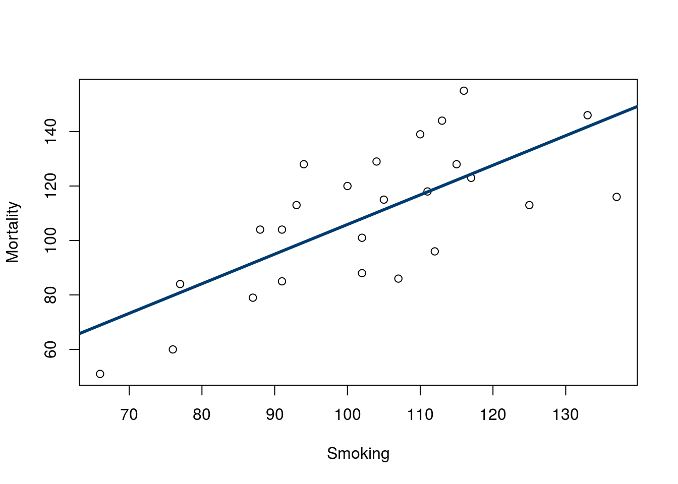
Now, look at the distance between each point and the line (added here for visualization).
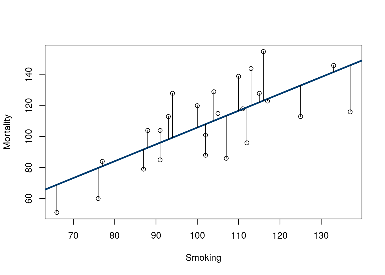
Note that there are similar numbers above and below the line, and they reach to similar lengths. We can see these values using the function residuals(), which takes an output from lm() (or similar functions) as it’s input.
# Show the residuals
residuals( smokeLine )
## 1 2 3 4 5 6
## 3.1453349 -30.1066007 -1.3559555 28.6572865 31.7315768 -7.0429716
## 7 8 9 10 11 12
## 0.1692381 14.7448187 11.1824800 -20.0429716 7.9198832 18.7819639
## 13 14 15 16 17 18
## -27.4806329 -22.9182942 23.9941735 22.2567703 -20.0562136 4.2435283
## 19 20 21 22 23 24
## 5.8191090 3.6944316 -12.7299877 -11.0801168 14.1320929 -19.7671329
## 25
## -17.8918103Note that the residuals are in the order they were passed into the line (i.e. the row order of smokingCancer) not the order they are on the plot. This can let us compare the residuals to our predictor value relatively easily. Try this:
# Plot residuals against smoking rate
plot( residuals(smokeLine) ~ smokingCancer$Smoking)
Note that there is no apparent relationship between Smoking and the residuals, and that is a good thing. If the data fit a line well, this is what we should see (we will see some exceptions soon). Later this semester we will explore more about what these residuals can tell us.
8.5 Extending beyond
Quick, how fast will a 1,000,000 foot tall coaster go? Plug it into our equation from above:
# Calculate predicted speed for 200 ft drop
38.4997 + 1000000 * 0.1826
## [1] 182638.5So, would a one million foot tall roller coaster go 182,638 MPH? What problems can you think of already?
There are clearly some building hurdles that would need to be cleared, but even then, we are way past the terminal velocity of roller coasters. So, even though we have a nice linear relationship where we have data we expect different physics to over ride that relationship if we extend beyond the area we have data.
This phenonmenon is common enough that we should always be wary about any interpretation outside the range of our data. Guessing about how fast a roller coaster is that is 10 feet taller might not big a big deal, but as we go further (100 ft, 1,000 ft, etc.) our risk of missing some new phenomenon increases.
8.6 Outliers
A major concern when analyzying correlations and linear regression is the major impact of outliers. Here, we don’t need any specific definition or equation for an outlier. Visual inspection is usually the best approach. To illustrate, plot the relationship between Alcohol and Tobacco purchasing (in British pounds per week) for British families in different regions. Make sure to add a line describing the relationship.
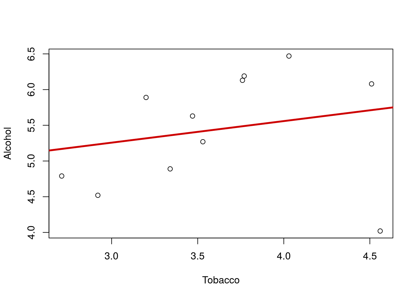
That line looks quite flat, and we migh think there is little relationship between the spending on these two products. But … look again at the plot. Notice the point in the lower left corner? that point is a long ways from the rest of the relationship. Lets make the line again, this time excluding that point by only including Alcohol values greater than 4.2. Note that when I add the line, I used the lty = parameter, which sets the line type. Type 3 is for dashed; try a few other numbers to find one you like.
# Make a trimmed line and add it to the plot
trimLine <- lm(Alcohol ~ Tobacco,
               data = alcoholTobacco[alcoholTobacco$Alcohol > 4.2,])
abline(trimLine, col = "darkblue",
       lty = 3, lwd = 3)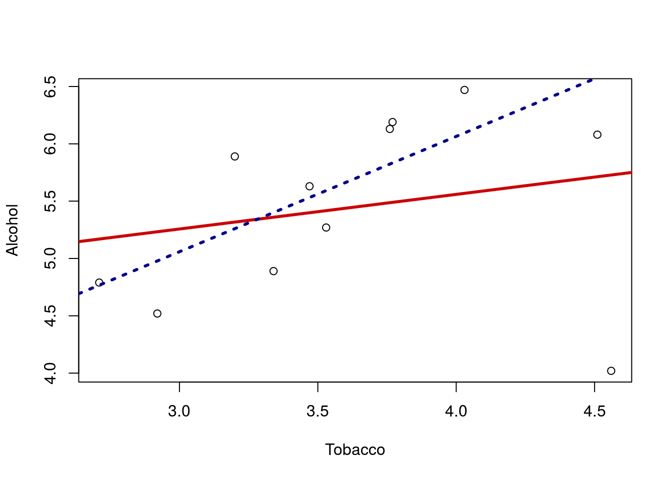
Now it looks like there is a rather strong positive relationship. Importantly, this result DOES NOT mean that we can just throw out that point and accept the positive relationship. It might be that the outlier shows us that the relationship does not hold. There are only 11 regions in the data set: maybe the other 10 are the weird ones for showing this relationship.
What we should do is investigate this point further. So, let’s look at this row from the data frame:
# Look at the row of the outlier
alcoholTobacco[alcoholTobacco$Alcohol < 4.2, ]| Region | Alcohol | Tobacco |
|---|---|---|
| Northern Ireland | 4.02 | 4.56 |
Now that we know more about the outlier, we can investigate further. The first step is often to confirm that the values are accurate. For example, if the value were listed a -1.02, we would be rightfully suspicious and perhaps throw it out. Failing that, we may investigate what caused such an extreme. Perhaps some feature of Northern Ireland (the cost of beer, the climate, cultural norms, etc.) cause it to have very low spending on Alcohol. Any of those things might lead us to re-analyze the data and perhaps reach interesting new conclusions. As a final recourse, we are at the very least obligated to report the result both with and without the outlier, and let a reader interpret the result.
8.7 Non-linear
Another major concern is non-linear data. Below is a plot of the temperature at an Alaska weather station throughout the day. The line is the linear regression returned by lm(). Does it make sense to interpret this line? What do you think it suggests the temperature will be in another 24 hours?
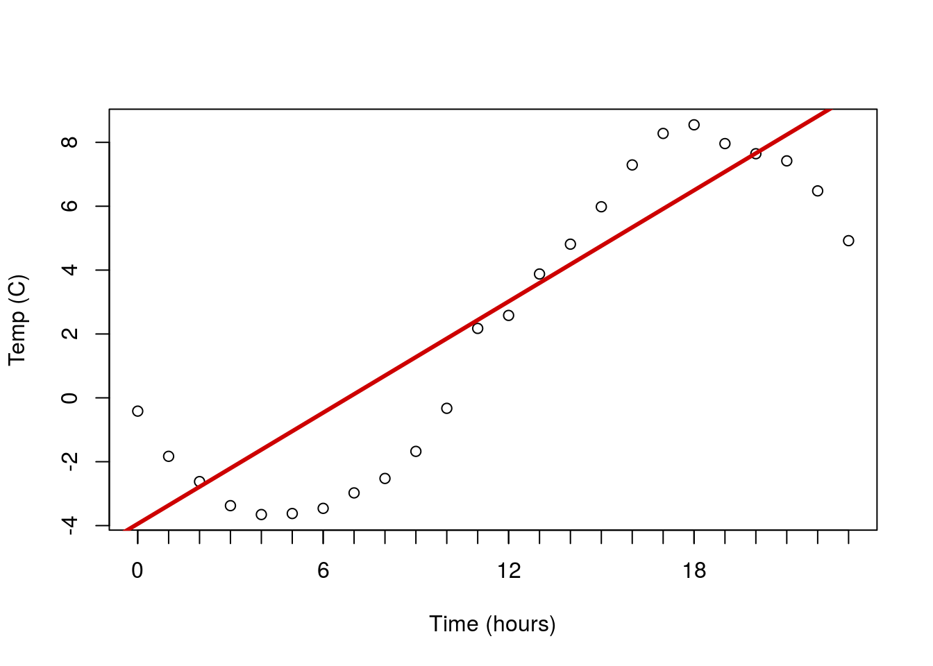
Here is a case of data that are clearly not linear, and for which a straight line doesn’t make sense to fit. In such a case, we are often left with little recourse but to say we can’t fit a line.
As a final note – this is a place where plotting the residuals can be really helpful. The residuals often reveal non-linear patterns even more clearly than the orignal plot. This is more important when the shape is closer to linear, but the effect is still apparent here.

8.8 Groups
The final major concern is the presence of groups. To examine this, plot the relationship between Sodium and Calories from the hotdogs data and add a line.
# Plot sodium cal relationship
plot(Calories ~ Sodium, data = hotdogs)

# Save line and add to plot
calLine <- lm(Calories ~ Sodium, data = hotdogs)
abline(calLine, col = "maroon", lwd = 3)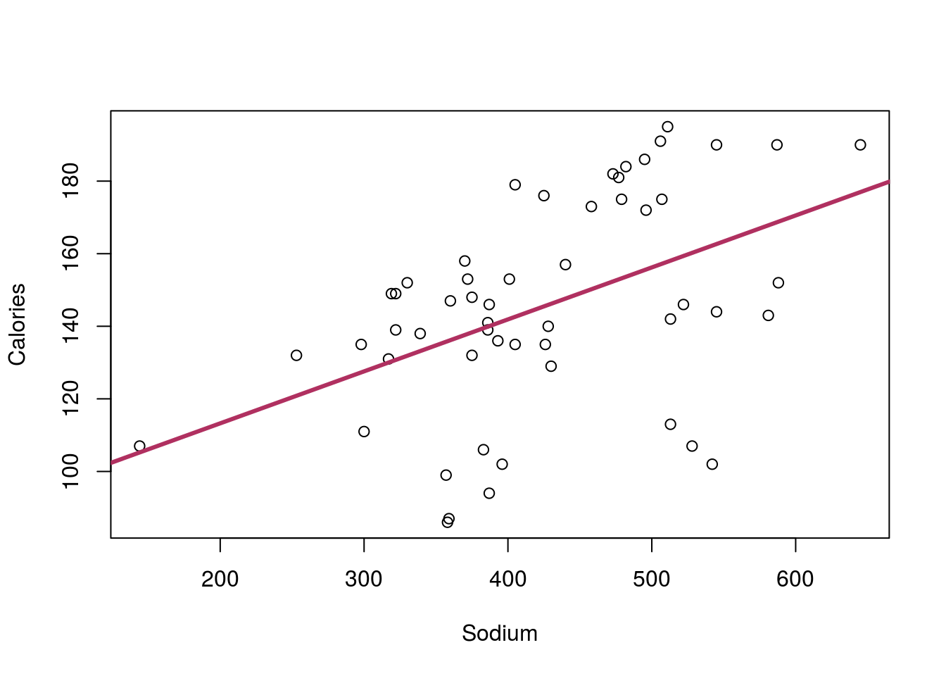
There seems to be a rather strong relationship between the two variables, but something doesn’t seem quite right. There seems to be a separate group of points running under the line. Do you remember any differences between the hotdogs? Maybe something about Type? Let’s check the data to see:
# What the heck is in here?
summary(hotdogs)
## Type Calories Sodium
## Beef :20 Min. : 86.0 Min. :144.0
## Meat :17 1st Qu.:132.0 1st Qu.:362.5
## Poultry:17 Median :145.0 Median :405.0
## Mean :145.4 Mean :424.8
## 3rd Qu.:172.8 3rd Qu.:503.5
## Max. :195.0 Max. :645.0That’s right, we had Beef, Meat, and Poultry hotdogs. Could it be that the various Type’s have different values, or even a different relationship? Let’s find out by adding points to the graph, colored for each type. In R, we can do this with the function points(), which works very similarly to plot() but just adds to the current plot. So, for each Type, we will select a color (feel free to pick your own), and limit the data to just rows matching that Type. I am also using a new argument pch = which allows us to pick different shapes to plot. Play with a few numbers, or even try setting it to a letter to see what happens (e.g. pch = "X").
# Add points for each type of hotdog
points(Calories ~ Sodium,
       data = hotdogs[hotdogs$Type == "Beef",],
       col = "red3", pch = 19)

points(Calories ~ Sodium,
       data = hotdogs[hotdogs$Type == "Meat",],
       col = "green3", pch = 19)

points(Calories ~ Sodium,
       data = hotdogs[hotdogs$Type == "Poultry",],
       col = "darkblue", pch = 19)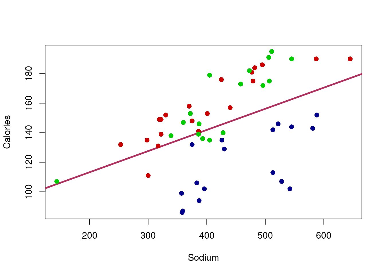
Wow – that makes things even more clear. The Poultry hotdogs don’t seem to have a strong relationship, and are pulling the line down away from the strong relationship in Meat and Beef hotdogs. We will be able to handle that by the end of this course, but for now, it is enough to be aware of the problem.
However, we also probably want to add a label to the plot, just to make it clear what colors meant what. For this, we can call legend() directly (this is the function used by barplot() to make its legends too). There are lots of ways to use legend() but for now we will stick with the straightforward approach of telling R where we want it. The arguments below tell R to (see help for more details):
- The first tells it where to put the legend
insetsays how far (in percent of the plot area) to move the legend from the edgelegendsay what to call each of the entriescolgives the colors to use (make sure these match yours if you changed them above)pchtells R to use that shape (make sure it matches the one you used; if you used different ones for each type, you can usec()to list them in order, just like we did for colors)
# Add legend
legend("topleft",
       inset  = 0.01,
       legend = c("Beef","Meat","Poultry"),
       col    = c("red3","green3","darkblue"),
       pch    = 19)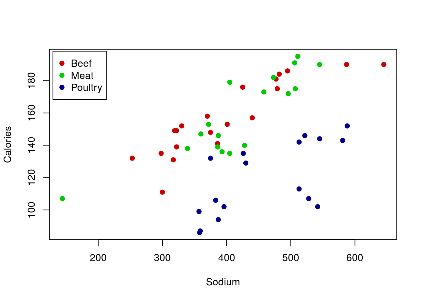
I will point out here that there is a faster route to this plot. Because the column Type is a factor (a class of variable in R), we can utilize some of its special properties. Specifically, we can create a new column named colorType based on Type. By setting the labels = argument, we are telling R: “Whatever the first kind of hotdog is, always replace it with this first color; then do the same for each type (2nd to 2nd; 3rd to 3rd; etc)”. This drastically reduces typing, particularly when dealing with variables with lots of levels (the term for the different kinds in a variable). It also means that to change all of the colors, we only need to change one line of code. Don’t worry about this now; I just want to show you so that you are aware of one of the ways in which factors can be used. We will re-introduce this and other features of factors later.
# Make column for colors
hotdogs$colorType <- factor(hotdogs$Type,
                            labels = c("red3","green3","darkblue"))

# Plot the data, setting col = to be the colors we created
# note that we have to use as.character, because otherwise
# the order of the types is returned
plot(Calories ~ Sodium, data = hotdogs,
     col = as.character(colorType),
     pch = 19)

# Add a legend, here by using levels() to make sure our orders match
legend("topleft",
       inset  = 0.01,
       legend = levels(hotdogs$Type),
       col    = levels(hotdogs$colorType),
       pch    = 19)
8.9 Anscombe
As a final point, these concerns are all quite old. They continue to be relevant, but they have been evaluated for a long time. In fact, in 1973, Anscombe published an artificial dataset to evaluate exactly this. It is such a crucial data set that it is included in R by default. You can load it like this:
# Load and view anscombe data
data(anscombe)
anscombe| x1 | x2 | x3 | x4 | y1 | y2 | y3 | y4 |
|---|---|---|---|---|---|---|---|
| 10 | 10 | 10 | 8 | 8.04 | 9.14 | 7.46 | 6.58 |
| 8 | 8 | 8 | 8 | 6.95 | 8.14 | 6.77 | 5.76 |
| 13 | 13 | 13 | 8 | 7.58 | 8.74 | 12.74 | 7.71 |
| 9 | 9 | 9 | 8 | 8.81 | 8.77 | 7.11 | 8.84 |
| 11 | 11 | 11 | 8 | 8.33 | 9.26 | 7.81 | 8.47 |
| 14 | 14 | 14 | 8 | 9.96 | 8.10 | 8.84 | 7.04 |
| 6 | 6 | 6 | 8 | 7.24 | 6.13 | 6.08 | 5.25 |
| 4 | 4 | 4 | 19 | 4.26 | 3.10 | 5.39 | 12.50 |
| 12 | 12 | 12 | 8 | 10.84 | 9.13 | 8.15 | 5.56 |
| 7 | 7 | 7 | 8 | 4.82 | 7.26 | 6.42 | 7.91 |
| 5 | 5 | 5 | 8 | 5.68 | 4.74 | 5.73 | 6.89 |
Each of the digits (1, 2, 3, and 4) represent a pair of x and y values. First run lm() on each set.
lm(y1 ~ x1, data = anscombe)
lm(y2 ~ x2, data = anscombe)
lm(y3 ~ x3, data = anscombe)
lm(y4 ~ x4, data = anscombe)
What do you notice about the lines from each pair? They should be nearly identical. Do you think this means that the data sets all look similar? Below are all four datasets, including there lines. do these look the same at all?

Hopefully this illustrates how incredibly important it is to plot your data. Of these, only set 1 is a reasonable use of linear regression or correlation, despite the fact that all of the lines are nearly identical. Bear this in mind when analyzing data: always know what you are working with.